Arthur Baker and my type classes
It started with the advice: ‘You have to go back to the broad edge pen. It’s all there.’
Brilliant calligrapher Arthur Baker gave me direction when I first set up my beginning typography course. And I’m still using the same approach today.
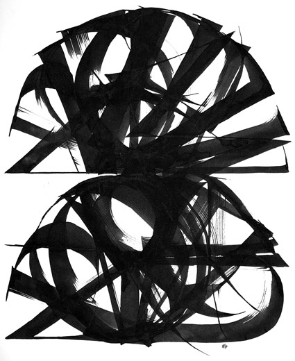
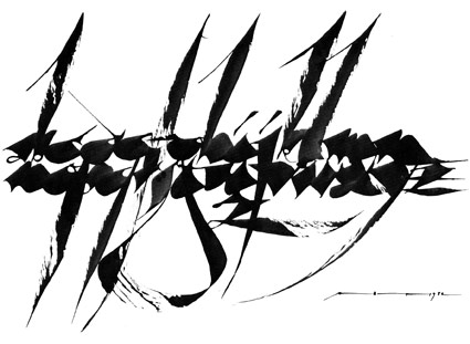
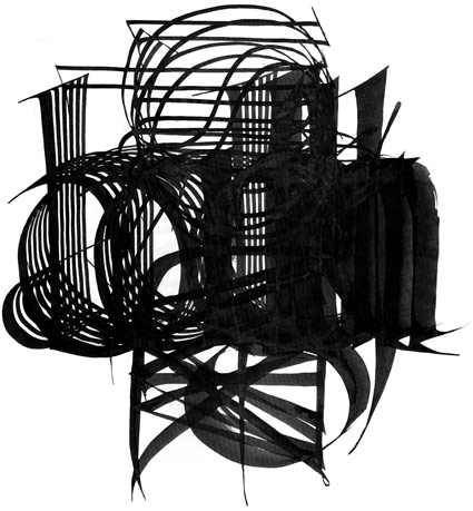
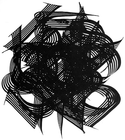
For years, his calligraphic work has been playing muse to how I see typography – as both a mechanical and expressive medium. This includes his ‘radical’ approach that involves creating his own tools and holding his implements ‘incorrectly’ by traditional standards.
Good lettering doesn’t have to conform to mathematics or pure structure. Good lettering is an extension of our own hands. It is something we’re already immersed in (often crudely), taught to us in elementary school.
Letterforms from hundreds of years ago are still with us. Type is around us every day – this influences and works on many levels.
I believe good type has the complexity of wine, or music.
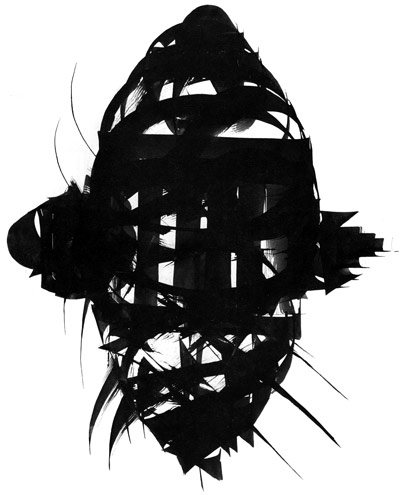
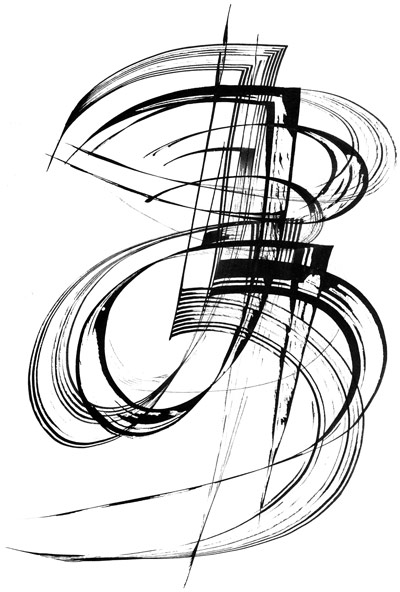
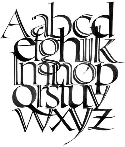
Pictured are a few images from The Calligraphic Art of Arthur Baker; one of many editions he’s penned.
I begin another quarter of type courses tomorrow. Looking forward to seeing what happens when students put pen to vellum.


Such beauty. Thank you.
Garmin Nuvi 1490t…
[…]here are some links to sites that we link to because we think they are worth visiting[…]…