Free Hero fonts!
Fontfabric’s free sanserif Hero fonts. Two weights, multiple language support.
Grab em here. Fontfabric has a great section of other freebies too.
Fontfabric’s free sanserif Hero fonts. Two weights, multiple language support.
Grab em here. Fontfabric has a great section of other freebies too.
Pictured: Cap Z from Penabico, a new font based freely on ‘the copperplate script styles to be found in the Universal Penman.’
Available at MyFonts. And currently trending as one of their best sellers.
More detail here.
‘T shirts that were designed to have the silhouette of 5 famous typefaces; Helvetica, Caslon, Baskerville, Courier and Cooper Black.’
Masashi Kawamura makes type into clothing. Details here.
Found via Tiffany Valdez
‘It’s just a shame they couldn’t have used just the original font, because [Comic Sans is] a real mess.’ -Dave Gibbons, interview in The Guardian
Sick of Comic Sans? Why not try something more authentic . . . .
Vincent Connare based the design of his Comic Sans fonts on the lettering work of comic book illustrator Dave Gibbons. With infamous results.
But the comic book lettering gurus at Comicraft have something a bit better: Real Dave Gibbons fonts.
They won’t come preloaded free on your PC. But if you want to put your money where your mouth is, the ‘DaveGibbons’ fonts – available in upper, lowercase, international, journal and splash page titling versions – should be up to the task at hand.
Snag em here. Multiple purchase options available, including some ‘Gibbous Packs.’
A few weeks back, I was explaining to a culinary instructor the whole hate Comic Sans thing.
She had just put together a bunch of slides for a presentation and picked Comic Sans as her font.
And was really surprised at the reaction she got. Some members of the Hate Comic Sans faction were there that day and they made their presence known. To her dismay. [Read more →]
‘If I could change anything, I’d straighten up that 0 on the number 10. It’s a bit wobbly.’
Here’s an excellent read by J.M. Mosley on the odd lettering used for the numerals at 10 Downing Street. Not quite the original, sort of an accident that is now part of history.
It’s interesting how small type details are often overlooked. The numbers on my own home are rather awful, and even though several years back I’d purchased some Bodoni as replacements, have never gotten around to actually installing them.
Found via Matthew Williams

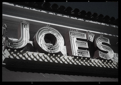
Rumor has it that Original Joe’s in San Francisco may be reopening this year.
Hoping to stop in for a Martini, of course.
Above: Photo of Original Joe’s original sign by mehallo
‘An original 21st-century design by Alejandro Paul, Brownstone is a monoline sans-serif with ornate details inspired by historic brownstone buildings of Brooklyn, NY.’
Love type. But also love Artie Shaw.