entries Tagged as [education]

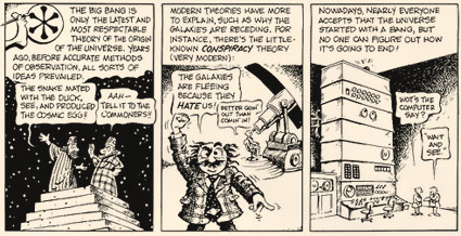
Gonick’s Cartoon History

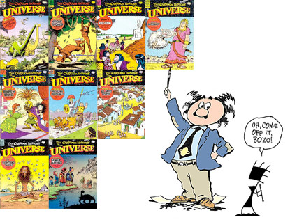
RSA’s new animated lectures remind me of Larry Gonick’s wonderful Cartoon History of the Universe series.

Gonick’s been working on these since the 1970s. I have a few of his original comic book editions. In the 1990s, he even licensed an interactive CD ROM version – with panels animated directly from his book, plus detailed 3D animated history lectures. Unfortunately, this CD adventure will not run on my computer today.

Wanna get caught up on history? Start here.

Larry Gonick’s official site here.

World changing: What could be next?

‘Renowned academic David Harvey asks if it is time to look beyond capitalism towards a new social order that would allow us to live within a system that really could be responsible, just, and humane?’

Dr. Harvey defines our world financial problems from a Marxist perspective – with cartoon illustrations by Andrew Park.

He asks the right question, but the problem does need an answer.

Part of the RSA Animate series of lectures.

The wonky type at 10 Downing

‘If I could change anything, I’d straighten up that 0 on the number 10. It’s a bit wobbly.’

Here’s an excellent read by J.M. Mosley on the odd lettering used for the numerals at 10 Downing Street. Not quite the original, sort of an accident that is now part of history.

It’s interesting how small type details are often overlooked. The numbers on my own home are rather awful, and even though several years back I’d purchased some Bodoni as replacements, have never gotten around to actually installing them.

Found via Matthew Williams

Nast, Thomas: Politics as usual

This is probably my favorite political image: Harper’s Weekly cartoonist Thomas Nast’s take on New York’s William “Boss” Tweed – with money head. Tweed was played by Jim Broadbent in the movie.

Thomas Nast (1840-1902) holds the title of ‘father of the American cartoon’ and along the way ended up turning both donkey and elephant into American political icons.

Prior to Nast’s involvement, ‘It all started with an insult. During Andrew Jackson’s 1828 presidential campaign, his political opponents labeled him a ‘jackass.’ Stubborn as he was, Jackson co-opted the insult and began putting a donkey on his election posters.’ [Read more →]

‘The Golden Rectangle’ en español

‘Donald nos enseña la magia que se esconde en los números y la naturaleza’

‘The Golden Rectangle’ explained in Spanish. Challenged by Donald Duck in Spanish.

(Here’s an English version – though I prefer it in Spanish)

Found via Menosunocerouno

Mapping European stereotypes

‘The geography of prejudice’

Digital illustrations by designer Yanko Tsvetkov of how various – groups – classify Europe. Above, ‘Europe according to the USA.’

Below, Europe as seen by Britian, Germany, Italy, France. Click for larger view/jump.

More here. Prints are also available.

Milk with cancer, from Monsanto

‘The news is what we say it is’ -(allegedly) Dave, FOX News

Video, above, from the documentary The Corporation. Watch the complete film – in segments – on YouTube.

The evil robots we were expecting haven’t taken over the world – something more psychopathic has. And these psychopaths have all the constitutional rights any other ‘person’ in the United States is afforded.

I also saw The Green Zone this weekend. So I’m already in a mood.

Influence: Der Mensch als Industriepalast

‘A German, Jewish gynecologist, artist, and popular science writer extraordinaire, Fritz Kahn (1888-1968) is considered by many to be the founder of conceptual medical illustration.’

The influence of Fritz Kahn’s Der Mensch als Industriepalast (Man as Industrial Palace) was far flung.

Here’s a sum up of the work of Kahn by Vanessa Ruiz at Street Anatomy.

Recasting Caslon

“Caslon’ is an example of what became known in the commercial world of the 20th century as a ‘brand’: a family name that was not only widely recognised by customers but which stood as a guarantee of long-standing integrity.’

William Caslon’s types keep making a comeback.

One of the first revivals was made in the late 1800s by Chiswick Press, London.

Full story here.

Advice for graphic design students  . . .

‘The things your teachers tell you in class are not gospel. You will get conflicting information. It means that both are wrong. Or both are true. This never stops. Most decisions are gray, and everything lives on a spectrum of correctness and suitability.’

‘Realize that you are learning a trade, so craft matters more than most say.’

‘Libraries are a good place. The books are free there, and it smells great.’

‘Don’t become dependent on having other people pull it out of you while you’re in school. If you do, you’re hosed once you graduate.’

‘Everything is interesting to someone. That thing that you think is bad is probably just not for you.’

‘Think of every project as an opportunity to learn, but also an opportunity to teach.’

A few pieces of good advice for design students from the Office of Frank Chimero.

Read all of his advice here.

Found via Saawan Ebe

‘Shitty piece  . . .  It is very bad history’

‘It was Benjamin Franklin’s favorite typeface, and the first printings of the Declaration of Independence and the U.S. Constitution were set in Caslon.’

I am a history junkie.

And I loved the scene in HBO’s John Adams miniseries when Adams disputed the accuracy of the above painting (video, below). And how Ben Franklin’s approach to French diplomacy was more  . . .  ardent, than formal.

(I also loved how the miniseries used titled camera angles – like the United States was founded by villains from the old Batman tee vee series)

William Caslon’s fonts were the typefaces of the American Revolution.

Here’s some great reads on early American documents – as handy PDFs.

And here’s a link to John Adams on DVD.


Creative Commons License

the work at the mehallo blog. beta. is licensed under a creative commons attribution - noncommercial - no derivative works 3.0 united states license.  if reposting, credit must be given to steve mehallo - and if possible, please provide a link back to the mehallo blog. beta.

i include images for the purpose of critique, review, promotion and inspiration - and always make my best effort give credit/link back to the original source.  if i’ve screwed up, please fire me a note.

page layout based on the wordpress 'darkwater theme' by antbag, adapted and redesigned by mehallo.  valuable php assistance from bill mead.