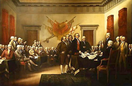
‘Shitty piece . . . It is very bad history’

‘It was Benjamin Franklin’s favorite typeface, and the first printings of the Declaration of Independence and the U.S. Constitution were set in Caslon.’
I am a history junkie.
And I loved the scene in HBO’s John Adams miniseries when Adams disputed the accuracy of the above painting (video, below). And how Ben Franklin’s approach to French diplomacy was more . . . ardent, than formal.
(I also loved how the miniseries used titled camera angles – like the United States was founded by villains from the old Batman tee vee series)
William Caslon’s fonts were the typefaces of the American Revolution.
Here’s some great reads on early American documents – as handy PDFs.
And here’s a link to John Adams on DVD.


