entries Tagged as [education]

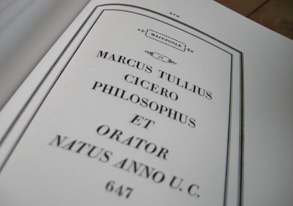
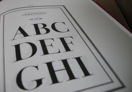
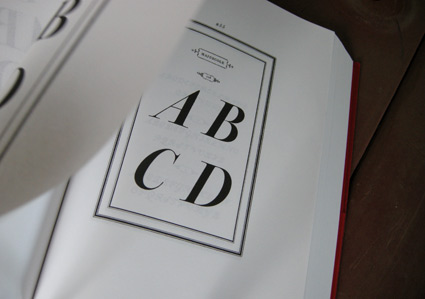
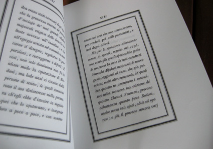
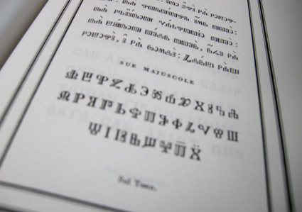
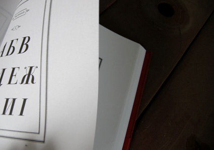
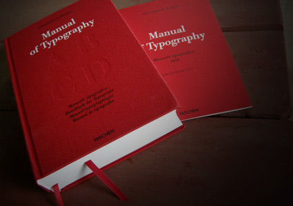
Bodoni’s Manuale Tipografico

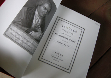
‘Published posthumously in a limited edition of 250, features 142 sets of roman and italic typefaces, a wide selection of borders, ornaments, symbols, and flowers, as well as Greek, Hebrew, Russian, Arabic, Phoenician, Armenian, Coptic and Tibetan alphabets.’

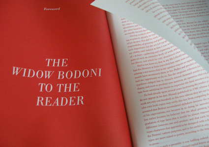
My birthday was last week and to my surprise, my wife got her hands on Taschen’s limited edition reprint of Giambattista Bodoni’s masterwork, his Manuale Tipografico (1818).

Bodoni had almost unlimited funding and resources at his disposal – so the details in his large body of types (he just kept going) is beyond what is seen in most revivals of his work. ITC Bodoni comes damn close, but a lot of Bodoni’s original designs end up on the cutting room floor.

My Jeanne types (named for my wife) have roots in Bodoni – and I used some digital resources to research his Manuale. But it is great to now actually have a print edition in my collection – cause I’m not done with tinkering.

The letter A

A look at the letter A. From Alan Fletcher’s The Art of Looking Sideways.

Brains on inspiration

‘Why you should know your shit’

Above, a look at how inspiration from multiple sources work better than tunnel vision. And design school tends to help with this.

Good design influences are everywhere. Ignoring it is like cutting off a limb. Or two.

Illustration by Jessica Hische. Click to view larger/jump.

Where do good ideas come from?

‘Chance favors the connected mind’

Steven Johnson pieces it all together. Interview here. Book here.

TED talk, above. Animate by Andrew Park/CognitiveMedia, below.

‘Changing Educational Paradigms’

‘This animate was adapted from a talk given at the RSA by Sir Ken Robinson, world-renowned education and creativity expert’

Another RSA Animate. Illustrated by Andrew Park.

Found via Robynne Raye

Cutting Bembo

Student Mike Thomas went back to basics with his work for my experimental type course.

As part of an 11-week study, Mike explored types created by the originator of italics, Francesco ‘Griffo’ da Bologna (1450-1518).

Mike’s work was produced using a stack of 20 year old, aged paper – and involved media ranging from paint to ink to digital.

His final project (above) was realized by cutting Griffo’s italic directly out of pieces of lead and creating a ‘soot proof’ of the carved letters. Not quite to spec, but challenging nonetheless.

John Bell in verse

I teach an experimental typography course at Ai Sacramento. And this past quarter, student Joyce Tabujara ventured into song.

For her final project, she wrote and preformed This Is To Mister Bell (above) – a tribute to typographer John Bell (1745-1831) and his types.

Below, a few of her studies.

Arthur Baker and my type classes

It started with the advice: ‘You have to go back to the broad edge pen. It’s all there.’

Brilliant calligrapher Arthur Baker gave me direction when I first set up my beginning typography course. And I’m still using the same approach today. [Read more →]

‘Let it dough!’

Christoph Niemann’s Let It Dough! Read all of it here.

Found via Marian Bantjes

State (צבירה)

‘Stop motion animation that spells out the word ‘Tzvira’ in Hebrew which means State (The physical property of matter)‏‏‏‏’

Melting ice typography created by Adam Barak – as part of a typography workshop instructed by experimental designer Oded Ezer.

Found via Odedadali

(RED) Penguin

‘Well known for its iconic cover designs over the years, to celebrate the partnership with (RED), Penguin’s design team has commissioned original artwork for each title, beautiful eye-catching designs that break from the conventional Penguin Classics black to red.’

Today is World AIDS day – help spread the message of an AIDS Free Generation by 2015 with the gift of great literature.

More info here.


Creative Commons License

the work at the mehallo blog. beta. is licensed under a creative commons attribution - noncommercial - no derivative works 3.0 united states license.  if reposting, credit must be given to steve mehallo - and if possible, please provide a link back to the mehallo blog. beta.

i include images for the purpose of critique, review, promotion and inspiration - and always make my best effort give credit/link back to the original source.  if i’ve screwed up, please fire me a note.

page layout based on the wordpress 'darkwater theme' by antbag, adapted and redesigned by mehallo.  valuable php assistance from bill mead.