entries Tagged as [education]

State of graphic design, 2012

‘As a student, live by these words, ‘Quantity rather than quality.’ The more you design the better your quality will become and you will continue to grow’ –Tony Montano

I like that quote.

Quality does come later. Being a designer becomes all about instinct – not having the best computer, not software, not measurements, not rules.

I’ve just started teaching another semester of Graphic Design History and Typography at American River College – have a whole new group of kids to introduce to my gospel of visuals.

One thought that’s been weaving its way thru my classes over the years is simply, ‘the more you do, the better you get.’ We’ve all heard this, and yeah, it’s true. The only real stumbling block is ‘the more you do, if you’re not paying attention, you probably won’t get better.’

This year the student work has been incredible – but only when tied to good, old fashioned Hard Work. Risk taking, going out on that edge, trying something one has never done before leads to fantastic creations.

I haven’t been blogging much – I also have my usual four type classes at Ai Sacramento and a rather large project that’s been taking up the rest of my time (more on that soooooon) – so something had to give. It was blogging.

I’ll be posting more as time permits; otherwise been immediately throwing finds up on my Twitter account.

I’m keeping busy. Hope you are too.

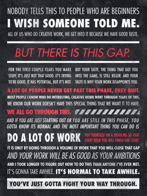
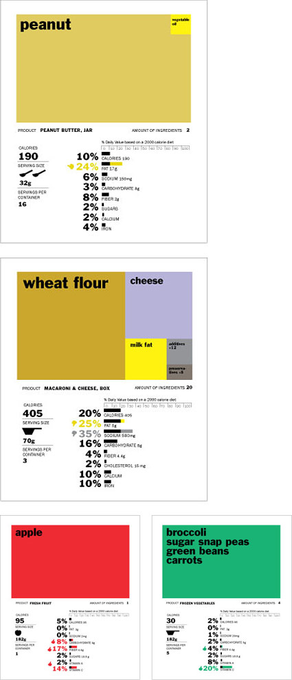
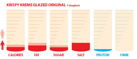
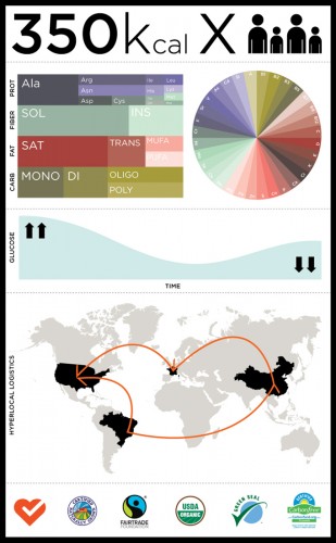
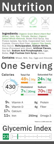
Infographic found via Ai Sacramento Graphic Design; click image to jump/view larger

Creative advice roundup

Here’s a roundup of advice graphics.

I’m always frustrated when beginning students give up prematurely, when there are those who see being ‘creative’ as either a job or something not important and/or not realizing the more a creative works at what they’re doing, the better they will get; collaboration is great, rules get in the way, others will never understand you and that’s okay, work should be fun (especially hard work), breaks are important and a zillion other things.

Click to view larger/jump.


Found via hyenabonz

How to piss off an introvert

Many creatives are introverts – some famous ones include J.K. Rowling, Eleanor Roosevelt, Clint Eastwood, David Letterman, Howard Stern, Steve Martin. The trick is most introverts are annoyed just enough by the banalities of everyday societal demands that one typically doesn’t want to get bogged down by the bullshit. Introverts have important thinking to do – typically, introverts are out to change the world in one way or another.

There’s a graphic that’s been bouncing around the interwebs (below) that doesn’t quite hit the mark. Shyness is something totally different.

Above, a list that nails it (and yes, the type is stretched. Typographers: Deal.) – it came from this cool post. And here’s an article with more detail (book available too).

When I’m in quiet mode, I’m busy. Then I come out and play when in a classroom or social situation. Even though the second part is a learned behavior, it is also quite fun and a great balance. Wouldn’t change it for anything.


Bullshit

Found via Lindsey, Jes

Accepting imperfection

‘Perfectionism is exhausting’

I’ve watched my students push themselves so hard to get an ‘A’ that they’ll overlook what it really takes to come up with creative work.

Here’s another take on the concept – by author Michael Nobbs, with a pitch for his book Sustainable Creativity.

‘A new way to think about creativity’

‘Creative people across all genres, it seems, have this reputation for being enormously mentally unstable  . . .  [and we’ve] accepted collectively the notion that creativity and suffering are somehow inherently linked’

Creativity = a horrible life? Anxieties, fear, alcohol – ?

In her TED Talk from 2009, Author Elizabeth Gilbert throws out some diversionary concepts to keep going – be undaunted.

Motivation


‘adapted from Dan Pink’s talk at the RSA’

What really motivates us to do the things we do? I’ve read studies like these over and over – it’s not quite money. And it’s not very simple either.

Found via Bill Mead

Alphabuild: Building alphabets

‘For our first release, Alphabuild for iOS, we wanted to pay tribute to the process of building letters (which is the other fun work we do here at our studio). We wish building letters for our clients was as zany and colorful as it is in Alphabuild. On the other hand, we’re glad we don’t have aliens, glue bottles and sawblades trying to mess up our letter drawings.’

Featuring types from the great Psy/Ops library (including my own Jeanne Moderno) as well as a few tikis (see below) – James Beall’s Alphabuild is a fun, quirky educational alphabet game for iPhone, iPad and iPod.

Snag it in the App store. Website here, Twitter here. And free goodies here.

Happy alphabuilding!

Homefront in color

‘Between 1939 and 1944, the OWI and the Farm Security Administration made thousands of photographs, approximately 1,600 of them in color’

Despite what my dad told me, the 1930s and 40s were actually in color.

More pics here, here, here and here.

‘The architect and the painter’

‘Watch the definitive documentary on the husband-wife design icons’

A new biography on Charles and Ray Eames is airing on PBS this week. Powerful and unflinching, more than just chairs. Playful optimism, powerful clients, amazing budgets, odd obsessions. Narrated by James Franco, titles feature the incredible Eames fonts.

Watch it online here.

Above, the IBM Pavilion at the 1964 Worlds Fair.

Below, Eames’ complete short film The Information Machine. Commissioned in 1958 by IBM, it was designed to get a fearful population to trust this perceived-dangerous, unknown mechanical variable: Computers!

Rethinking food labels

‘The rectangles on top of each label represent main ingredients, and bars on the bottom provide a quick thumbs or thumbs down for a breakdown of fat content, carbohydrates, etc. Icons of spoons and scoops are used to supplement serving size since no one knows what 182 grams looks or feels like.’

Above, Renee Walker’s food nutrition label redesign, winner of UC Berkeley School of Journalism’s Rethink the Food Label competition.

Her work was originally part of an interdisciplinary topic studio focused on contemporary health issues; she has her original versions posted here.

Below, a few of my favorites from the competition:


Corinne Pritchard


Fabius Leineweber


Bradley Mu

Found via FlowingData

Typography, iced

Final project from my beginning typography course at American River College: Futura Condensed Extra Bold, crafted as iced chocolate cake by student Lilie Matyuk.

Food-based type is always a tricky undertaking, but luckily we had Teresa Urkofsky teaching next door – in the culinary classroom. Teresa had recipes and techniques ready to advise.


Creative Commons License

the work at the mehallo blog. beta. is licensed under a creative commons attribution - noncommercial - no derivative works 3.0 united states license.  if reposting, credit must be given to steve mehallo - and if possible, please provide a link back to the mehallo blog. beta.

i include images for the purpose of critique, review, promotion and inspiration - and always make my best effort give credit/link back to the original source.  if i’ve screwed up, please fire me a note.

page layout based on the wordpress 'darkwater theme' by antbag, adapted and redesigned by mehallo.  valuable php assistance from bill mead.