Rethinking food labels
Posted on December 8th, 2011 by steve
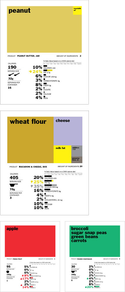
‘The rectangles on top of each label represent main ingredients, and bars on the bottom provide a quick thumbs or thumbs down for a breakdown of fat content, carbohydrates, etc. Icons of spoons and scoops are used to supplement serving size since no one knows what 182 grams looks or feels like.’
Above, Renee Walker’s food nutrition label redesign, winner of UC Berkeley School of Journalism’s Rethink the Food Label competition.
Her work was originally part of an interdisciplinary topic studio focused on contemporary health issues; she has her original versions posted here.
Below, a few of my favorites from the competition:
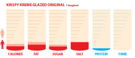
Corinne Pritchard
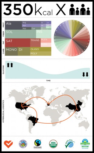
Fabius Leineweber
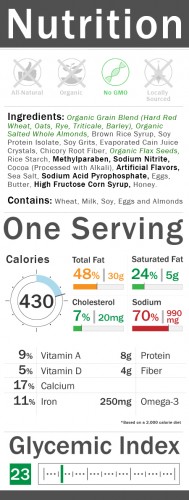
Bradley Mu
Found via FlowingData


