entries Tagged as [education]

US Interstate, London Underground Map

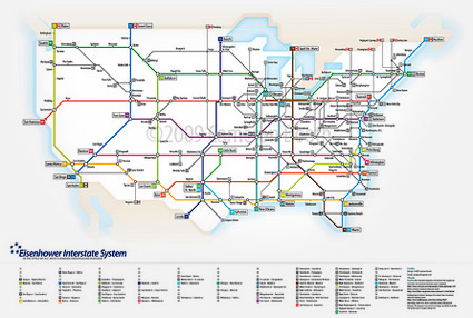
Here is the US Interstate highway system drawn in the style of H.C. Beck’s London Underground map.

More info (and links to other Interstate maps) here. Super large size here (Yahoo/Flickr account required to view).

Illustrated by Cameron Booth.

Found via Coudal Partners

Type history: Budapest

The upscale typography blog has a few beautiful Hungarian type images posted, via Budapesti Történeti Múzeum (Budapest History Museum). Details here.

NYC Spaghetti

Designed by UK-based design student Alex Creamer. Details here.

Found via Ashley Simko

Adopt an original Bodoni alphabet

The original type punches of Giabattista Bodoni (1740-1813) are in bad shape and the Friends of the Palatina Library and the Bodoni Museum are raising funds to restore the full set of over 600 alphabets.

Bodoni’s multiple alphabets contain some incredibly detailed wonders – with craft beyond many of the digital versions that exist today.

You can adopt part or a whole alphabet. For more info, go here.

McDonaldland

Stephen Von Worley maps McDonalds locations in the US. Looking at the Dakotas, there’s not as many as one would think. Details here.

GOOD is good. So is Scott and his team.

GOOD is for people who give a damn – read more below.

but first   . . .
OPEN studio’s Scott Stowell headed up the original design team for GOOD. And I have to write about Scott because he’s been a major influence on my work. Scott = GOOD influence.

I’ve been a fan of Scott’s work for years, ever since I saw a talk he gave at one of the 1990s ATypI conferences. His views/advice on design and teaching – for me – has been invaluable. [Read more →]

The power of a girl

‘Adolescent girls are uniquely capable of raising the standard of living in the developing world.’

Go to the girl effect website to find out how.

The Nike and NoVo Foundations are involved. And it’s a part of the UN Millennium Development Goals. Design by Wieden + Kennedy.

Found via Dr. Shelley Gruendler

The US has been nuked

If you’re having problems coping with unemployment in the US (who isn’t?), here’s some visuals. It’s huge. Bigger than you are. Interactive map here.

Change is about rethinking how we do things. I’ve been changing my whole outlook; what I do with my business – my blog is part of it. And following the status quo, doing the same thing over and over and over isn’t working. This map shows it.

Found via FlowingData

Design beyond decoration

Designers do more than just make things look pretty. Designers can play a role in the overall experience of a customer or audience. Often thru small design decisions.

These concepts are shown in this TED video (above) featuring Paul Bennett. And Bauer Bodoni. And a slightly tortured teddy bear.

What it’s really like to be a designer  . . . .


‘Check my framing. Apply Rule of Thirds  . . .’

Jeremy Davis takes it apart – before and after studies – as to what happens when one swallows the red pill and actually becomes a designer.

Visual politics

The Left and the Right in the US – as visualized by David McCandless and Stefanie Posavec. From the upcoming book, The Visual Miscellaneum.

Click on the image for larger view/jump. More stuff from David McCandless here. And check out Stefanie Posavec’s site here.


Creative Commons License

the work at the mehallo blog. beta. is licensed under a creative commons attribution - noncommercial - no derivative works 3.0 united states license.  if reposting, credit must be given to steve mehallo - and if possible, please provide a link back to the mehallo blog. beta.

i include images for the purpose of critique, review, promotion and inspiration - and always make my best effort give credit/link back to the original source.  if i’ve screwed up, please fire me a note.

page layout based on the wordpress 'darkwater theme' by antbag, adapted and redesigned by mehallo.  valuable php assistance from bill mead.