Twombly’s ‘Sexy font’
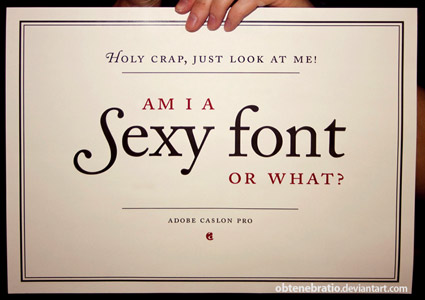
‘I’m a Sexy Font’ poster, created by Obtenebratio
Back in the early 1990s, the Carol Twombly-drawn Adobe Caslon was one of the first font packages I ever purchased.
I’ve been in love with it ever since. I use it on just about everything – including this blog’s title, my own logotype. I’m a font designer myself, but still don’t consider my own letterforms to even come close to what was accomplished with this particular interpretation of Caslon.
‘Twombly worked primarily from a 1924 specimen from the Caslon foundry, although she referred also to specimens from 1738 and 1768’ -Serif: The Magazine of Type & Typography, Fall 1995
the maker
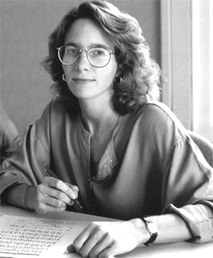
Carol Twombly (above, photo from this book) was an incredible type designer. Retired from the type world, she lives nearby in Grass Valley. I’d say I’ve learned to draw letter forms myself by taking apart her lettering. There’s some incredible decisions in her outlines.
Years ago I was lucky enough to find an Australian design magazine that printed her roughs and sketches for Adobe Caslon. I devoured these with glee.
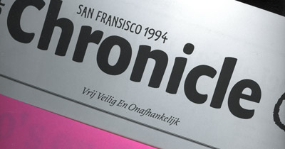
‘Desktop-published’ daily paper, from ATypi 1994
94
I met Twombly in 1994 at the ATypI Conference in San Francisco.
She was a bit shy, but I was . . . in awe and simply had to say hi. We had a short talk, and she did make a point to mention that there are people behind every typeface that appears on the font menu; a concept I pass on to my students.
And she was shocked that the Australian magazine I had found was available in America (Thanks to the obscure things that were carried by now-defunct retail version of Tower Books). Said she gave the interview to them because she was hoping no one in the US would see it.
She had also just won the Prix Charles Peignot. Then did a few more fonts and left the business.
There’s been some conjecture on why she left, but what we have today is an incredible legacy of typefaces. To use and abuse.
others
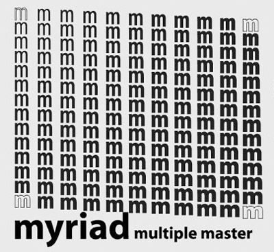
Twombly was also co-designer of the incredible Myriad – now used to make Apple look cool.
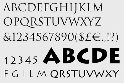
Trajan and Lithos
The most accurate version of Trajan is her’s as well, as is the Greek-inspired Lithos – with which the 1990s never would have existed.
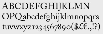
Adobe Caslon Pro
still goin
Adobe Caslon – now expanded as a Pro font – is now commonplace on many computer systems and is a great drawing that simply can’t be beat. For me, it’s part of a journey into typography that’s inspired me all these years. Good type that holds up well.
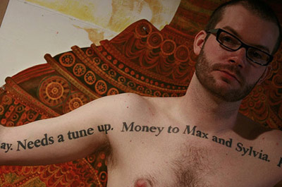
Adobe Caslon Bold as tattoo – details here


[…] This post was mentioned on Twitter by steve mehallo, Mike Krieger. Mike Krieger said: Great writeup about Caslon, one sexy font: http://j.mp/c3Wxt8 […]
Garmin 1490t GPS…
[…]while the sites we link to below are completely unrelated to ours, we think they are worth a read, so have a look[…]…
1.) What do you think…
2.) […]it would be cool if you took a look at this site. It has some good information on it[……]…
Hello there! I am working on a typography project on Carol Twombly right now, and i’m wondering if you know the title and issue of that Australian Magazine with her sketches? It would be a great help for me and my project!
Thanks in advance!
Megan
meganpowell.k [at] gmail.com