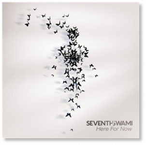
entries Tagged as []

SeventhSwami

This past Sunday night there was an incredible TypeCon party at at the International Printing Museum in Carson, California – I’ll have photos in a later post.

And in the background of the tinkering of machinery (and grilling of some incredible, Southern California tacos) was the music of longtime friend, DJ (and graphic designer) SeventhSwami.

Download some of Swami’s free mixes here.

Blog here. Debut album (pictured above) also available.


SeventhSwami: Praise and War Ship

‘hy’ ligature

New type concept: The ‘hy’ typographic ligature. Developed by former student Holly Rabayda-Wickland.

New Arabic

Some modern examples of Arabic. More here.

Found via designnewz

Pepsi and the Font Me mug

My type mug goes well with the real Pepsi that’s back in stores this month.

Get the mug here.

Recueil d’Alphabets à Dessiner

Pages from Recueil d’Alphabets à Dessiner by René Henry Munsch (1951).

More here.

Found via Biggest Apple

ABCDEFGHIJKLMNOP

‘A video of two people drawing the alphabet.’

Drop cap(puccino)

‘Hand sprinkled cinnamon’

Snapshot by student Rikki Morehouse. She went thru several cups of coffee til she got them serifs right.

(Hedline written by former student Devon Cloutier)

Butterbeer!

Butterbeer: A heavy, butterscotch soda. Can be made with alcohol too. Here’s a basic recipe.

And here’s some alternates.

Photos via fuckyeahemmawatson; Food Network

Beyond Burberry

‘An ode to Lady and the Tramp’ -Emma Watson

Video for One Night Only’s Say You Don’t Want It. Featuring (now) former Burberry model, Emma Watson and her bf. Album drops in the US September 7, 2010.

Vuitton Persona

‘Vuitton Persona is an all-capital two-color custom font designed by Jean François Porchez for Louis Vuitton Malletier. Hand-painted stripes and monograms are part of the Vuitton heritage, and it was natural to apply this to new technologies.’

Exclusive typeface. Custom monograms. Details here. Official website here.

Georgia, expanded


A few fonts from the new Georgia Pro type family

Matthew Carter’s Georgia is among my favorite fonts. And recently, Georgia turned into something a bit  . . .  more.

I love that Georgia exists, or the interwebs would be Times forever (well, until WOFF kicks in) – and without Georgia, the argument that sans fonts online are more legible (which I think is hooey) sort of wins.

And if you’re reading my blog directly online (without using RSS), you’re reading Georgia. It does what I like it to do. Reads well. [Read more →]


Creative Commons License

the work at the mehallo blog. beta. is licensed under a creative commons attribution - noncommercial - no derivative works 3.0 united states license.  if reposting, credit must be given to steve mehallo - and if possible, please provide a link back to the mehallo blog. beta.

i include images for the purpose of critique, review, promotion and inspiration - and always make my best effort give credit/link back to the original source.  if i’ve screwed up, please fire me a note.

page layout based on the wordpress 'darkwater theme' by antbag, adapted and redesigned by mehallo.  valuable php assistance from bill mead.