Spoon
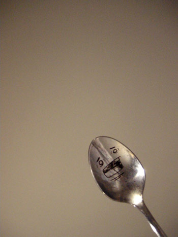
This spoon has been sitting in a classroom at the Art Institute. For weeks. Not bothering anyone.
This spoon has been sitting in a classroom at the Art Institute. For weeks. Not bothering anyone.
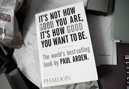
‘Just as Sun Tzu’s Art of War is read as a lesson in business strategy rather than fighting in a miliary sense, or Machiavelli’s The Prince is written about government but used as a guide to management, so this book uses the creative processes of good advertising as a metaphor for business practice.’ -inside cover
In It’s Not How Good You Are . . . UK-based advertising guru Paul Arden (1940-2008) does a great job reframing how one can approach creativity, their career and life – by not playing by the rules and reinventing convention. [Read more →]
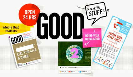
GOOD is for people who give a damn – read more below.
but first . . .
OPEN studio’s Scott Stowell headed up the original design team for GOOD. And I have to write about Scott because he’s been a major influence on my work. Scott = GOOD influence.
I’ve been a fan of Scott’s work for years, ever since I saw a talk he gave at one of the 1990s ATypI conferences. His views/advice on design and teaching – for me – has been invaluable. [Read more →]
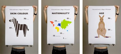
‘This is a self-initiated project based on the scenario – If the world were a village of 100 people . . . I designed a set of 20 posters, which contain most of the information.’ -Toby Ng
The images are telling. View them at Toby Ng’s website.
Statistics need visuals or they’re often perceived as just numbers. For those who don’t think visually, it’s hard to connect numbers to people.
I had a conversation about this recently regarding a group project for a research class I’m taking (hi Luci!). We were analyzing a research study and the right charting system would have really driven some very important points home.
Maybe enough to get the study accepted. Maybe get the right person to implement its findings. Maybe.
Found via Joe Rucker Design News
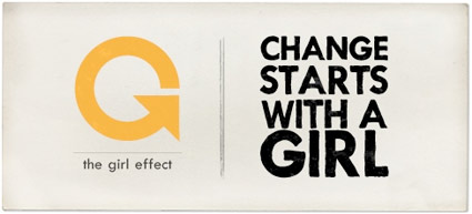
‘Adolescent girls are uniquely capable of raising the standard of living in the developing world.’
Go to the girl effect website to find out how.
The Nike and NoVo Foundations are involved. And it’s a part of the UN Millennium Development Goals. Design by Wieden + Kennedy.
Found via Dr. Shelley Gruendler
Compassion is not just ‘feeling sorry for someone.’
Today, religion is lost.
The need to be ‘right’ is counterproductive.
Great video.
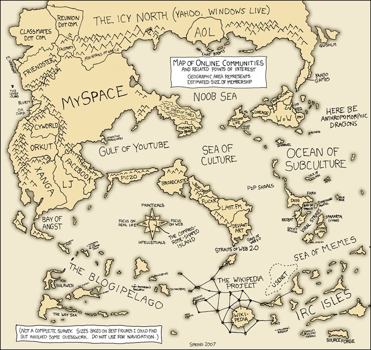
‘Do not use for navigation’
The world is smaller thanks to online communities. Click on the map for larger view/jump.
Note: There’ve been quite a few changes since 2007 (when this map was drawn). Facebook has sort of conquered a big chunk of the land once occupied by MySpace – then Twitter kinda built this huge bridge that one can see from space . . . .
Found via Web Design Ledger
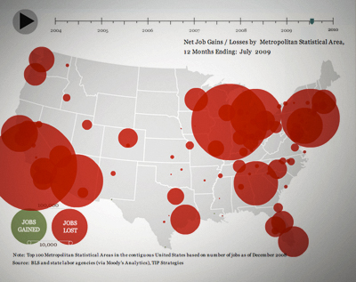
If you’re having problems coping with unemployment in the US (who isn’t?), here’s some visuals. It’s huge. Bigger than you are. Interactive map here.
Change is about rethinking how we do things. I’ve been changing my whole outlook; what I do with my business – my blog is part of it. And following the status quo, doing the same thing over and over and over isn’t working. This map shows it.
Found via FlowingData
We’re still talking about ‘change’ right? It was a huge word last year.
Design thinking can change the world.
But design thinking is much more than ‘aesthetics, image and fashion.’ More than just a means to encourage passive consumption – which for a long time has been the basis for our (now shattered) economy.
Talk (above) by Tim Brown of IDEO. Where design should be headed.


the work at the mehallo blog. beta. is licensed under a creative commons attribution - noncommercial - no derivative works 3.0 united states license. if reposting, credit must be given to steve mehallo - and if possible, please provide a link back to the mehallo blog. beta.
i include images for the purpose of critique, review, promotion and inspiration - and always make my best effort give credit/link back to the original source. if i’ve screwed up, please fire me a note.
page layout based on the wordpress 'darkwater theme' by antbag, adapted and redesigned by mehallo. valuable php assistance from bill mead.