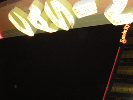
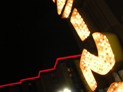
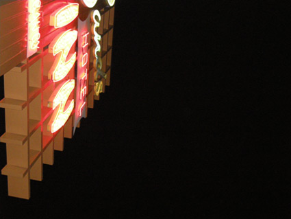
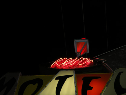
entries Tagged as [typography]

Googie primer


Lyon’s Coffee Shop, San Bruno, CA 1962. Found via Googie Art.

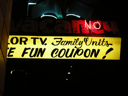
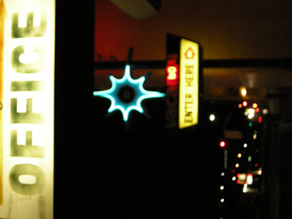
I grew up around Googie Architecture. It was just there. Space age-looking buildings, funky decor and rocks in the walls. Lots of rocks. Flintstones-like, but where the Jetson’s were running the quarry.

The 24 hour Lyon’s in San Bruno (see above) was the high school hangout. Long weird nights. In college, those weird nights spread to the other Lyon’s in San Mateo, San Carlos and Daly City. Denny’s was the alternative.

The style’s roots can be traced back to Frank Lloyd Wright and Tallesin West. Architect John Lautner designed the first Googie structure in 1949 and it was panned by critics. The firm of Armet and Davis designed most of the rest. [Read more →]

Lights and type of Reno

Snapped these while in Reno a few weeks back. Love 1950s vernacular typography, I’ve built an entire font family around this.

Drove the guy at the motel front desk crazy with my flash.

A really nice drug dealer tried to sell me his wares.

I’m not being sarcastic, he was really, really nice.

Took me a long moment before I realized what he was up to.

Baby, baby, baby

Baby Baby Baby, Make The Girl Dance, shot in Paris

 
It’s the type that’s sexy.

If it were one of my fonts, that’d made it even sexier.

Make The Girl Dance is Campana & Perrin, aka Greg & Pierre. This is their MySpace page.

Found via Ashley Simko’s blog

Organon: New font superset by Nick Cooke


Organon Sans Family


Organon Serif Family

Robust and playful, Organon is Nick Cook’s new superset type family – now available thru Fontworks UK. Click on the links above to order. Detailed release notes can be also be found in this post at Typophile.

As for the moniker, Nick says, ‘I got the name from the first line of ‘Cloudbusting’ by Kate Bush.’

Found via Twitter.com/typegirl

How type families work

Here’s a great article at Typotheque on fonts who hang out in families. Where they come from, why they get along better than real families.

Hm. SacBee uses SacUnion’s fonts  . . . .

The Sacramento Bee redesign, as posted on Font Bureau’s Facebook page. Fonts used include Benton Sans, Miller, Miller Daily and Miller Headline

A few years back, I was the art director for a reincarnation of The Sacramento Bee’s long time rival, The Sacramento Union.

In this version, The Union was reimagined as a magazine. We did just a handful of issues, the design concept was: ‘newspaper in magazine’ format  . . . [Read more →]

Coming soon: Typophile Film Fest 5

Typophile Film Fest 5 Trailer from Typophile on Vimeo

Preview for Punchcut’s 5th Typophile Film Fest. Typographic films, shorts and more. Here’s a list of who’s showing.

The Fest is confirmed for Typ09, the 2009 ATypI conference in Mexico City, October 29th. And coming to other places too.

TETRO and typography

Watch this beautiful title sequence for Francis Ford Coppola’s TETRO. Designed by SFAUSTINA. Both avant garde and not at the same time.

And  . . .  I’ve always wondered why so many motion picture title sequences end with a shot of a bus.

Found via Twitter.com/Typegirl

Eric Gill: The wine

Wine label inspired by the work (and life) of font designer Eric Gill (1882-1940). Student-designed project.

The art of setting type

‘Graphic designers were never meant to set type  . . .  That’s what typesetters are for.’

I’m not even sure who said this, it was early on; probably college. Possibly a printer, maybe Roger. Roger would say stuff like that. He’d swear to the ‘ITC god’ and he had the old dusty Varitype machine sitting in the corner to prove it. [Read more →]

Armin Hofmann’s Graphic Design Bible

Like Helvetica? Like the Swiss International Style?

Armin Hofmann’s Graphic Design Manual (1965) is what I learned out of – and if it weren’t out of print, I’d be using it in my basics classes. (right now, I have a few slides made from my dog eared edition as part of a form lecture)

Graphic Design Manual breaks composition into basics: dot, line, confrontation, plus letters and signs. And it shows by example how these basics can be applied to good, clean graphic design: form, composition, typography.

I’ve seen it going for upwards of 90 bucks in some listings. As I write this, there are 22 used available at Amazon starting at $4.10.


Creative Commons License

the work at the mehallo blog. beta. is licensed under a creative commons attribution - noncommercial - no derivative works 3.0 united states license.  if reposting, credit must be given to steve mehallo - and if possible, please provide a link back to the mehallo blog. beta.

i include images for the purpose of critique, review, promotion and inspiration - and always make my best effort give credit/link back to the original source.  if i’ve screwed up, please fire me a note.

page layout based on the wordpress 'darkwater theme' by antbag, adapted and redesigned by mehallo.  valuable php assistance from bill mead.