entries Tagged as [typography]

Fonts: The Secret History

Behind every well-made font is, typically, an obsessive individual who is out to make the world a beautiful place. And individuals, human beings, can be rather screwy. And here’s a book (now in paperback) about all the screwiness.

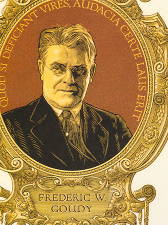
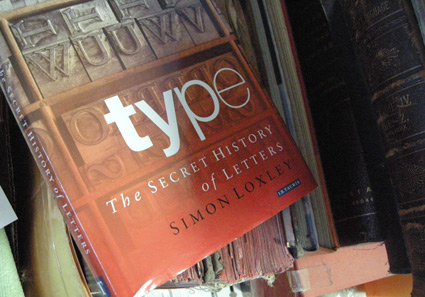
Simon Loxley’s Type: The Secret History of Letters blows the lid off of William Caslon’s wicked right cross; Stanley Morison and the Wardes; Frederic Goudy’s tarnished shining star, M.F.Benton’s ulcers and what really happened with John Baskerville’s dead body. And Eric Gill, religious sex junkie. Don’t even know where to start with that.

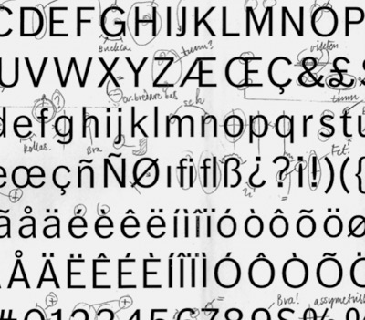
If you don’t think type is anything more than what’s on the font menu, stay away from this book. Because it’ll drag you into a world of intrigue, ego and dalliances with God and dog.

(Okay, that was a good sentence, but truth be told, the dog stuff isn’t in this book. You’ll need other sources for that)

A font primer: Comic Sans walks into a pub  . . .

Writer Ian Peacock looks at the ‘hidden power of typography

Via the Times of London

Plus, here’s that wonderful Typographics video that’s been bouncing around, produced by Boca and Ryan Uhrich  . . .

The Great Times New Roman Controversy


Photo composition by mehallo for Agfa Monotype, 2000

seeds
Mike Parker’s been in the news lately, mostly about the origins of Times New Roman. [Read more →]

The changing ‘faces’ of the web

Typography on the web is about to change dramatically. Several entities are involved. I have a bunch of my fonts about to launch with Typekit.

And here’s a really good rundown by Elliot Jay Stocks, posted on the i love typography blog.

Keeping calm, carrying on

Designer Steven Shearer’s update of the iconic British Keep Calm and Carry On poster – typeset in one of my fonts, Jeanne Moderno. Available now on some nifty Cafe Press items.

Sort of reminds me of the revisionary 1930s British history portrayed in this version of Shakespeare’s Richard III (1995).

It’s okay, it’s alright, don’t worry


Released just a few days ago: Jackson Cavanaugh’s Alright Sans

Alright Sans is a really nice contemporary update of early 20th century grotesk types. With roots related to the wonderful ATF gothics (which exist today in the form of the Knockout group and Benton Sans), but with a humanist twist. Sixteen styles designed by Jackson Cavanaugh, it can be found at MyFonts here. And it’s on sale right now: 20% off.

Follow Jackson on Twitter here. Visit his foundry, Okay Type & Design here.

Found via Twitter.com/Typegirl

Örjan Nordling’s Dagny, now at FontShop

All about FF Dagny: Evolution of a newspaper type font, interview and post at GarciaMedia.

FF Dagny is now available thru FontShop.

Design exhibitions at the San Francisco Public Library


Calligraphy by Marsha Brady, found via the MyFonts Blog


Kalligraphia 12,
an exhibition of hand-lettered art and calligraphy

Runs thru August 23, 2009


A Trip to the Fair, 1939:
The Golden Gate International Exposition in San Francisco

Runs thru August 23, 2009

Both are the main branch of the San Francisco Public Library, 100 Larkin Street (at Grove), sixth floor, San Francisco, CA 94102 [map]

Details here.

John Downer exhibition in El Lay


John Downer doing his thing, via The FontFeed

An Exhibition of Hand Lettered Posters by John Downer
Opening Reception Thursday, August 13, 2009 from 8 to 11 p.m.

At RESERVE, 420 N. Fairfax Avenue, Los Angeles, CA 90036
(directly across from Canter’s Delicatessen) [map]

Details here.

Frederic W. Goudy: new site launches, new releases


F.W.G. portrait by Clarence P. Hornung
from Leslie Cabarga’s Logo, Font & Lettering Bible

Frederic W. Goudy (1865–1947) was considered one of the most prolific type designers of the early 20th Century. Not to be confused with Antonio Gaudi, F.W.G. is mostly known for Copperplate and Goudy Oldstyle that show up on most font menus. But that’s just the beginning.


Goudy’s ‘quick sketch’ drawings for Kennerley Italic
from D.J.R. Bruckner’s Frederic Goudy

Goudy was self taught. And his font career really didn’t take off until he was in his 40s. Legend goes, Goudy could draw a font in about a week. [Read more →]

‘I am type’ – Frederic W. Goudy

‘Of my earliest ancestry neither history nor relics remain  . . . .


Via Typoretum


Creative Commons License

the work at the mehallo blog. beta. is licensed under a creative commons attribution - noncommercial - no derivative works 3.0 united states license.  if reposting, credit must be given to steve mehallo - and if possible, please provide a link back to the mehallo blog. beta.

i include images for the purpose of critique, review, promotion and inspiration - and always make my best effort give credit/link back to the original source.  if i’ve screwed up, please fire me a note.

page layout based on the wordpress 'darkwater theme' by antbag, adapted and redesigned by mehallo.  valuable php assistance from bill mead.