Armin Hofmann’s Graphic Design Bible
Like Helvetica? Like the Swiss International Style?
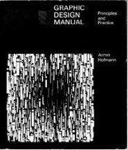
Armin Hofmann’s Graphic Design Manual (1965) is what I learned out of – and if it weren’t out of print, I’d be using it in my basics classes. (right now, I have a few slides made from my dog eared edition as part of a form lecture)
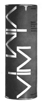
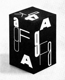
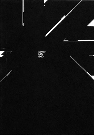
Graphic Design Manual breaks composition into basics: dot, line, confrontation, plus letters and signs. And it shows by example how these basics can be applied to good, clean graphic design: form, composition, typography.
I’ve seen it going for upwards of 90 bucks in some listings. As I write this, there are 22 used available at Amazon starting at $4.10.


[…] This post was mentioned on Twitter by Jared Thompson. Jared Thompson said: RT @mehallo: Just seeing who's online today: I'm giving away a free font this week ($32 value). Details here: http://mehallo.com/blog/ar … […]
good article…
Hello there, just became aware of your blog through Google, and found that it’s truly informative. I am going to watch out for brussels. I will appreciate if you continue this in future. Numerous people will be benefited from your writing. Cheers!…