entries Tagged as [typography]

Good grade: d++

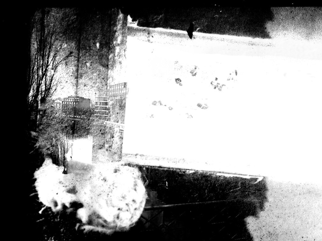
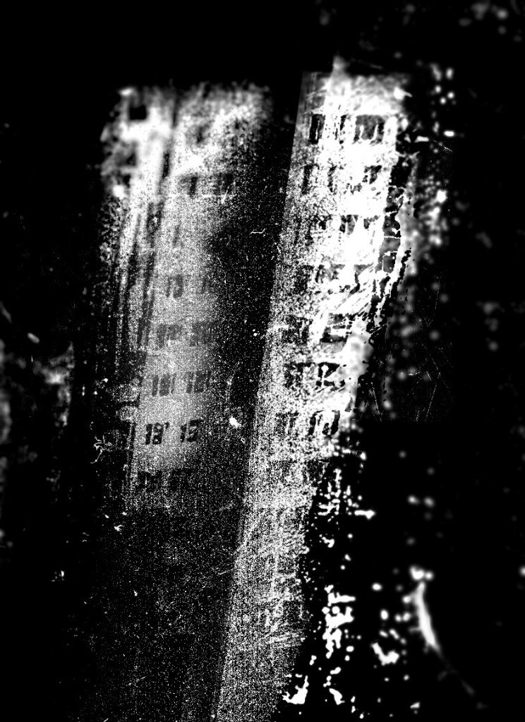
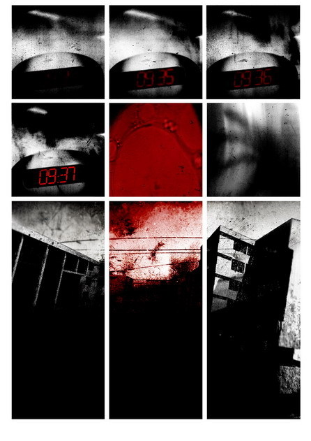
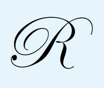
Marko Davidovic is an artist and graphic designer out of Belgrade. I love the expressive freedom in his art – it just totally syncs with me – in each medium he works, his energy explodes.

He’s always posting something interesting on my MySpace page – ‘just fooling around,’ is his MySpace approach. His work, however – calligraphic, canvas, photographic, illustrative, digital – is something else.

He goes under the tag of d++. Find him on MySpace here.
 

Musicians and the letter R

Above: Remi Nicole tweets ‘Rrrrrrr’
Remi Nicole on MySpace.

Below: Lisa of The Veronicas tweets, ‘My favorite letter of the alphabet… ;)’
The Veronicas on MySpace.

NYT: Turkish edition


Advertisement for the launch of the Turkish Edition of the New York Times, created by Istanbul-based studio Imago New Media

More typographic details via The Font Feed here.

Typembrya


Typembrya by Oded Ezer on Vimeo

Typembrya is a personal homage to Herb Lubalin’s famous Mother & Child logo (seen below). This is the third experimental project in the ‘Biotypography’ series by Israel-based designer Oded Ezer. For more info, please visit his site here.

Liquid logo

From Tokyo: Click on the image to watch video/jump.

Found via Twitter.com/rockstaronline

Typophile Film Festival 5


Typophile Film Festival 5 Opening Titles from Brent Barson on Vimeo

‘The Typophile Film Fest 5 is a one hour selection of typographic films hailing from all over the world including Argentina, The Netherlands, Russia and the United States. The films vary in subject matter and style; creating a dynamic presentation of motion design, typographic animation, short stories, documentaries and interviews.’

More info here.

Eggs and sausage with a side of type  . . .


Tom Waits’ Eggs and Sausage animated by Jackie Lay on Vimeo

Found via Drawn

Chill


Vintage Original Joe’s ashtray, photo by mehallo

Kick back, have a Martini at Joe’s.

get the playlist or watch video or create your own at mixpod.com
please support the musicians on my player by legally purchasing their music

Jeanne Moderno detergent

I was told when I released my Jeanne Moderno fonts, they’d probably end up being used on a cereal box.

Instead, I’ll settle for this cool laundry detergent box designed by Bootleg.

Jeanne Moderno type samples

. . .  And when MyFonts did a write up of my Jeanne Moderno fonts for their Rising Stars newsletter – they spent some time digging thru so they could show some of my telescoping ascenders, alternates and ligatures (above). I like to hide things in my fonts, fill the blank slots as it were.

(Below) Psy/Ops new type sample for Jeanne Moderno. Psy/Ops also carries the Jeanne fonts, they did the final OpenType mastering before release (and without their support, Jeanne could possibly still be sitting in the 10 year limbo that was part of my process).

Making a type sample


The Making of a Type Sample from FontShop on Vimeo

Once a font is completed, showing the letters and glyphs in their best light is a tricky exercise. FontShop does it right and in this video shows some of the decisions made when creating a good type sample – in this case, the sample for Matthew Carter’s beautiful Miller typefaces, which I used for The Sacramento Union Magazine.

In the 1800s, type foundries used to set their samples in Latin – following the belief that our alphabet looks best in its original language. Marcus Tullius Cicero’s first speech against Lucius Sergius Catilina (below) was popular for samples.

Today, graphic designers use Lorem Ipsum for placeholder text.


Robert Thorne’s Fat-Face type sample, 1821


Creative Commons License

the work at the mehallo blog. beta. is licensed under a creative commons attribution - noncommercial - no derivative works 3.0 united states license.  if reposting, credit must be given to steve mehallo - and if possible, please provide a link back to the mehallo blog. beta.

i include images for the purpose of critique, review, promotion and inspiration - and always make my best effort give credit/link back to the original source.  if i’ve screwed up, please fire me a note.

page layout based on the wordpress 'darkwater theme' by antbag, adapted and redesigned by mehallo.  valuable php assistance from bill mead.