entries Tagged as [typography]

Hangul at the Design Museum

Claudia Pungaru, one of my students, turned me on to the work of Dr. Hyunju Lee. Lee’s work is typographic and she uses the Korean script Hangul as a starting point for expressive interpretations – about Korean life and culture.

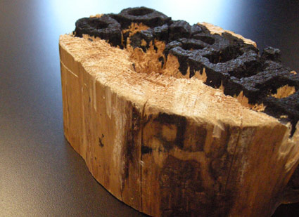
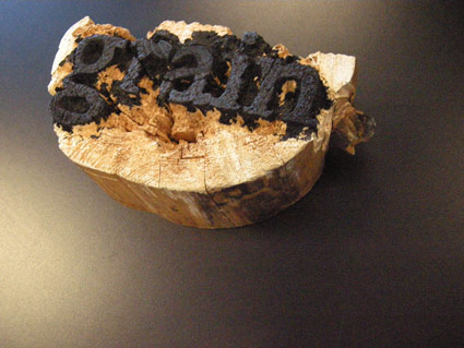
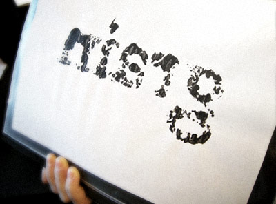
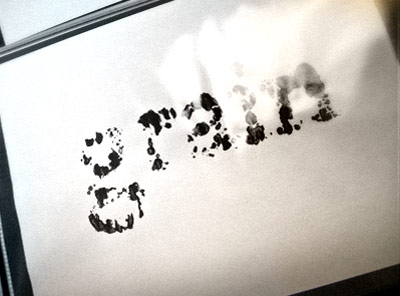
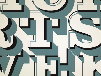
Ongoing right now is Typographic Exploration in Hangul: An Exhibition of work by Hyunju Lee and Phil Choo (work pictured above) at the UC Davis Design Museum. In the show, letters evoke emotions – all tied to the tradition and sounds of the Hangul writing system.

For more information about the show, go here. The Design Museum’s site is here.

The museum is open limited hours Monday thru Friday, and on Sunday afternoons. Show ends December 6, 2009.

Image found via design in society

‘It’s time to be bold’

The work of Poland-based designer/illustrator Martin Plonka.

Found via Typography Daily

Wood type

Experimental final project from my beginning typography course. Carved by student Rikki Morehouse.


First print  . . .


Offset print made from first print

Alta California: Named after a newspaper


Alta California office, San Francisco 1851; found via Flickr

At one point in my life, I was going to be a journalist. So folly along  . . . .

I love history, so every one of my fonts falls into some historical category (or categories, if you look at Jeanne Moderno).

Alta California is my artist’s response to Susan Kare’s early Macintosh font, San Francisco. And it was a tricky build, as I was literally going thru book after book after book of old types – then messing them up, then messing them up more; and redrawing the edges until I had what I wanted.

(Please note, when it comes to ‘grunge typography’ – I don’t trust anything automatic; I’ve always gone in and tweaked the edges until I have something that looks – printed. Printed poorly, but printed.) [Read more →]

Typeface: A Documentary

‘Charting the intersection of Rural America and Contemporary Graphic Design’

The film about the Hamilton Woodtype Museum is making the rounds.

Official site here. Pictured: promo prints for the documentary.

Found via “JE NE SUIS QU’UNE PAUVRE PLUME…”

Slab serif ‘Egyptian’ types: A history

Here’s a detailed history over at Hoefler & Frere-Jones on slab serif typefaces; showcasing their new Clarendon-based Sentinel fonts.

The Clarendon types: A history

The Know your type series at idsgn continues with an overview of Oxford-bred, 19th Century wonder Clarendon.

Parkinson’s Sutro fonts


ADAC 38th season promotional material

It’s not often one gets to meet one of their heroes.

When I was in high school, a bunch of kids thought it would be funny to sign me up for every magazine subscription they could find – by sending in a large pile of subscription cards. My parents were not amused; but it was Rolling Stone that I kept. I fell in love with the hand-inked masthead – and decided that that was what I wanted to do.

Hand-ink mastheads.

Not a big field. And who knew people actually did this? I wanted to do it, and early attempts (for my high school paper) netted not so wonderful results. Who knew that someday I’d actually be drawing fonts as a consequence.


Rolling Stone masthead by Jim Parkinson

Around five years ago, I finally met the guy behind the logotype – lettering artist Jim Parkinson. And the conversations have been great – as long as I don’t actually call him hero, he’s cool. And (who knew?) we both like fresh anchovies. Which I’ve found can gross out anyone who is eating near us.

using jim’s fonts
I used Jim Parkinson’s Sutro fonts on promotional materials for the 38th season of the Sacramento Art Directors and Artists Club. I was the newly appointed president, so I was determined to use fonts from the best of the best and (of course) Jim was on my list. [Read more →]

Futurism by the bay

‘Futurism was an international art movement founded in Italy in 1909. It was (and is) a refreshing contrast to the weepy sentimentalism of Romanticism. The Futurists loved speed, noise, machines, pollution, and cities; they embraced the exciting new world that was then upon them rather than hypocritically enjoying the modern world’s comforts while loudly denouncing the forces that made them possible. Fearing and attacking technology has become almost second nature to many people today; the Futurist manifestos show us an alternative philosophy. Too bad they were all Fascists.’ -Kim Scarborough’s Guide to Futurism


Parole in Libertà book cover (1932), found via laura@popdesign

This year is the 100th anniversary of F. T. Marinetti’s Manifesto of Futurism (1909) – and San Francisco has celebrations planned October 14th thru 18th. [Read more →]

Blackbird

‘Just be nice to people. Not because you think it will get you into heaven. Just because it’s right.’ -Natasha Newton, Blackbird Sings

This is one of my favorite quotes. It was posted under ‘Religious Views’ on the Facebook page for UK-based visual artist Natasha Newton. And if one could have the title of ‘social networking ambassador,’ it should go this particular blackbird.

myspace came first
I didn’t trust MySpace. I’d heard about the freaks, the stalkers, the time wasted. But it was Natasha’s simple page that said to me, MySpace isn’t as stupid as it seems to be. She was the first one I followed out to Twitter. Because she does it right. [Read more →]

Seeing stars!

Award-winning magazine designer Jason Malmberg made me a logo.

He said, ‘It’s not quite what I envisioned. I’m still trying to find a way to give a lens flare TO a lens flare.’

If you don’t see the humor, you’re reading the wrong blog.

To see Jason’s real work, check out Sactown magazine, one of the best city/metropolitan magazines in the country. (So good, even local competitor Sacramento Magazine has reformatted to be a bit more like Sactown. I always see that as a nice compliment.)

But if you want the real deal, the October/November 2009 Sactown (above) just dropped. It should be showing up on select newsstands just about now (Sactown is distributed nationally). Or subscribe here.


Creative Commons License

the work at the mehallo blog. beta. is licensed under a creative commons attribution - noncommercial - no derivative works 3.0 united states license.  if reposting, credit must be given to steve mehallo - and if possible, please provide a link back to the mehallo blog. beta.

i include images for the purpose of critique, review, promotion and inspiration - and always make my best effort give credit/link back to the original source.  if i’ve screwed up, please fire me a note.

page layout based on the wordpress 'darkwater theme' by antbag, adapted and redesigned by mehallo.  valuable php assistance from bill mead.