entries Tagged as [typography]

Type face

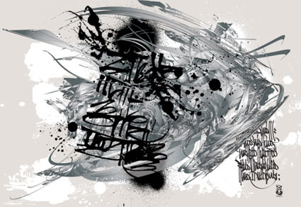
Illustration for Computer Arts Magazine article about typography
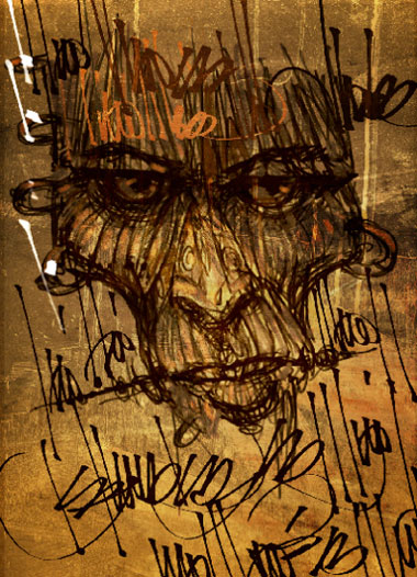
The work of Austrialian designer Christopher Haines.


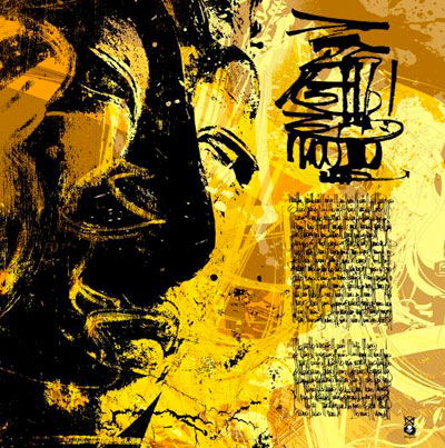
Cover illustration for Computer Arts Magazine
Fountain presents: Heroine fonts
Eleisha Pechey’s Windsor typeface (1905) is one of my funky favorites. There’s a hint of it in Jeanne Moderno (believe it or not; even moreso in my upcoming text versions), Woody Allen loves it for titles and Sacramento’s Golden 1 Credit Union uses it for a distinct yellow logo.
Today, Fountain Type releases Göran Söderström’s Heroine, a ‘modern interpretation of this rusty pearl is something that always have been missing in the major type libraries.’
More details here.
Baskerville: The Animated Movie
John Baskerville (1706-1775) was an incredible type designer. His work holds up very well today. He reinvented printing and his ink was beyond compare. And, unfortunately, he was hated by his contemporaries. His type was seen to ‘hurt the eye’ and would be ‘responsible for blinding the nation.’
‘Baskerville the Animated Movie celebrates John Baskerville, the man, the typeface and his future legacy.’
For more about this short film, drop by The Baskerville Project website.
For more detail about John Baskerville and other famous type luminaries, snag a copy of Type: The Secret History of Letters and start reading.
It’s not all about fonts

Shirley-Ann Dick’s There’s more to life than Helvetica tee
Designed in under 10 minutes.
Found via Whitezine


Type mistakes you may be making

Fonts can’t handle being stretched, they end up looking awkward/slows down reading
Fonts require a lot of massaging in order for them to work for you. Here’s a list of some fairly common mistakes – posted over at The Design Cubicle.
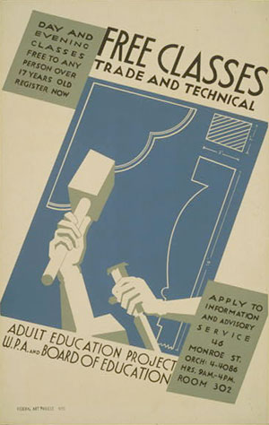
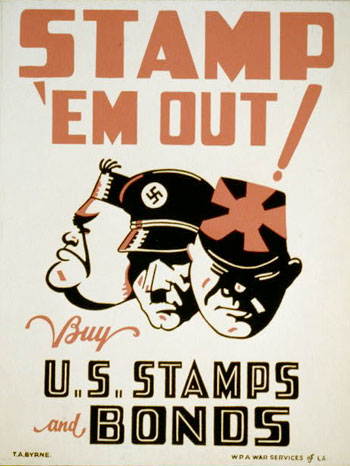
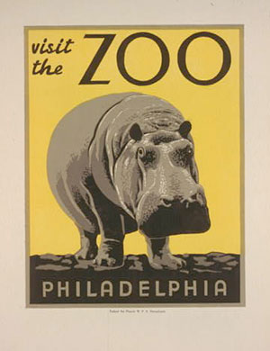
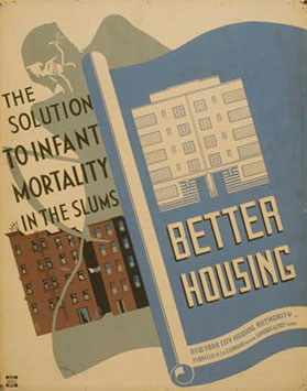
WPA Gothic font – free download

Introducing Stephen Coles’ new Fontstruct: WPA Gothic. Based on the posters of the Works Progress Administration.
Click here for free download and more info.
For more about Fontstruct, go here.
And here’s some highlights from the Library of Congress’ WPA collection . . .


handpicked posts

a piano falls in old manhattan
tetro and typography
it’s typography: film, song and dance
ghosts of gustov klimt
the great times new roman controversy
picking fonts
kapitaal
defining terms: design is not decoration
garcia's 'pure design'
'enhance that image!'
magic highway remixed
the cynic
rad anthem
Brought to you by man dom-


buy my fonts
go shopping
mehalloreads

Divinely Elegant: The World of Ernst Dryden
Jozsef Pecsi: Photo and Advertising
Color: A Natural History of the Palette
Collage: Assembling Contemporary Art
Modern Dog: 20 Years of Poster Art
Gaberbocchus Press: An Experiment in Publishing, 1948-1979
Advertising Art in the Art Deco Style
Googie Redux: Ultramodern Roadside Architecture
Hot Sour Salty Sweet: A Culinary Journey Through Southeast Asia
now playing


the work at the mehallo blog. beta. is licensed under a creative commons attribution - noncommercial - no derivative works 3.0 united states license. if reposting, credit must be given to steve mehallo - and if possible, please provide a link back to the mehallo blog. beta.
i include images for the purpose of critique, review, promotion and inspiration - and always make my best effort give credit/link back to the original source. if i’ve screwed up, please fire me a note.
page layout based on the wordpress 'darkwater theme' by antbag, adapted and redesigned by mehallo. valuable php assistance from bill mead.


