entries Tagged as [typography]

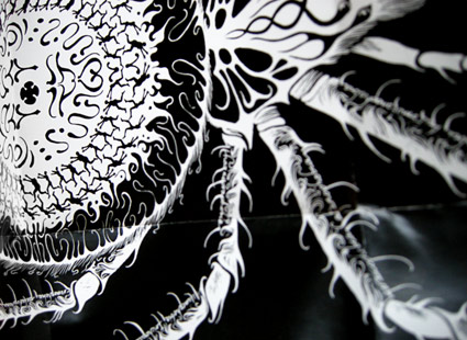
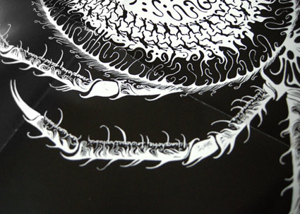
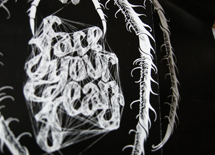
Big Bantjes spider on my desk!

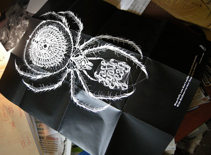
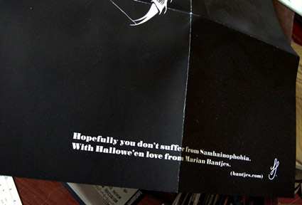
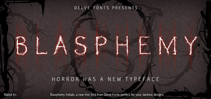
A few years back the incredible Marian Bantjes sent me this wonderful Hallowe’en poster. Earlier the same year, I had put her work in an exhibition.

Marian’s post on heraldry is one of my favs. And check out her 10th Anniversary cover for GQ Italia, ’10 designers, 10 covers  . . .  10 years of men, stories, adventures and style.’

Happy Hallowe’en!

Symbiosis: E-Coli font

‘the font changes shape and colors as it breeds and dies’

Jelte van Abbema’s award-winning bacteria font, Symbiosis. Details here.

Found via Twitter.com/rogerioabreu

Free caps font, it’s Blasphemy!

Just in time for Halloween!

Blasphemy Initials from Delve Fonts is GREAT for titles, drop caps, frightening timid people, crucifictions, things like that. The thorny letters are carefully proportioned and based on classical form.

To snag your own, simply GO HERE and do what you’re told.

Good thoughts about eating

Michael Pollan’s 20 favorite food rules: interactive feature at the NYT.

Design + art: Cut-Click does Text

UK-based Cut-Click Magazine is small, fun and edited by Caroline Twidle.

Number 13 is the ‘Text issue,’ download a free copy here.

LAIKA: Interactive typography from Switzerland


LAIKA from Michael Flückiger on Vimeo

Traditional fonts are static. For their bachelor thesis, Michael Flückiger and Nicholas Kunz created a dynamic typeface called LAIKA.

LAIKA isn’t static. Style, weight, size, kerning and other properties can be adjusted on the fly using a control panel, as seen in the video. LAIKA can also respond to outside stimuli, such as people.

To test drive/interact with LAIKA, go here.


Interactive online interface for LAIKA

Found via Twitter.com/frank000

Helvetica vs. Arial: Game

This has been a favorite for awhile. Premise: You’re time-honored Helvetica and you get to beat the crap out of sneaky Arial. Unless Arial gets to you first.

Go here.

And call me crazy, but this game seems to go a bit faster these days. That bastard Arial has gotten even more aggressive!

Helvetica vs. Arial: Identification

Take the quiz.

It ain’t easy. I actually got 19/20 and I supposedly know what I’m doing.

Helvetica-themed interfaces: clean, neat

Sick of overdesigned interfaces? Go Swiss!

Emily Chang does a roundup of Helvetwitter, Helvetical and more.

Swiss interpretations

A bunch of Helvetica posters here.

Type that doesn’t wash off


‘ . . .  WW is Walt Whitman.’

Ina Saltz wrote THE book on typographic tattoos, Body Type: Intimate Messages Etched in Flesh. You can snag a copy by clicking on the image below.

But there’s even more at her website here.


Creative Commons License

the work at the mehallo blog. beta. is licensed under a creative commons attribution - noncommercial - no derivative works 3.0 united states license.  if reposting, credit must be given to steve mehallo - and if possible, please provide a link back to the mehallo blog. beta.

i include images for the purpose of critique, review, promotion and inspiration - and always make my best effort give credit/link back to the original source.  if i’ve screwed up, please fire me a note.

page layout based on the wordpress 'darkwater theme' by antbag, adapted and redesigned by mehallo.  valuable php assistance from bill mead.