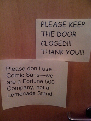
entries Tagged as [typography]

The real Comic Sans

‘It’s just a shame they couldn’t have used just the original font, because [Comic Sans is] a real mess.’ -Dave Gibbons, interview in The Guardian

Sick of Comic Sans? Why not try something more authentic  . . . .

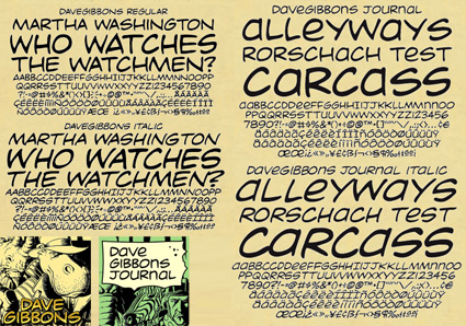
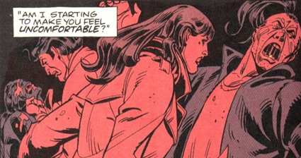
Vincent Connare based the design of his Comic Sans fonts on the lettering work of comic book illustrator Dave Gibbons. With infamous results.

But the comic book lettering gurus at Comicraft have something a bit better: Real Dave Gibbons fonts.

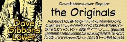
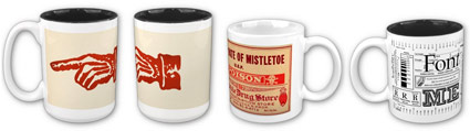
They won’t come preloaded free on your PC. But if you want to put your money where your mouth is, the ‘DaveGibbons’ fonts – available in upper, lowercase, international, journal and splash page titling versions – should be up to the task at hand.

Snag em here. Multiple purchase options available, including some ‘Gibbous Packs.’

Comic Sans and candy jars

A few weeks back, I was explaining to a culinary instructor the whole hate Comic Sans thing.

She had just put together a bunch of slides for a presentation and picked Comic Sans as her font.

And was really surprised at the reaction she got. Some members of the Hate Comic Sans faction were there that day and they made their presence known. To her dismay. [Read more →]

On now! Save on mehallo stuff for Veterans Day

$2 off t-shirts, $4 off mugs. Input code: VTRNSDAYSALE.

Visit my store at Zazzle here – or just click the images.

More Zazzle Veterans Day Sale info here. (other stuff on sale too, not just my stuff)

Sale ends Thursday November 11, 2010 at 11:59 pm (PST).

Talk

Conan’s back tonite.

Pictured, the work of designer Andy Mangold, student at Maryland Institute College of Art.

Astronomical Clock in Strasbourg Cathedral

‘The cathedral’s south transept houses an 18-metre astronomical clock, one of the largest in the world  . . .  The astronomical part is unusually accurate; it indicates leap years, equinoxes, and much more astronomical data. Thus it was already much more a complex calculating machine than a bare clock.’

Photography by Peter Rinblad. More about the clock here.

The Escoffier font giveaway, enter to win!

I think it’s time for a good old fashioned font giveaway.

Escoffier Capitaux is my tribute to culinary legend Auguste Escoffier – and is based on the 1920s lettering (done while in France) of commercial illustrator/fashion designer Ernst Dryden. The font also has some Herb Lubalin-like ligatures and a bit of Garamond thrown in.

Very French.

to enter
All you have to do is leave a comment on this post. To comment, just click the ‘comment’ link below (and please fill out all the fields).

I will randomly select one winner from the comments. The winner will receive a complete, licensed copy of my Escoffier Capitaux font, OpenType format, $19.23 USD value. For more about the font, go here.

(Just for the record, 1923 was the year my dad was born)

Contest ends 11 p.m. (pacific time) Wednesday, November 10, 2010.

update
A winner has been randomly picked: Derek Walker won a licensed copy of Escoffier Capitaux! Thanks to everyone who played along, and I loved the comments.

ABC123

From the Jackson 5ive cartoon. Animation by Rankin/Bass. From 1971.

The wonky type at 10 Downing

‘If I could change anything, I’d straighten up that 0 on the number 10. It’s a bit wobbly.’

Here’s an excellent read by J.M. Mosley on the odd lettering used for the numerals at 10 Downing Street. Not quite the original, sort of an accident that is now part of history.

It’s interesting how small type details are often overlooked. The numbers on my own home are rather awful, and even though several years back I’d purchased some Bodoni as replacements, have never gotten around to actually installing them.

Found via Matthew Williams

Souls & type, Glendaloch

‘Photos from Glendaloch, a glacial valley south-west of Dublin, Ireland’

Photoset by Aaron Bell. More here.

Losing religion

‘The letters are bread’

The work of Northern Ireland-based designer Christopher Scott. Photographed by Ryan O’Neill.

Found via Art Chantry

Adams, Henry

‘Seriously gorgeous paired volumes of Adams’ celebrated intellectual autobiography – a brilliant deployment of two classic typefaces, Garamond and Caslon’

Pictured, covers from the beautifully-designed 1964 double volume, of which a copy may be snagged here. If you’re fast.

Details about Bostonian Henry Adams (1838-1918) here. Theme analysis by the NYT here.

Found via this, that, and also


Creative Commons License

the work at the mehallo blog. beta. is licensed under a creative commons attribution - noncommercial - no derivative works 3.0 united states license.  if reposting, credit must be given to steve mehallo - and if possible, please provide a link back to the mehallo blog. beta.

i include images for the purpose of critique, review, promotion and inspiration - and always make my best effort give credit/link back to the original source.  if i’ve screwed up, please fire me a note.

page layout based on the wordpress 'darkwater theme' by antbag, adapted and redesigned by mehallo.  valuable php assistance from bill mead.