Comic Sans and candy jars
A few weeks back, I was explaining to a culinary instructor the whole hate Comic Sans thing.
She had just put together a bunch of slides for a presentation and picked Comic Sans as her font.
And was really surprised at the reaction she got. Some members of the Hate Comic Sans faction were there that day and they made their presence known. To her dismay.

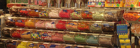
candy jar
My explanation uses an analogy that originated with designer Michael Leonardini: ‘Picking fonts is like going into a candy store. Even though there’s better things to pick, we’re drawn to the bright colors. And pick whatever’s in front of us.’
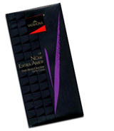
I liken it to: You buy the cool jawbreakers (before you realize jawbreakers are a really horrible pick), but ignore the great Guittard or Valrhona bars over to the side. Even though that’s the best candy you’ll find in the store.
So as I told the presenter: ‘You went down the font menu and hit upon the goofiest thing you could find. And that’s how Comic Sans ended up in your slides.’
Even though a nice Valhrona bar – or Myriad – would do the job much better.
I don’t hate Comic Sans. I just think there are better, easier to read options out there. Sophisticated picks that taste great, melt in your mouth and communicate extremely well.
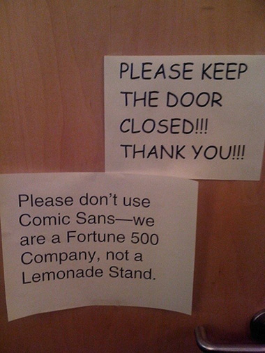
Sans image via The Huffington Post


[…] This post was mentioned on Twitter by steve mehallo, Cristina Robinson. Cristina Robinson said: @Viking_Lord look, @mehallo wrote about your FAVORITE typeface: http://mehallo.com/blog/archives/22541 […]