entries Tagged as [typography]

Futura, the play

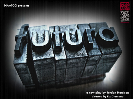
‘Can a font change the future? On her first day back at the University, a rogue Professor sets out to avenge her missing husband – and the lost art of ink on paper – by conducting a dangerous lesson on typography. When the Professor’s lecture jumps the rails, we peer into a near future where desperate people search for the tangible in an ever more virtual age.’

Futura, as a play, is an interesting concept. It starts with a history of typography lecture – then weaves in its own story about a paperless future.

But is a type history talk good enough to stand on its own – without a play attached? The NYT thinks so. There’s a lot of cool stuff in type history.

The play closed last week, but here’s a few more details.

Found via H&FJ

Alphabet City

The work of Scott Teplin. More here.

Free Conqueror fonts!

‘Jean François Porchez was approached at the end of 2009 to create a set of typefaces to relaunch the Conqueror papers collection.’

Jean François Porchez’s beautiful Conqueror fonts are based on some great historical design eras – and are available free via Arjowiggins Creative Papers thru end of March 2012.

The fonts themselves are mostly caps and missing a few punctuation marks – but they also have similar widths, cool alternate characters (such as swashes) and 3D carved versions (as extras) – making them vastly interchangeable. And who knows, since they’re free, maybe they’ll conqueror the design world.

A standard commercial font license applies. Grab em here.

More details here.

Free Hero fonts!

Fontfabric’s free sanserif Hero fonts. Two weights, multiple language support.

Grab em here. Fontfabric has a great section of other freebies too.

Zed

Pictured: Cap Z from Penabico, a new font based freely on ‘the copperplate script styles to be found in the Universal Penman.’

Available at MyFonts. And currently trending as one of their best sellers.

More detail here.

Y

Layered wonders: Zooth dimensional typefaces.

Snag the individual components (as fonts) here.

New W

‘The last logo ran for 20 years’

A few months back, Stefano Tonchi jumped over from singular letter T magazine to reboot singular letter W magazine. And the results are quite elegant. [Read more →]

Typographic accessories

‘Originally used on hand-cranked Vandercook Proof Presses, each piece of type used in these necklaces were worn out ever so slightly by normal printing use  . . . These obsolete pieces (each measures a little under 1 inch long) have been rescued, plated in silver, and hung from a 22 inch silver-plated brass figaro chain.’

Erica Weiner’s Double Letterpress Necklace.

Also available in Gold. And brass chain options [Silver and Gold].

Kawamura’s Typographic Ts


‘T shirts that were designed to have the silhouette of 5 famous typefaces; Helvetica, Caslon, Baskerville, Courier and Cooper Black.’

Masashi Kawamura makes type into clothing. Details here.

Found via Tiffany Valdez

Orzechowski letters Star Wars

‘Orzechowski modeled his lettering on the Flash Gordon newspaper strips of the 1930s. Another influence was Robert Crumb’s Zap Comix: Orzechowski recognized that Crumb’s title work was clearly derived from the brush techniques of that same era, the 1920s and 30s.’ –Wiki

One of the first times I really became aware of hand lettering in comic books came with Marvel Comics’ 1977 Star Wars movie adaptation. From issue #2 thru #5, the lettering had this smooth, compact quality to it. With cool titles up top.

Behind the scenes was lettering artist Tom Orzechowski – working for the Mighty Marvel Bullpen. [Read more →]

Comic Slab font

A.J. Maher’s funky serif version of Comic Sans.

Snag it free here.

(Screw with the Comic Sans haters. Start using it all over the place. They won’t know what it is.)


Creative Commons License

the work at the mehallo blog. beta. is licensed under a creative commons attribution - noncommercial - no derivative works 3.0 united states license.  if reposting, credit must be given to steve mehallo - and if possible, please provide a link back to the mehallo blog. beta.

i include images for the purpose of critique, review, promotion and inspiration - and always make my best effort give credit/link back to the original source.  if i’ve screwed up, please fire me a note.

page layout based on the wordpress 'darkwater theme' by antbag, adapted and redesigned by mehallo.  valuable php assistance from bill mead.