entries Tagged as [thoughts]

‘Close Your Bank Accounts’

This seems obvious but it isn’t.

I’ve been using credit unions for about 15 years, have free checking and there’s no fees on my debit cards – unless BofA (or another ‘out of network’ teller) decides to charge me one.

For more info about credit unions (or simply banking local), visit the Move Your Money Project website.

Image found via Don Button

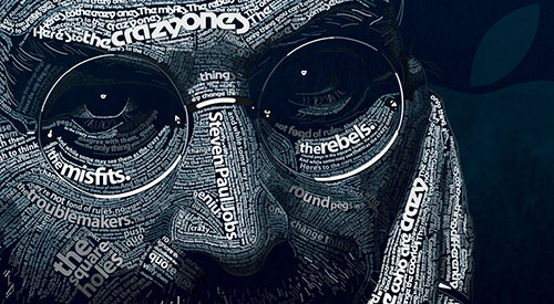
Jobs: Making the world a better place

‘Your time is limited, so don’t waste it living someone else’s life. Don’t be trapped by dogma – which is living with the results of other people’s thinking. Don’t let the noise of others’ opinions drown out your own inner voice. And most important, have the courage to follow your heart and intuition. They somehow already know what you truly want to become. Everything else is secondary.’ –Steve Jobs

Intuition is very powerful, once one knows how to trust it. It involves turning off the insecurities of ego and concentrating on pure feeling. And it works wonders.

The news of Steve Jobs’ passing came in via social media. I saw a Facebook post right after I gave a design history lecture on early modern artists and how they’d managed to change the world.

I was fortunate enough to both go to school and work in and around Silicon Valley where Jobs’ approach reverberates and inspires. Playing it safe, following the status quo will not lead to new things, will not improve life as we know it – and Jobs knew how to get the best work out of Apple’s creative team.

He knew that details are excruciatingly important. Leveraging design, using good typography, giving us what we really want – instead of what we think we need – was all part of the package.

Thinking different makes the world a better place. That’s the legacy he leaves.

Image by Dylan Roscover, using Apple’s suite of fonts from over the years

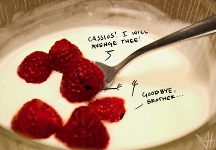
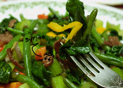
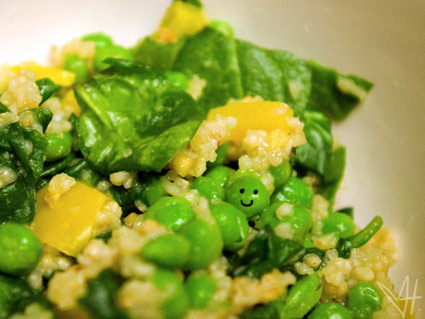
‘Wtf are you eating?’

‘Having many food and chemical sensitivities has been a largely trial-and-error process for what can be tolerated and what can’t, and has resulted in many creative kitchen science experiments’

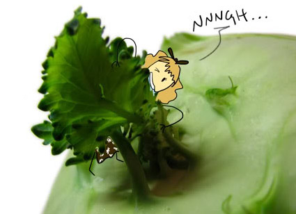
Web designer/cartoonist (and former student of mine) Annie Hero has developed some major health problems. Recently, she’s taken to blogging about her approach to reclaiming her life from years of processed food intolerance.

Annie’s WTF are you eating? can be found here.

In food

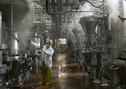
‘The company injects fatty beef trimmings with ammonia to remove E. coli and salmonella’

Ammonia in the beef. Sawdust in the cookies. Orange juice on life support.

Today’s US food processing industry is similar to a big Hollywood production of an apocalyptic society, arrived early. Fast Food Nation and FOOD Inc. were appetizers.

Read CRACKED’s The 6 Most Horrifying Lies here.

CRACKED? Yes, the humor ‘mazagine’ I read when I was a kid turned snarky humor website is now an investigative news site. Another sign of the apocalypse.

Photo by Carol Guzy/Washington Post

Arby’s, sign and BBQ sauce


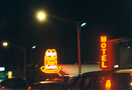
South San Francisco Arby’s, photographed 1991

I have a soft spot for Arby’s.

The food isn’t great. But when I was a kid, there wasn’t an Arby’s nearby – so heading to the South City location, which showcased a super cool flashing chuckwagon-themed neon sign, was always a special trip.

It was years before I even tasted what REAL sliced roast beef was – who knew it wouldn’t have a salty, lunchmeat-like boiled flavor?

Back then, Arby’s house BBQ sauce was sold in take home bottles; which today I’ve replaced with a knockoff recipe. The trick to a good sauce is a long, slow simmer and the right non-HFCS ketchup. Trader Joe’s Organic makes a great base. [Read more →]

Genghis Kitchen

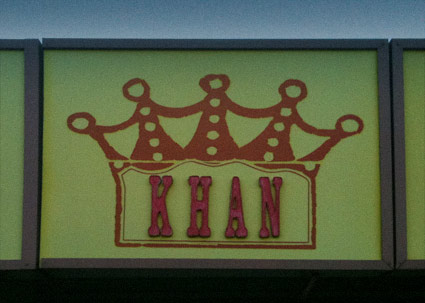
Up until a few months ago, I was living down the road from this place. I love the name, the food: not so good. Which may explain its recent closure.

Mongolian BBQ has nothing to do with Mongolia, but is a cuisine unto itself. Not anywhere near highbrow, not exactly a real BBQ. It’s a Taiwanese invention, a greasy, interactive meaty experience; the best I ever had was somewhere in Denver. The sport is all about getting as much slammed into the bowl as possible (flattening out the meat) so the food is plentiful and the trips to the grill are few.

Places with extra ingredients (such as shrimp, lamb, tofu) and seasonings (Italian herbs, Cajun spices and Rooster Sauce) are special. Ginghis (Khan) Kitchen, unfortunately, had neither. But – cool name, cool sign.


Photos by mehallo

‘I can’t sleep’

Been wickedly busy this week. And I’ve discovered working odd hours and bouts of insomnia become part of the whole experience. Had some cool stuff happen, and some really shitty things happen. I’ve also managed to slip in some great conversations.

Had a 3 a.m. chat with my cousin George. Haven’t talked to him in eons. Tuesday night I finally met the recently-promoted head of the Animation department at school. We talked about how wonderful the feeling is when students blow us away with incredible work. And we decided to join forces in doing something new for students involving typography and motion graphics.

Also had a long, detailed chat with a former student about designers and the fears that slow or stop what it is they’re doing. And how the process is difficult, but incredibly fulfilling when one creates work that they’ve never thought possible. Brilliant minds accomplish surprising things when they get past whatever it may be that gets in the way.

‘Did I do that?’

Yeah. You actually did.

Sleep? Sometimes. The whole 9 to 5 experience: Overrated.


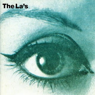
The La’s: I Can’t Sleep

Found via Ronnie Carnwath

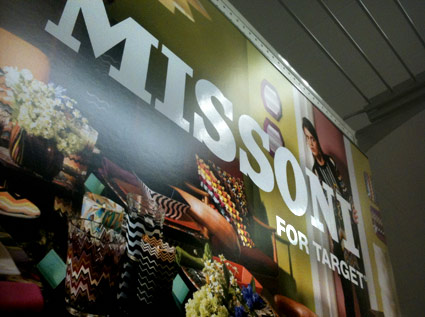
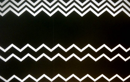
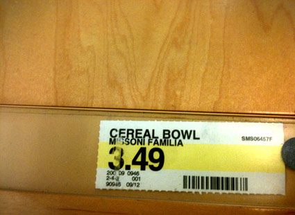
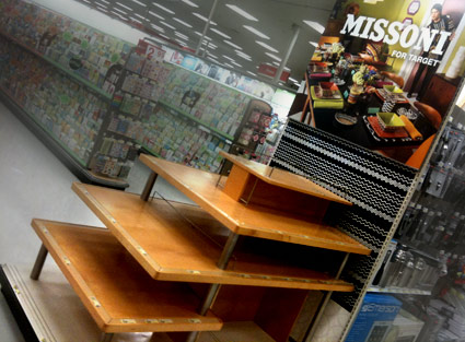
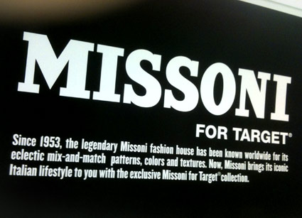
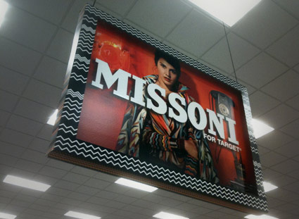
Missoni, Target

‘Should probably be called Missoni for Target for eBay.’ –Zooey Deschanel

Gone, gone and gone.

About the collection here. A look at ‘Missoni madness’ here.

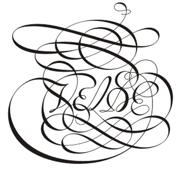
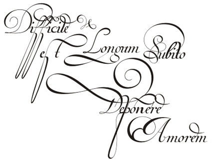
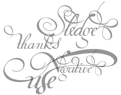
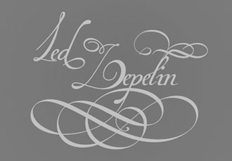
Swooshy! Van den Velde Script

The newest font package from Brazil-based Iza and Paulo W of Intellecta Design is pure pen magic: A loose interpretation of the work of Dutch calligrapher Jan van den Velde, 1568-1623.

The Van den Velde fonts feature a bunch of stylistic alternatives, ligatures, swooshes, swashes and other strokes that say woooooooo!

Two frilly fonts are available – one with letters, alternates and fleurons – and a ‘words’ version that features a set of customized words to make any decorative communiqué become the domain of an expert penman.

Snag your own thru MyFonts. Both fonts are on sale thru September 27, 2011.

In Helfer & Baker’s Shadow

‘It didn’t last long; true-blue Shadow fans (and, apparently, the owners of The Shadow trademark) didn’t care for Helfer and Baker’s smart-ass approach, especially when they killed the character off and resurrected him as a killer cyborg. It’s not surprising that happened to also be their final issue.’ –Robot 6

The Shadow (1987-89) was my favorite comic book series.

It was a sequel to a Howard Chaykin-penned 1986 update to the classic radio program, pulp novel character The Shadow, ‘What evil lurks in the hearts of men  . . .  The Shadow knows!’

Chaykin had brought the character into the 1980s, with uzis instead of .45s, ‘for mature readers’ emblazoned on the cover. And unlike the rest of his crew (Margo Lane and others had aged), Shadow alter-ego Lamont Cranston was still a rather youngish, dapper guy – ready to take on the New York of the Miami Vice era.
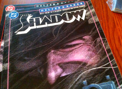
A monthly series followed – and after a few artist changes, writer Andy Helfer and artist Kyle Baker made it something else entirely.

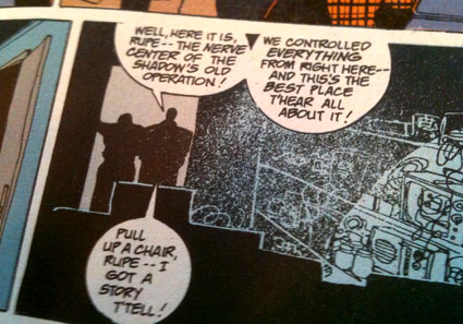
Helfer and Baker’s take on The Shadow became a crazy whirlwind tour of Sopranos-like mobsters, wickedly dark humor, extreme violence, unexpected plot twists and in issue 13, they killed off the main character. Then his sons lost his body and with every successive chapter, one could not predict what would happen next. [Read more →]

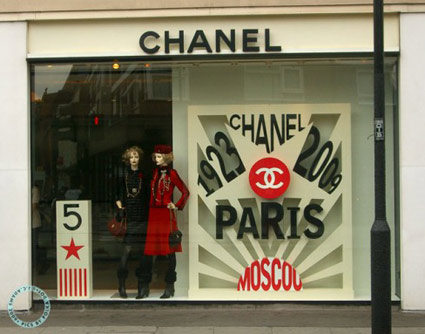
‘Not what she would have wanted’

Coco? Are you out there?

Chanel shop, London, 2009.

Found via Self Interest and Sympathy


Creative Commons License

the work at the mehallo blog. beta. is licensed under a creative commons attribution - noncommercial - no derivative works 3.0 united states license.  if reposting, credit must be given to steve mehallo - and if possible, please provide a link back to the mehallo blog. beta.

i include images for the purpose of critique, review, promotion and inspiration - and always make my best effort give credit/link back to the original source.  if i’ve screwed up, please fire me a note.

page layout based on the wordpress 'darkwater theme' by antbag, adapted and redesigned by mehallo.  valuable php assistance from bill mead.