Forbidden park, 2008

‘Terry is very much about sex’ –Tom Ford
Photographer Terry Richardson is largely considered to be the next Helmut Newton.
Pictured, shots for Tom Ford’s Spring 2008 campaign. More here.
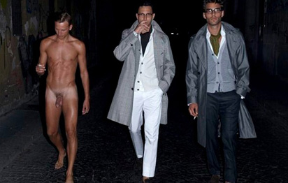
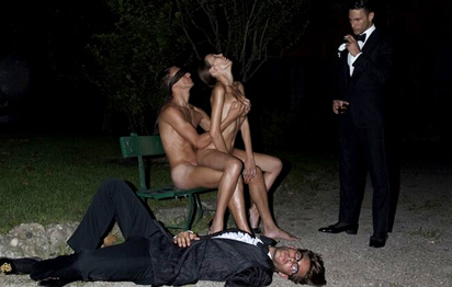
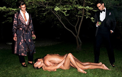


‘Terry is very much about sex’ –Tom Ford
Photographer Terry Richardson is largely considered to be the next Helmut Newton.
Pictured, shots for Tom Ford’s Spring 2008 campaign. More here.


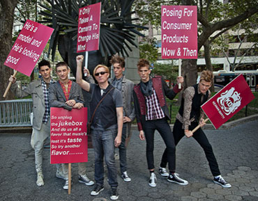
‘Keanan Duffty participated in Mercedes-Benz Fashion Week at the brand-new venue of Lincoln Center, but he didn’t use a runway. He used the sidewalk.’
Keanan Duffty staged a guerilla-style fashion show at NY Fashion Week, showcasing his Spring 2011 line ‘Glorious Journeys,’ a salute to Spandau Ballet.
Details here. More photos here.


Maripol is best known as the stylist of Madonna, circa 1984. She’s worked as an art director, producer, photographer, fashion designer and artist.
This year, she brought back the 80s with Marc Jacobs and her newest book can be snagged here.
Here’s an interview from a few years back. And drop by her (oddly designed) official site here.

Maripol for Marc Jacobs, above; some of Maripol’s Polaroids, below
Madonna: Into The Groove
Madonna and daughter Lourdes launched their Material Girl line just a couple weeks ago. With Gossip Girl Taylor Momsen fronting the collection the way she fronts The Pretty Reckless.
Considering the provocative personalities, it seems like a good fit. More of a ‘pass the torch’ moment than that Britney kiss those many years ago.
Website here.
Madonna: Like a Prayer
The Pretty Reckless: Goin Down
Video for The Cars’ You Might Think. From 1984.
Early award-winning animation by ‘computer graphics’ pioneer Charlex. Video details here.
‘A surreal commercial for Viva Vena. A collaboration between LT and Co and the broadcast design studio Gretel. Music by Copilot.’
Found via Ashley Simko


Before and after
I was thinking.
The recycle symbol we’ve been using all these years could use an update. Something simpler, more modern, earth-friendly and all that.
And what better way to update than looking to the most legible of the legibles, Helvetica. With all the Gap hoohaw this past week, I’d noticed that the G actually has an arrow in it. Not a perfect arrow, but redrawing Helvetica – that would take too much time. No one’s gonna notice an arrow that’s a bit off, right?
G is for garbage, of course. Turning it backwards means sending things back. For recycling. And the gradiated avocado green box, it just says green better than anything else can say green.
Because people really like avocados.
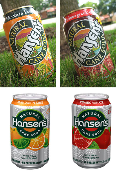
Before and after
This hit last year, redesign of soda cans for Hansen’s Natural Sodas by Deutsch Design Works.
The look just seems very . . . techno to me.
Garbage: I’m Really Into Techno, B-side from Shut Your Mouth 3
Photos found via BevReview