Penguin by Illustrators
When it comes to design, UK-based Penguin Books produces some beautiful specimens. And here’s a write up by Ace Jet 170 on the Penguin Collectors Society and their wonderful Penguin by Illustrators monograph.
When it comes to design, UK-based Penguin Books produces some beautiful specimens. And here’s a write up by Ace Jet 170 on the Penguin Collectors Society and their wonderful Penguin by Illustrators monograph.
Eleisha Pechey’s Windsor typeface (1905) is one of my funky favorites. There’s a hint of it in Jeanne Moderno (believe it or not; even moreso in my upcoming text versions), Woody Allen loves it for titles and Sacramento’s Golden 1 Credit Union uses it for a distinct yellow logo.
Today, Fountain Type releases Göran Söderström’s Heroine, a ‘modern interpretation of this rusty pearl is something that always have been missing in the major type libraries.’
More details here.
John Baskerville (1706-1775) was an incredible type designer. His work holds up very well today. He reinvented printing and his ink was beyond compare. And, unfortunately, he was hated by his contemporaries. His type was seen to ‘hurt the eye’ and would be ‘responsible for blinding the nation.’
‘Baskerville the Animated Movie celebrates John Baskerville, the man, the typeface and his future legacy.’
For more about this short film, drop by The Baskerville Project website.
For more detail about John Baskerville and other famous type luminaries, snag a copy of Type: The Secret History of Letters and start reading.

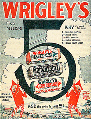
I’m typically not a purist when it comes to a lot of design. But updating a brand should be done with respect to the original brand. In this case, it simply bugs me that in its current configuration, Wrigley’s famous SPEARmint gum is now identified with the DOUBLEmint double arrow.
In terms of visual semantics, the arrow was a SPEAR (for spearmint – get it?). Spearmint was one spear, Doublemint (peppermint) was identified as a double spear (see above).
But now – both gums carry the double spear (below). It’s like someone didn’t get the memo. Totally throws it for me. The current wrapper, with illustrated sweaty mint leaves and pseudo-retro-like design – could have been handled so much better.
Yes, I do worry about this stuff. Someone has to.

Introducing Stephen Coles’ new Fontstruct: WPA Gothic. Based on the posters of the Works Progress Administration.
Click here for free download and more info.
For more about Fontstruct, go here.
And here’s some highlights from the Library of Congress’ WPA collection . . .
Google conspiracy theory animation by Ozan Halici & Jürgen Mayer. Bachelors’ Thesis at the University of Applied Sciences, Ulm, Germany.
From 2003: What Barry Says by Simon Robson & Barry McNamara. Short anti-US fascism animation. This controversial film won Best Animation at the Brooklyn International Film Festival in 2004.
If you’re wondering why Type Daily says ‘since 1455’ up top . . . this historical atlas will fill in some of the blanks.
After Johann Gutenberg did his thing, the technology of printing spread across Europe in just around 50 years.
This interactive map from the University of Iowa charts its progress – with timeline, zoom features, trade routes, locations of paper mills and more. Also included is a briefly animated model of what we know of Gutenberg’s press.
From the Histeria! series, here’s a cartoon overview of the invention of printing . . . well, actually the invention of moveable type . . . well, whatever it was that ‘Type A’ Gutenberg guy did.
Found via Twitter.com/MyFonts
If you’ve been thru San Francisco, this sign should seem familiar.
Originally planned as a driving promotion for the 1939 Golden Gate International Exposition, the 49 Mile Scenic Drive [map] passes thru all the visual highlights and lowlights of The City. Rex May is credited with designing the iconic signs – for more dope on the drive, check out this handy guidebook.
And Annie Galvin of 3 Fish Studios made a big splash last year with her multicolored acrylic paintings, also available as nifty postcards (seen above).

Henry C. Beck’s 1933 map for the London Undergound set the standard for transit maps worldwide. Based on an electrical schematic, and handlettered by Beck – he pitched the map to the Underground as easier to understand than what they’d been using. Skeptical at first, they eventually released Beck’s version. It was a major hit with commuters – and he spent the next 27 years updating and revising his creation.
Here’s the iconic tube map as interpreted in this presentation video by Digital Urban . . .
London Tube Map Traditional Layout from Digital Urban on Vimeo.