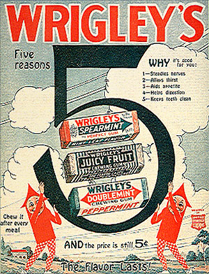
Double take

I’m typically not a purist when it comes to a lot of design. But updating a brand should be done with respect to the original brand. In this case, it simply bugs me that in its current configuration, Wrigley’s famous SPEARmint gum is now identified with the DOUBLEmint double arrow.
In terms of visual semantics, the arrow was a SPEAR (for spearmint – get it?). Spearmint was one spear, Doublemint (peppermint) was identified as a double spear (see above).
But now – both gums carry the double spear (below). It’s like someone didn’t get the memo. Totally throws it for me. The current wrapper, with illustrated sweaty mint leaves and pseudo-retro-like design – could have been handled so much better.
Yes, I do worry about this stuff. Someone has to.


(They also changed the formula for Wrigley’s Spearmint – it’s more like Altoids these days) :(