entries Tagged as [design history]

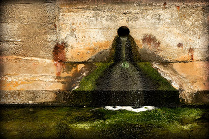
Parkinson’s Sutro fonts
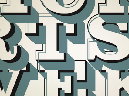

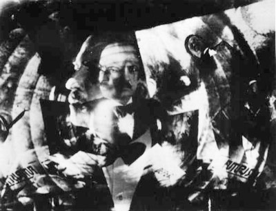
ADAC 38th season promotional material

It’s not often one gets to meet one of their heroes.

When I was in high school, a bunch of kids thought it would be funny to sign me up for every magazine subscription they could find – by sending in a large pile of subscription cards. My parents were not amused; but it was Rolling Stone that I kept. I fell in love with the hand-inked masthead – and decided that that was what I wanted to do.

Hand-ink mastheads.

Not a big field. And who knew people actually did this? I wanted to do it, and early attempts (for my high school paper) netted not so wonderful results. Who knew that someday I’d actually be drawing fonts as a consequence.


Rolling Stone masthead by Jim Parkinson

Around five years ago, I finally met the guy behind the logotype – lettering artist Jim Parkinson. And the conversations have been great – as long as I don’t actually call him hero, he’s cool. And (who knew?) we both like fresh anchovies. Which I’ve found can gross out anyone who is eating near us.

using jim’s fonts
I used Jim Parkinson’s Sutro fonts on promotional materials for the 38th season of the Sacramento Art Directors and Artists Club. I was the newly appointed president, so I was determined to use fonts from the best of the best and (of course) Jim was on my list. [Read more →]

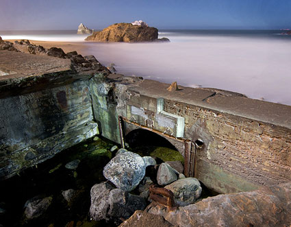
Baths, Sutro-style

‘I must have it large, pretentious, in keeping with the environment, with the Heights, with the great ocean itself  . . . ‘ -Adolph Sutro (1830-98), engineer, philanthropist, mayor of San Francisco

The ruins of San Francisco’s Sutro Baths (1896-1966) are fun to wander thru. Here’s some photosets on Flickr.

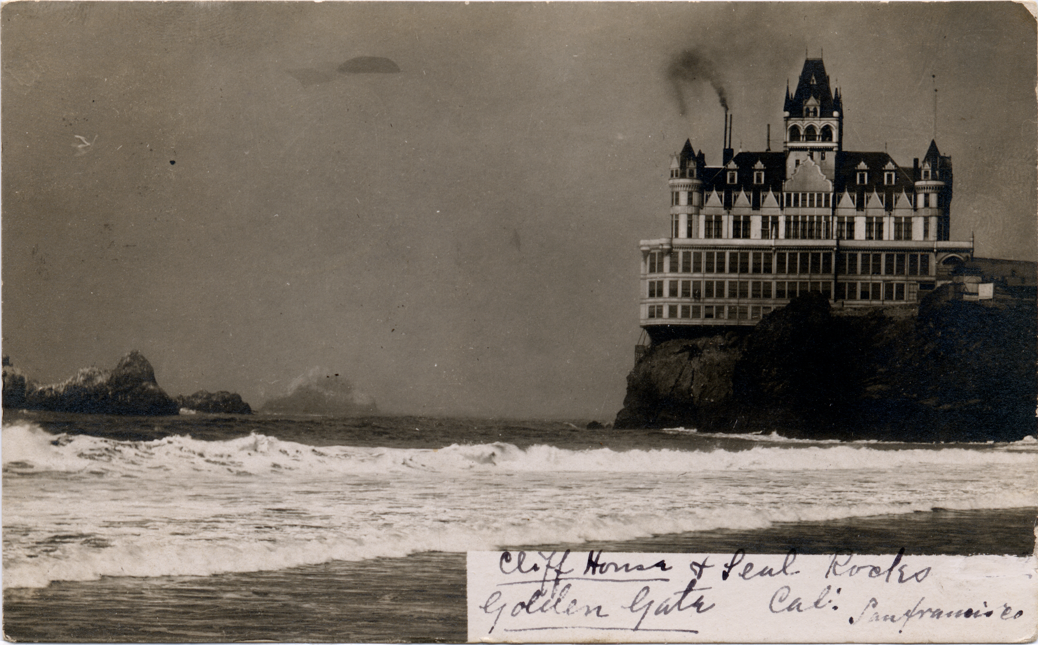
Sutro’s Cliff House was located just next door.


The Sutro Baths’ last stand: the fire in 1966 (film only, no audio)


A 1991 proposal for reopening the baths using solar/wind power


Program, 1897

Futurism by the bay

‘Futurism was an international art movement founded in Italy in 1909. It was (and is) a refreshing contrast to the weepy sentimentalism of Romanticism. The Futurists loved speed, noise, machines, pollution, and cities; they embraced the exciting new world that was then upon them rather than hypocritically enjoying the modern world’s comforts while loudly denouncing the forces that made them possible. Fearing and attacking technology has become almost second nature to many people today; the Futurist manifestos show us an alternative philosophy. Too bad they were all Fascists.’ -Kim Scarborough’s Guide to Futurism


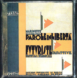
Parole in Libertà book cover (1932), found via laura@popdesign

This year is the 100th anniversary of F. T. Marinetti’s Manifesto of Futurism (1909) – and San Francisco has celebrations planned October 14th thru 18th. [Read more →]
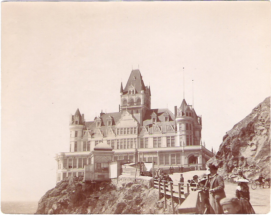
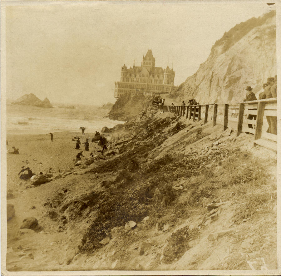
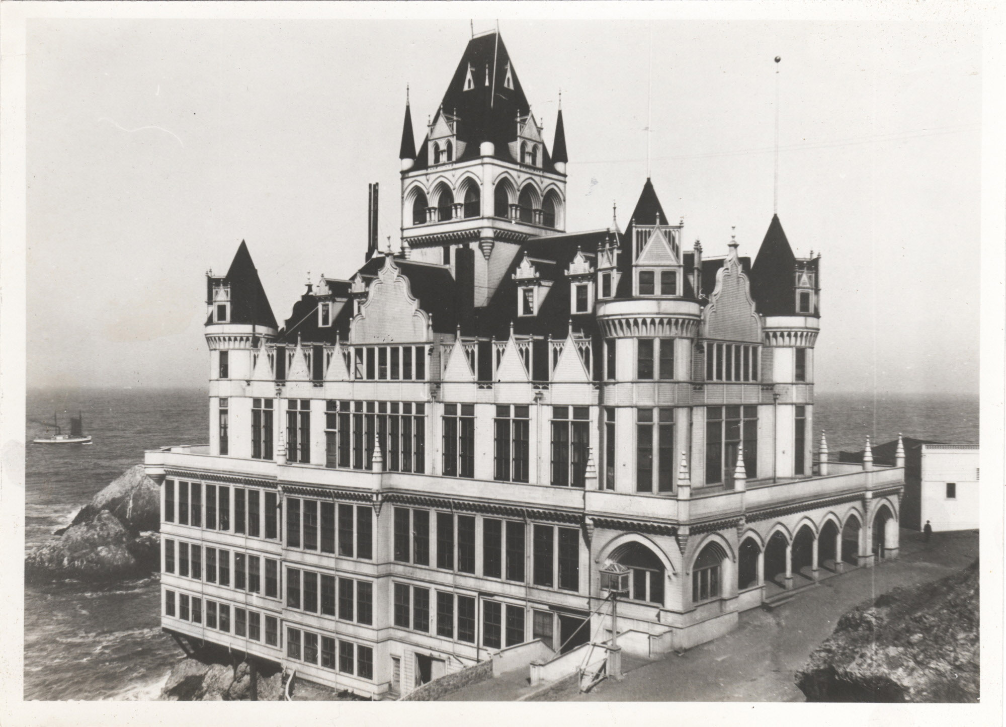
Victorian images from the cliff

‘It was neither the first structure nor the last to carry the name of Cliff House, but it was certainly the most grand. Sadly, its existence was short-lived. It was constructed in 1896 and, like so many wooden structures of that era, burned completely to the ground in September of 1907.’

Images of Adolph Sutro’s Cliff House (1896-1907) – Victorian style on the coast in San Francisco – via the Cliff House Project website. Click on photos for jump/larger versions.

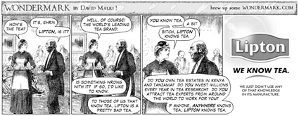
Lipton knows tea

Click the image for larger size/jump.

Found via Justin Nelson

National Banned Books Week


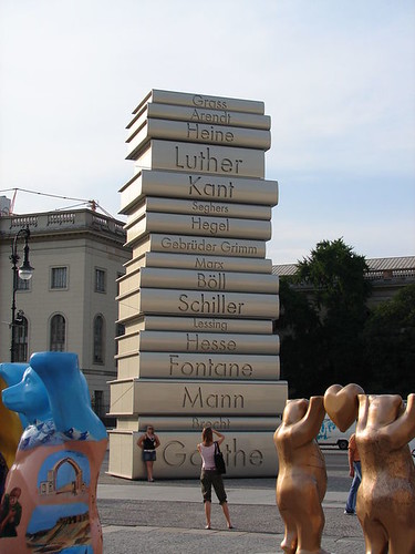
Bebel Platz’s Berlin memorial to Nazi book burning; even the font used in the memorial used to piss off the Nazis

This week is The American Library Association’s Banned Books Week. Here’s a link to the 11 Most Ironically Banned Books of All Time. Go read something that might change your view of the world. Something you shouldn’t be allowed to read. [Read more →]
Atomic kitchen: Duck, cover!


Bomb Shelters, Inc. business card, 1959

Everything you’d ever need to know about ‘The Golden Age of Homeland Security’ can be found at the Conelrad website.

The site is named for the Civil Defense emergency network – ‘CONtrol of ELectronic RADiation’ which was set up to broadcast on AM 640 and 1240 in the event of an atomic attack.


Illustration from Walt Disney’s Our Friend the Atom children’s book, 1956


From TIME, July 26, 1963

Atomic kitchen: with built-ins

From Paleo-Future, Tomorrow’s Kitchen (1943)

Making a type sample


The Making of a Type Sample from FontShop on Vimeo

Once a font is completed, showing the letters and glyphs in their best light is a tricky exercise. FontShop does it right and in this video shows some of the decisions made when creating a good type sample – in this case, the sample for Matthew Carter’s beautiful Miller typefaces, which I used for The Sacramento Union Magazine.

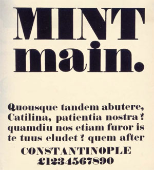
In the 1800s, type foundries used to set their samples in Latin – following the belief that our alphabet looks best in its original language. Marcus Tullius Cicero’s first speech against Lucius Sergius Catilina (below) was popular for samples.

Today, graphic designers use Lorem Ipsum for placeholder text.


Robert Thorne’s Fat-Face type sample, 1821

Penguin: The covers

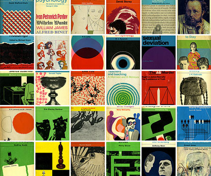
Check out Joe Kral’s Flickr collection of some of Penguin (and Pelican)’s best cover designs.

And  . . .  check out Phil Baine’s Penguin by Design: A Cover Story 1935-2005.

Found via LifeClever

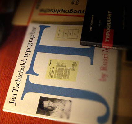
Tschichold: distinguisted typographer

When I want to design something that calls for sophistication, I thumb thru the work of Jan Tschichold (1902-1974).

Modernist and  . . .  Classicist. This contrast leads to some interesting thinking that informs my own ability to design for different industries.

Tschichold put The New Typography on the map by publishing the book on the subject and helped spread the idea of the bauhaus – and modernism – worldwide.

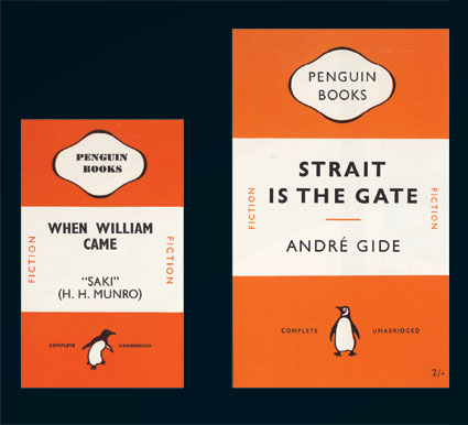
The largest project of his career took place in the late 1940s – the redesign of Penguin’s line of paperbacks (below). As a whole, Penguin’s quality hasn’t wavered since.

Here’s an overview of the work of Tschichold at retinart – with some good links for additional info.

And I’m still looking for a decent (inexpensive) replacement text for my beginning type courses since Tschichold’s Treasury of Alphabets and Lettering is now out of print. Nothing I’ve found so far comes close to showing well-drawn – and well selected – metal specimens.


Penguin redesign, an exercise in subtlety: before (1941) and after (1947)


Creative Commons License

the work at the mehallo blog. beta. is licensed under a creative commons attribution - noncommercial - no derivative works 3.0 united states license.  if reposting, credit must be given to steve mehallo - and if possible, please provide a link back to the mehallo blog. beta.

i include images for the purpose of critique, review, promotion and inspiration - and always make my best effort give credit/link back to the original source.  if i’ve screwed up, please fire me a note.

page layout based on the wordpress 'darkwater theme' by antbag, adapted and redesigned by mehallo.  valuable php assistance from bill mead.