entries Tagged as [design history]

IKEA, hacks and history


Built in knife rack by mehallo, hacked from an IKEA’s Molger bathroom shelf

I’m an IKEA hack. Because the products don’t always fit the space, don’t always work the right way or can be repurposed for other use. Form follows function – or form changes for better function – as it were.

IKEA is everywhere, almost. They seem to be in specific parts of the US, and then strategically all over the rest of the world. A photographer I once worked with noted that when they come to town, one can see them slowly change the look of a community. My dentist notes that they seem to open next to train tracks. [Read more →]
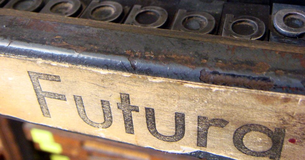
What do you know about Futura?

‘Foo-der-ah’ – as one of my students once called it. Paul Renner’s Futura is everywhere – and here’s a write up in idsgn’s ongoing know your type series.

Or – if you really want to get your hands dirty – snag a copy of the expanded edition of Christopher Burke’s wonderful biography of Paul Renner – detailing the creation of Futura – how knock offs were released before he even finished his drawings, his arrest by the Nazis, other fonts, sketches, experiments  . . .  But even more, the book details philosophy, beliefs and how they contributed to the creation of types that are as fresh today as they were in the 1920s.

Did you hear that IKEA???

Modern wheels


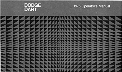
Award-winning cover design for the 1975 Dodge Dart’s user manual

RIP Cash for Clunkers. The program – which ended today – may have totally changed the look of our roadways.

Art found via Graphis Annual 76|77

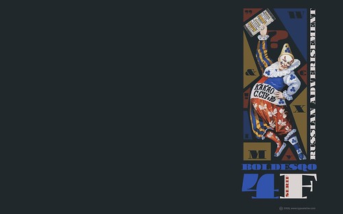
Moderno wallpaper, from Austria

Here’s a link to a cool collection of typographic wallpapers designed by Arno Kathollnig/Typoatelier. Including a fun ((t+y+p+o)-o)+e= version (pictured above) featuring my very own Jeanne Moderno fonts.

‘Adobe Illustrator’ from the early 1960s


Part 1

From a half hour show documenting the early development of computer-human graphical interaction.


Part 2

The originals

I miss these icons. Susan Kare developed them – and the standard city-named fonts – for the original Apple Macintosh in the early 1980s.

I particularly like the alert message guy in the right corner – a playful bitmapped take that has a similar feel as Oskar Schlemmer’s 1921 bauhaus icon.

My grungy Alta California font was inspired by Kare’s original San Francisco font; which, unfortunately hasn’t been available on a Macintosh for many years. I have a great respect for her ability to convey so many many different letters within a small 72 dpi black and white space. Unfortunately – thru gratuitous use – San Francisco did sort of become the Comic Sans of its day. Sort of.

Check out Kare’s online store for some fantastic tees and notecards. Rad digital art from a simpler era. An era that didn’t need gradients and drop shadows in order to dazzle.

And drop by the Japan-based Vintage Mac Museum to see some of Kare’s original icons in action.

Apple: the visual history


Apple Evolution: Visual History of Apple Products via Fandome
Featuring Fiona Apple’s cover of Across the Universe

Also, check out my other post about Braun and Apple.

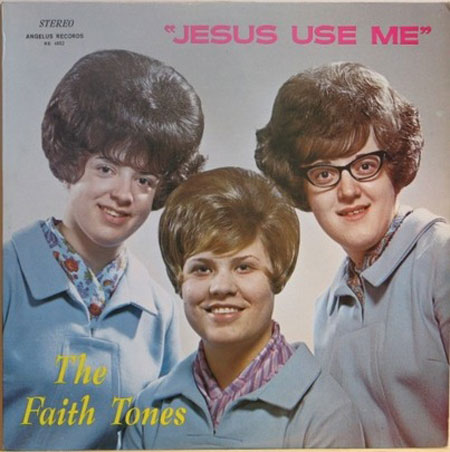
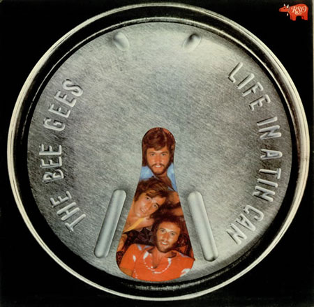
The 25 worst album covers of all time


#15

The thing is, there’s some mainstream stuff on the list too. To peruse, simply jump over to Designer Daily.


#22


#2

Pablo the Movie

‘Pablo is the story of outlaw filmmaker, countercultural icon, and world famous title designer Pablo Ferro.

‘The film blends animation, documentary footage and testimonials of illustrious filmmakers and artists who unravel the legendary life of Pablo Ferro and his legacy.’

More on Pablo The Movie here. Updated trailer (with animation) posted here.

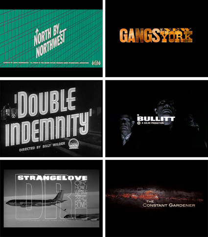
Great movie titles

Browse thru Christian Annyas’ Movie Title Stills Collection, which contains ‘hundreds of main titles from feature films’ – and some shots of trailers – organized by decade.

Found via Designisms

Building


Building design by Giulio Cittato
From Basic Typography: Design With Letters (1974) by Ruedi Ruegg

In order for the Swiss International Style to actually work, it needs a sense of drama. Imagine how interesting our industrial zones could have been with this sort of design thinking.


Creative Commons License

the work at the mehallo blog. beta. is licensed under a creative commons attribution - noncommercial - no derivative works 3.0 united states license.  if reposting, credit must be given to steve mehallo - and if possible, please provide a link back to the mehallo blog. beta.

i include images for the purpose of critique, review, promotion and inspiration - and always make my best effort give credit/link back to the original source.  if i’ve screwed up, please fire me a note.

page layout based on the wordpress 'darkwater theme' by antbag, adapted and redesigned by mehallo.  valuable php assistance from bill mead.