entries Tagged as [design history]
Latex ‘Wedgewood’
Elegant British jasperware reinterpreted in latex. Hat, neckpiece, mitts and pasties. By Peacock Blue Design Studio. Details.
Vanilla is blue
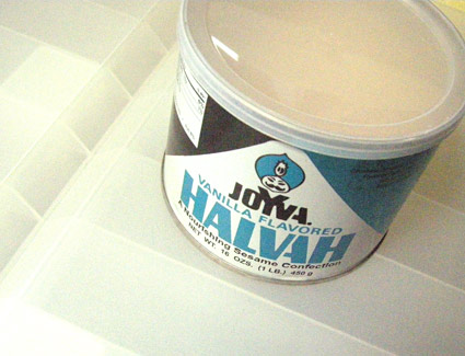
Something weird happened between now and the 1970s. Vanilla turned brown. Or beige. Or something like that.
I remember Shasta Creme Soda used to come in a metallic blue can. A lot like their cola can, but more of a turquoise blue. To find something vanilla, all one had to do was look for the blue packaging. It was a design standard.
Joyva Halvah (above) still gets it. They still use their old can design.
Vanilla was blue. Something happened and it isn’t anymore.
Adopt an original Bodoni alphabet
The original type punches of Giabattista Bodoni (1740-1813) are in bad shape and the Friends of the Palatina Library and the Bodoni Museum are raising funds to restore the full set of over 600 alphabets.
Bodoni’s multiple alphabets contain some incredibly detailed wonders – with craft beyond many of the digital versions that exist today.
You can adopt part or a whole alphabet. For more info, go here.
Dürer fonts
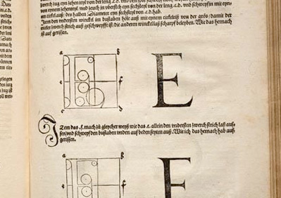
Albrecht Dürer’s contribution to typography took capitals in new directions.
His books on proportions, De Symmetria Partium in Rectis Formis Humanorum Corporum (books on the normal proportions of the parts of the human form) with Underweysung der Messung (instruction in measurement) cover drawing of human form, perspective – with a dissertation on Roman caps as well as gothics.
Both can be snagged in hi-res digital form from Octavo. Their Graphic Arts Bundle option also includes editions from Giabattista Bodoni (1740-1813), Geofroy Tory (c. 1480-1533) and Owen Jones (1809-74).
Dürer’s original letters exist today in the following fonts:
[1] Dürer Caps from P22

[2] Hands on Albrecht from URW
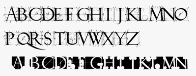
[3] Albrecht Dürer Gothic from Scriptorium

Dürer style
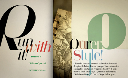
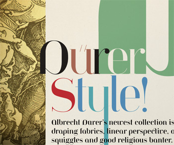
Sort of a 16th century fashion magazine spread.
Used as a promo piece for my Jeanne Moderno fonts. Available as a print or on a greeting card/notecard/postcard.
Dürer’s rhino
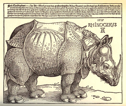
Albrecht Dürer’s Rhinoceros broadside, 1515
‘probably no animal picture has exerted such a profound influence on the arts’ -T.H. Clarke
The story behind Dürer’s Rhinoceros involves a Pope, some guesswork, a sketch and a shipwreck.
And the famous 16th century poster (above) influenced rhino art for years to come. This Wiki has some great historical detail (with derivatives) – including Salvador Dalí’s sculptural take on Dürer’s famous Rhino (below).
Salvador Dalí’s Rinoceronte vestido con puntillas, 1956
rhino prints
And one can snag a giclee print of Dürer’s rhino here. Or here. Or if a poster doesn’t suit and you’d rather have a tee, mug or stein, check out these wares at Cafe Press. This one hops. Or here’s basic black.
rhino book
The story behind the actual rhino became the basis for Lawrence Norfolk’s epic novel The Pope’s Rhinoceros. Snag a copy here.
rhino sale
Plus, a few years back – in lieu of a White Elephant – a handful of volunteers from ADAC had a White Rhino Sale. Because ‘white rhinos trump white elephants.’
Dürer said so. Flyer below.
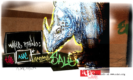
Design by mehallo and Jeremy McCain (with a little help from Dürer), 2006
Alta California: Named after a newspaper
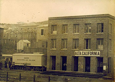
Alta California office, San Francisco 1851; found via Flickr
At one point in my life, I was going to be a journalist. So folly along . . . .
I love history, so every one of my fonts falls into some historical category (or categories, if you look at Jeanne Moderno).
Alta California is my artist’s response to Susan Kare’s early Macintosh font, San Francisco. And it was a tricky build, as I was literally going thru book after book after book of old types – then messing them up, then messing them up more; and redrawing the edges until I had what I wanted.
(Please note, when it comes to ‘grunge typography’ – I don’t trust anything automatic; I’ve always gone in and tweaked the edges until I have something that looks – printed. Printed poorly, but printed.) [Read more →]
Typeface: A Documentary
‘Charting the intersection of Rural America and Contemporary Graphic Design’
The film about the Hamilton Woodtype Museum is making the rounds.
Official site here. Pictured: promo prints for the documentary.
Found via “JE NE SUIS QU’UNE PAUVRE PLUME…”
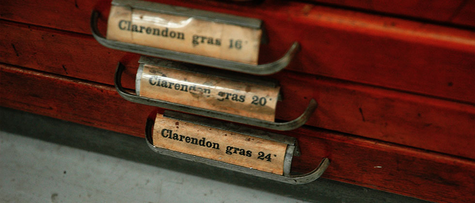
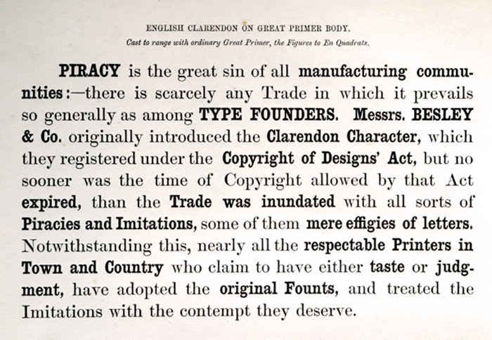
Slab serif ‘Egyptian’ types: A history
Here’s a detailed history over at Hoefler & Frere-Jones on slab serif typefaces; showcasing their new Clarendon-based Sentinel fonts.


