entries Tagged as [design history]
Parkinson FontCasts
Part 1 of 2
‘Jim is affable and funny and incredibly humble, despite the caliber and profile of his work. It was a joy to spend time in his studio as he casually pulled from his flat files one landmark piece of design history after another.’
Stephen Coles sat down with Jim Parkinson and talked about his beginnings as a lettering artist, working at Hallmark, work for Rolling Stone, Newsweek (Dope-n-beer! Will never look at the Newsweek logo the same again), the circus and ‘cigar-smoking twits.’ FontFeed articles here, and here. Videos above (and below).
Roger Black on Jim Parkinson
Part 2 of 2
Your Life Work Series: Printing
‘Hand compositors usually set the large type called ‘display line,’ used in advertisements and other printed matter. Hand composition offers opportunities for artistic expression. Compositors who have the ability to create original ideas are highly-paid craftsmen. The work requires manual dexterity, good eyesight and thoroughness.’
Vocational documentary on printing and typesetting. From 1947.
I like how he pronounces ‘ad-verr-tiz-mints.’
The Bunnies
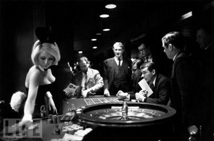
Playboy Bunnies everywhere!
Above, scene shot in the London Playboy Club, from the film Purab Aur Pachhim (1970). Love the guy’s glasses, tho subtitles would be helpful (long conversation at the end, no idea what they’re saying).
Pink Lady and Jeff (1980) was (yet another) ill-conceived variety show on NBC. And in one episode, Hef showed up with Bunnies and walked his way thru a musical number:
And
Below, Rabbit Roulette: At a Playboy Club, from LIFE magazine, 1967.
Click on the image for a vintage Playboy Bunny photo gallery.
Koch Tart Cards

‘a ‘Tart Card’ to support the St Bride Library, London’
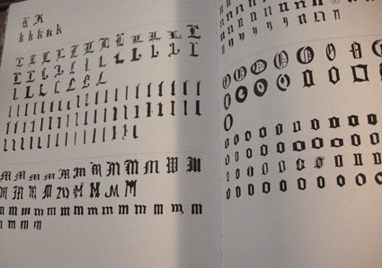
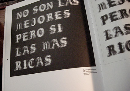
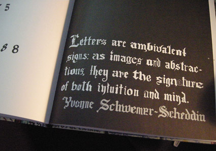
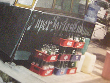
Mexican Blackletter
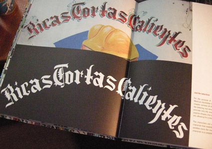
‘The letterform’s characteristics rely on ornaments and contrast, which are both playful and mysterious at the same time. The same as the market engulfs the shopper with its array of stimuli’ -CP
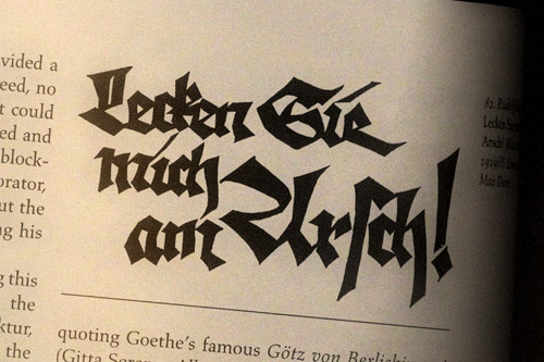
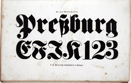
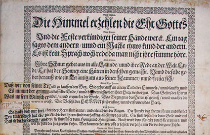
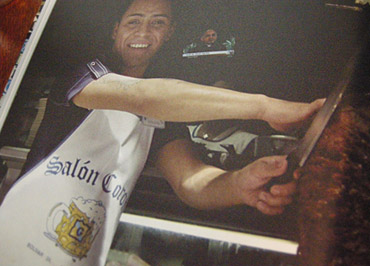
Cristina Paoli’s slim coffee table book Mexican Blackletter takes a look at the importation of blackletter types into the Americas (via Spain) and subsequent vernacular adaptations in Mexico.
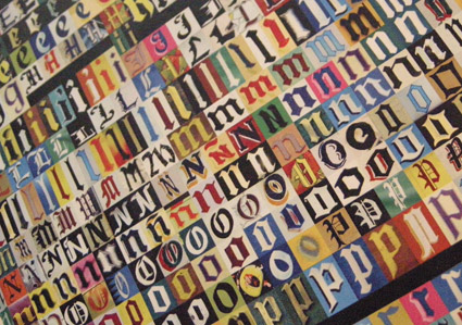
My favorite part is the breakout of multiple adapted forms, how they compare with each other (below) and how these forms have evolved into something distinctly Mexican.
Snag the book here. It’s a delightful read.
The Road Less Traveled
‘The Road Less Traveled takes its inspiration from American folk tunes from the likes of Pete Seeger and Bob Dylan . . . I have been really into the typographic work of Ed Ruscha and inspired by the typography that appears on old fruit crate labels. Both have a very ‘American’ feel to me just like the song’ -Matt Owens
Matt Owens’ The Road Less Traveled. More details here.
Found via Oded Ezer
Dead Sea Scrolls and Gutenberg, locally
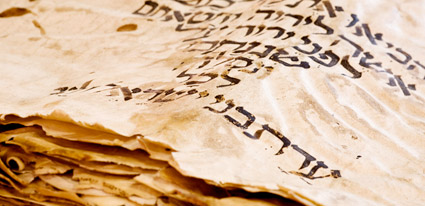
Opening April 8, 2010 at the Bayside Church in Granite Bay, CA is ‘From the Dead Sea Scrolls to the Bible in America,’ an exhibition featuring five pieces of the Dead Sea Scrolls.
Also on hand will be some rare Bibles including (reportedly) an original by Gutenberg.
More information here. SacBee article here.
Found via Susan Poirier
Blackletter in Mainz
I Love Typography takes a look at the holdings of the library of the Gutenberg Museum in Mainz. More than just Bibles.
Article here.
