entries Tagged as [design history]
Jenson’s Italic
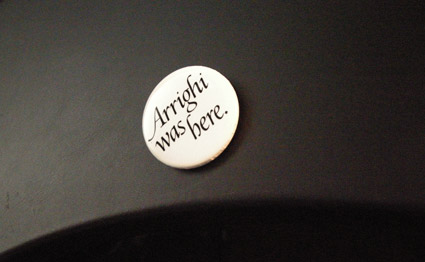
‘Arrighi was here’ button by George Abrams
Any current drawing of the type work of Nicholas Jenson (1420-80) that includes an Italic is doing a little fudging. Since (like Trajan and lowercase), Italic wasn’t quite around yet when Jenson was making type.
Typically the work of Ludovico Arrighi (1475–1527) is adapted as the companion font to Jenson – as the Italic.
Monotype did this with its Jenson-influenced Centaur – and Adobe Jenson sports an Arrighi-influenced italic. [Read more →]
Trajan with lowercase
Why doesn’t the Trajan font have lowercase?
Traditionally, Trajan is based on a carefully drawn and carved inscription at the base of Trajan’s Column in Rome – crafted sometime around 113 A.D.
And basically, lowercase didn’t exist yet. What we call lowercase – minuscules, our second alphabet – evolved over the next 1000 years (or so).
So what would Trajan look like if it actually did have a lowercase? This is open to interpretation.
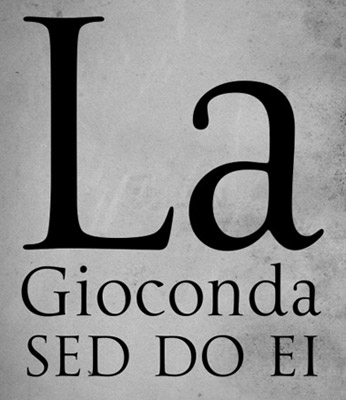
Dave Farey and Richard Dawson’s La Gioconda is one take on this, adapting the 16th Century lettering of Giovanni Francesco Cresci as the companion letterforms.
Check it out here.
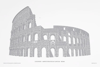
Reimagining the Roman Colosseum with type
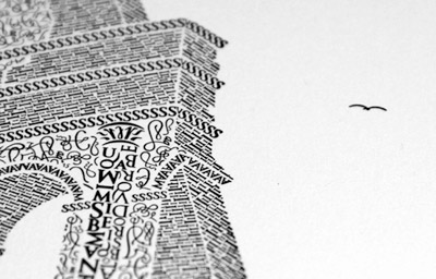
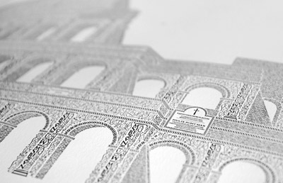
‘Over the course of the next 12 months, the artwork was handcrafted character by character, totaling roughly 250 hours of work from start to finish. Characters from the Goudy Trajan and Bembo Pro typefaces form the Coliseum (or Colosseum)’
Cameron Moll’s limited edition Colosseo letterpress posters. Video above, more project details here.
MoMA and the history of @
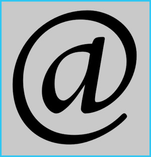
‘MoMA’s announced what might be its boldest acquisition ever. And it didn’t even cost anything: The ‘@’ symbol is now a part of the museum’s permanent design collection.’
Article here.
Pictured above, the @ symbol from Goudy’s Bertham font.
Making Metal Typefaces in the 21th Century
‘This project has a dual goal of documenting the almost-lost skill of creating metal fonts and of capturing the personality and work process specifically of practitioner the late Canadian graphic artist Jim Rimmer (1931–2010)’
Richard Kegler’s long-delayed documentary, Making Faces: Metal Type in the 21st Century, has just secured just enough funding for completion.
For more about the film, go here and here.
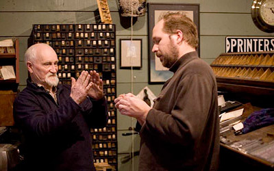
Rimmer and Kegler
McGrew is back
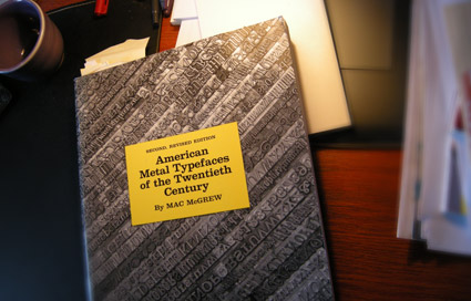
‘Mac McGrew’s 1993 2nd, revised edition is an important book for any printer, collector, student or aficionado of letterpress type. Equally valuable as a typeface reference and an insightful history of the typemaking industry in America.’ –Letterpress Type
THE book on metal typefaces cast in America (hint: not all of them have been digitized) is Mac McGrew’s American Metal Typefaces of the Twentieth Century.
Long out of print, this 398 page resource is available once again. Snag your copy here.
Pictured: my dog eared, Post-It note filled edition.
Found via Steve Matteson
The International Printing Museum: New logo, new site
One of the coolest printing history finds in the Los Angeles area is The International Printing Museum in Carson.
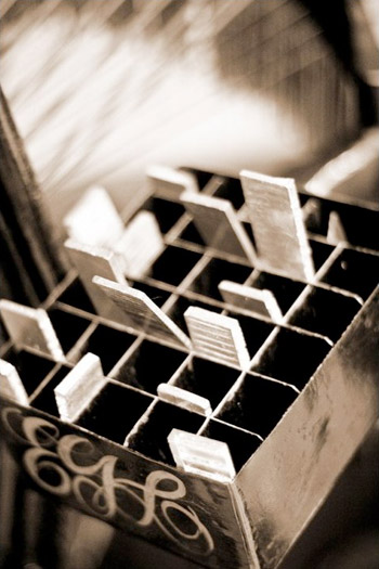
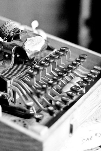
Tucked away in an industrial section and run by the incredible Mark Barbour, the museum hosts an amazing collection of rare equipment, The Book Arts Institute (Hi Rachelle!), The Wayzgoose Gazette, a gallery, library and more.
And now they have a new RSS-friendly blog-based website – sporting a new logotype (above) created by Gina Pirtle Simpson.
Click on any image to visit the museum’s website/jump.
Museum photographs by April Rocha
Support St Bride
‘The St Bride Library is the largest library for printing, publishing and the graphic arts in the English-speaking world.’
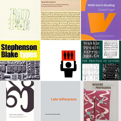
The St Bride Library now has a shop. Limited edition type/printing books, snag em here.
The Clarendon trend
Just had a discussion – and major test question – involving 19th Century wonder Clarendon in my history class. As a type, Clarendon has been popping up all over the place for a bunch of years now.
I use it (paired with Jenson) for handouts in my introductory type course at ARC, up until recently, it was the corporate font for Starbucks . . . it just boldly says, read me.
New article (and cool samples) posted by SOTA’s Tamye Riggs here.
