entries Tagged as [design history]

Doret’s type

I have one little parallel with Michael Doret.

I like to do type revivals – interpretations – of vernacular lettering that we often take for granted.

My Martini at Joe’s fonts are all about this. I based them on my favorite restaurants, the Joe’s of Northern California.

And Doret based his fantastic Deliscript on signage lettering of world famous Canter’s Deli on Fairfax in LA. This led to him developing their catering truck. All elements of an incredible body of work. [Read more →]

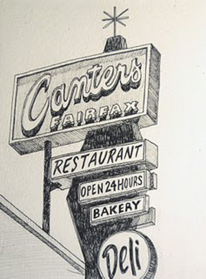
Canter’s in pen and ink

The work of Michael Rubin.

Glaser’s mom’s spaghetti

Legendary graphic designer Milton Glaser has been a foodie for years.

His original Underground Gourmet column for New York magazine – collected in book form here – looked at NY ethnic cooking before the rest of the food world jumped in.

And his mother’s very Jewish spaghetti recipe takes things to a whole other place.

Recipe here.

And Glaser can be seen explaining how it came together – which in this version includes the extra step of baking before frying – in Wendy Keys’ documentary Milton Glaser: To Inform and Delight (2008).

Photo found via Slumber Dept

Hating Saturn

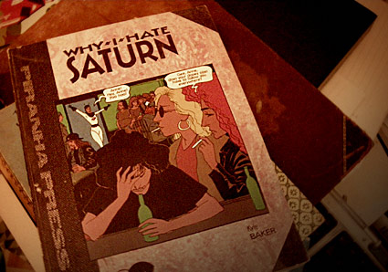
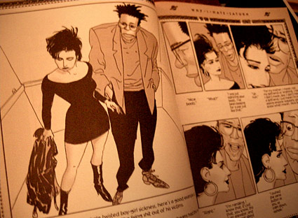
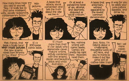
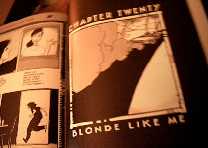
Kyle Baker’s brilliant Why I Hate Saturn could have been Seinfeld. But the television powers that be passed on it.

Even though it was optioned, the network at the time didn’t feel that the American Public would be interested in watching a show about neurotic New Yorkers.

A time capsule from 1990, Why I Hate Saturn is a fable for anyone who is still trying to find themselves. And for anyone who has a freaky sibling.

No answers, just (mostly) relatable life. With a pretty scary bad guy named Murphy (or Warner).

Snag a copy here. Review here. Kyle Baker’s website here.

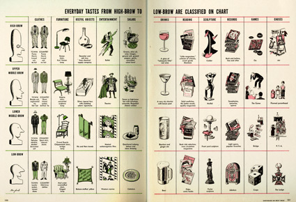
Highbrow to Lowbrow taste

‘The first usage in print of highbrow was recorded in 1884. The term was popularized in 1902 by Will Irvin, a reporter for The Sun who adhered to the phrenological notion of more intelligent people having high foreheads.’

Russell Lynes famously satirized the concept of ‘Highbrow, Lowbrow and Middlebrow’ in an article published in Harper’s Magazine in 1949.

That same year, Life magazine published the chart (above) to sort out the particulars. Works as a nice supplement to my own Taste chart.

Click the above image to view larger.

Found via Holly Hadley Agundes

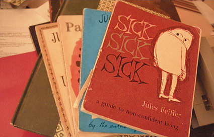
Feiffer

Passed along books are great.

That’s how we ended up with dog-eared copies of Jules Feiffer’s first books, collections of his beat era comic strips for The Village Voice.

Feiffer did his weekly loose, sketchy strip for 42 years – eventually canceling it when he felt the audience just wasn’t there anymore. [Read more →]

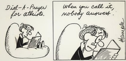
Allen comic strip

‘Woody, the pen-and-ink protagonist, was angst-ridden, flawed, fearful, insecure, inadequate, pessimistic, urban, single, lustful, rejected by women’

My first ever exposure to Woody Allen came from a comic strip. One that floated around the daily paper.

The very neurotic Inside Woody Allen was drawn by cartoonist Stuart Hample – and ran in newspapers from 1976-84.

The author explains what it was and how it happened here.

Retrospective book available here.

Hample passed away in 2010. Career overview here.

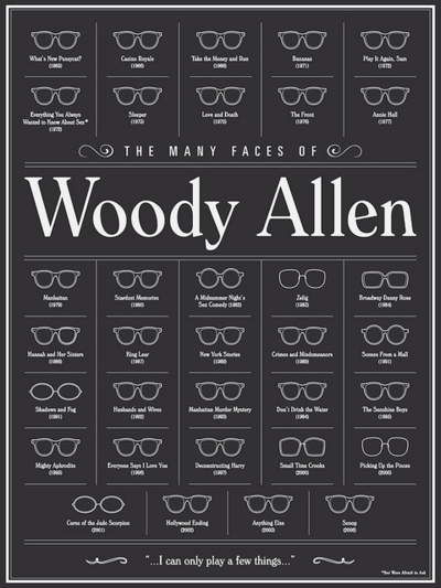
Allen

‘The Many Faces of Woody Allen’ by Brandon Schaefer. Prints available here.

Click to view larger/jump to source.

Found via a place for pretty things & the occasional giggle

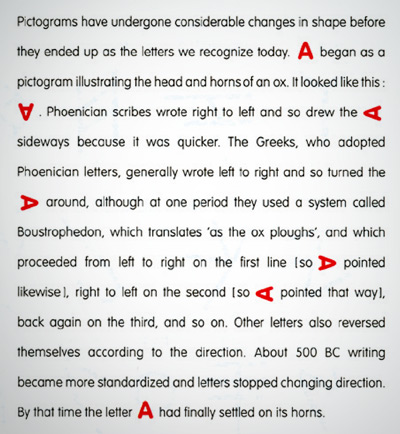
The letter A

A look at the letter A. From Alan Fletcher’s The Art of Looking Sideways.

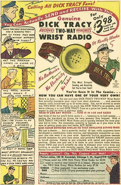
2-Way Wrist Radio

‘Alfred Gross said yes, and in January, 1946, the Dick Tracy cartoon was changed forever with the introduction of the iconic two-way wrist radio.’

Wrist radios today – here.

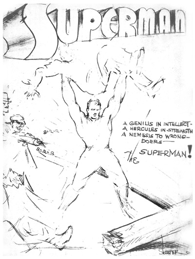
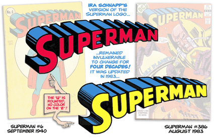
Superman: The logo

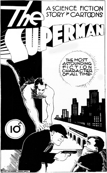
A look at the design and evolution of Superman’s logotype.

Detailed article here.


Creative Commons License

the work at the mehallo blog. beta. is licensed under a creative commons attribution - noncommercial - no derivative works 3.0 united states license.  if reposting, credit must be given to steve mehallo - and if possible, please provide a link back to the mehallo blog. beta.

i include images for the purpose of critique, review, promotion and inspiration - and always make my best effort give credit/link back to the original source.  if i’ve screwed up, please fire me a note.

page layout based on the wordpress 'darkwater theme' by antbag, adapted and redesigned by mehallo.  valuable php assistance from bill mead.