Taste and graphic design
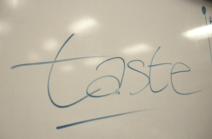
I’ve been drawing my ‘taste’ chart on a white board for about six or seven years now.
Taste in graphic design is a concept I’ve been aware of for a long time – but as I looked out at what other designers were doing, taste wasn’t always a part of it. I kept seeing graphic designers who were stuck in one mode and not going any further.
‘I know that’ – is typically the term that shuts down most creativity. I’ve heard it from a lot of professionals in my field.
Diversity is the key to being a graphic designer today. Understanding concepts of other design industries – fashion, interior, architecture – even music – takes one further.
So one day in a classroom, I spontaneously drew this ‘taste’ chart.
I’ve since used it with clients, students and other designers to show different ways of approaching graphic design – so we’re not all just sitting here with blinders on, our heads in the sand.
‘Taste cannot be learned’
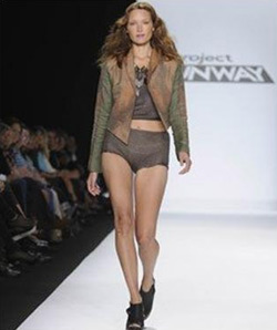
I’ve heard Nina Garcia (on Project Runway) mention this a few times. And I don’t agree with it. I think the first step in understanding ‘taste’ – which is ubiquitous with fashion design – is to realize it exists.
Pictured above, questionable taste from Project Runway 8
By nature, Taste is a qualitative thing. Intangible. Can’t be quantified, easily explained. But fashion designers are tied to it, and it’s a major part of design.
One knows good taste when they see it.
taste and retail
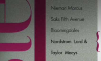
My chart itself is a very simple construct – many people already understand it. As a consumer-based society that loves to shop – drawing a chart of department stores and their perceived ‘taste’ level is a good model.
It works for department stores – most ‘get it.’ For those who don’t – it’s an eye opener. That there’s something beyond just heading out to the local Kmart.
To find the level, I put a ‘liquor store’ at the bottom. Closeout stores (such as Ross) aren’t on the list, since they sell post-season merchandise. And my students typically know what goes where. Opinions, arguments: always welcome.
It gets interesting when I discuss with students why certain stores hit at certain levels. And how the chart is constantly in motion.
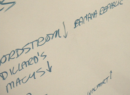
And how Nordstrom – piano and all – isn’t at the very top.
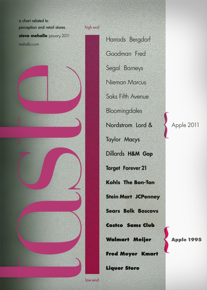
Taste chart: click to view larger
We talk about how Target and Kmart – which were basically the same store – managed to move up and down the chart. Kmart pioneered bringing in designers (such as Joe Boxer and Martha Stewart) but Target perfected it (starting with Michael Graves), using good design as a basis for just about every product they now carry.
Walmart is an interesting anomaly – in that they’ve recently become self-aware. High end designers at Walmart didn’t work. And there’s been tons said about how Walmart has destroyed the American Way of life.
But Walmart gets it. Dropped the MERICAN STAR from their logo, replaced it with a sunburst symbol (which I refer to as an asterisk– which one student said ‘means their batting average is in question’) and a tag line that really symbolizes who they are right now.

When talking about the very top I reference the brilliant sweater scene from Devil Wears Prada (2006), below. It IS how design works. Someone creates something incredible and it works its way down to the everyday consumer. This happens in all industries – sometimes the inspiration leads to great things, other times, not so much.
How everything falls into place on the chart leads to a long discussion.
Why JCPenney isn’t what it used to be and how Macy’s – which once competed with Nordstrom – is dropping fast. I rant about how Macy’s should NOT have a queue when it comes to purchases. THAT – and an overall cheap approach to their in store merchandising – is dropping them fast.
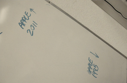
sidebar: apple
Apple in 1995 and Apple in 2011 is worth looking at.
And what Apple did to move up the chart so fast. It has a lot to do with candy coating and taking a technology company into the realm of high end fashion. Today Apple stores are boutiques. Alongside Burberry, Louis Vuitton.
I’ve been asking classes (for years now): ‘Who’s owned an iPod?’ and ‘Who’s owned a Zune?’ Non-scientifically, about 2 percent of my classes will have Zune owners, 90% are in the Apple camp.
Steve Jobs knows how to leverage taste in design. And it works very well.
how I use the taste chart
I have clients in multiple industries – so I have to hit the mark, not just go with what ‘I like.’
I use the chart to start discussions – about what design really can do. More than just ‘here’s a logo, slap it on something.’ I’ve used the chart with clients, often just scribbling it on a piece of paper.
It helps define where the work should be headed – who the client’s audience is vs. what the client’s tastes may be. Gets both client and myself to buy off on what direction the design should take.
Designer Gerry Simpson puts it this way: ‘Don’t let your personal taste get in the way of your work.’ If your taste isn’t in sync with the audience you’re designing for – the results won’t be there.
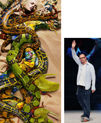
One HAS to change their taste to fit the project. Gloria Vanderbilt’s tastes are a bit different than the audience she designs for. And Alexander McQueen’s own wardrobe was more humble than his couture work (below).
learning taste
Absorb. All one can. Inspiration can come from anywhere.
My blog is all about showing design in its many forms. With many different levels of taste. Read blogs, read books, magazines. I get a lot of inspiration by just grabbing what I find at a newsstand. (And I prefer other Vogues over the US model. Surprising to note: US Vogue has such surprisingly bad typography.)
Inspiration is everywhere. Taking that inspiration and zeroing in on what will work for the job is part of these levels of taste.
And knowing if you’re designing for a ‘Walmart’ level audience, a ‘Bloomingdales’ approach simply isn’t going to cut it. And vice versa.
In graphic design, being at the wrong taste level: ‘The message isn’t going to communicate to its intended audience.’
That’s the point of failure.


Very interestting way to look at how we represent ourselves and others. I shall dress more thoughtfully today, thanks!
I find that the most importat thing in our society today is to just have the look… The real thing is not important as long as you have the look as long as you can get close to your real desire without the price tag… Why do you think inexpensive knock offs are so popular… Not all knockoffs are illegal for example, a person can’t afford to buy a Bentley so they go to Crysler and buy a 300 in which Crysler has designed as close to the Bentley as possible without bringing a lawsuit upon itself for knocking off the style of the Bentley… You buy Mocs so you don’t have to pay the price for Crocs… This society is force to compete with the rich and famous at every turn even though their paychecks can’t compete…
I was amazed, when teaching design students, at how many truly have no barometer for good taste whatsoever. I agree that it can be taught to an extent, just as someone who’s tone deaf can be told what music is good and what is bad, but they’ll never really “get” it if they don’t have a feel for it to begin with.
In a way, this gets to the heart of my issue with the for-profit education model — they’ll let anyone who can write a check in the door, but what kind of designers will these people be, who may not have any innate “eye” or sense of taste whatsoever? Should design be exclusive to those with taste? I mean, shouldn’t some higher standard apply whether you’re designing corporate annual reports, commercial ads, or skateboard decks? In fact, as a designer, isn’t it our responsibility to apply a high standard of taste, no matter the stylistic or content requirements of the job?
It is.
And the interesting thing is to see who goes in what direction. One thing I’ve noticed teaching all these years, one can’t easily predict who will ‘get it’ and who won’t. Especially starting with a pool of students who haven’t yet quite found themselves.
Tho I also look at it this way:
Someone’s gotta work at the PennySaver.
I wish there were more good taste in graphic design – it’ll just lead to a more beautiful society.
But reality is: liquor stores exist. And someone has to design for them.
This is something I will always keep in mind, its so simple yet quickly overlooked.
[…] That same year, Life magazine published the chart (above) to sort out the particulars. Works as a nice supplement to my own Taste chart. […]
good article…
Hi there, just became alert to your blog through Google, and found that it is really informative. I’m gonna watch out for brussels. I will be grateful if you continue this in future. Lots of people will be benefited from your writing. Cheers!…
Websites worth visiting…
[…]here are some links to sites that we link to because we think they are worth visiting[…]……
flexibility in implementing…
[…]according to their particular circumstances and[…]…
Garmin 1490t…
[…]below you’ll find the link to some sites that we think you should visit[…]…