entries Tagged as [design history]

Dr Pepper’s (original) secret formula (maybe)
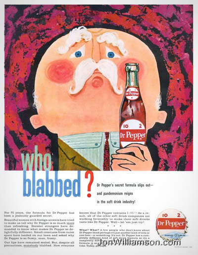
‘Poking through antiques stores while traveling through the Texas Panhandle, Bill Waters stumbled across a tattered old ledger book filled with formulas.’

The Dr Pepper company says this ain’t it. Others think otherwise.

The formula in the ‘Castles’ ledger purchased by Bill Waters contains (among legible ingredients) ‘gentian root, sweet flag root, mandrake root, wahoo bark, cinnamon bark, cardamom, coriander, cloves, diluted alcohol, syrup, glycerin’ and is labeled, ‘D Peppers Pepsin Bitters.’

Like another pharmacy invention, Coca-Cola, Dr Pepper’s secret flavoring formula is the subject of much conjecture.

Time frame and location are all right. More info here and here.
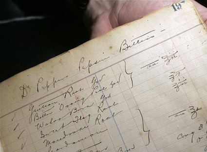

The ‘D Peppers Pepsin Bitters’ page from ‘Castles Formulas’
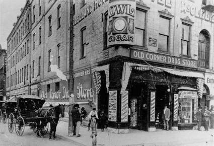

The birthplace of Dr Pepper: Morrison’s Old Corner Drugstore, Waco, TX

1960 advertisement (top) found via Jon Williamson
Italian soul

‘This track is the representation of GLUTTONY as being an obsession for the classics of soul music.’

Music video for Micha Soul’s Soul Food. Video produced by Frame24.

Good Ol Font

Hobo, of course, was the font of choice for Them Duke Boys (1979-85). Theme sung by Waylon Jennings.

War Pigglies

Tex Avery’s Blitz Wolf, Academy Award-nominated war propaganda cartoon from 1942. Uncut version.

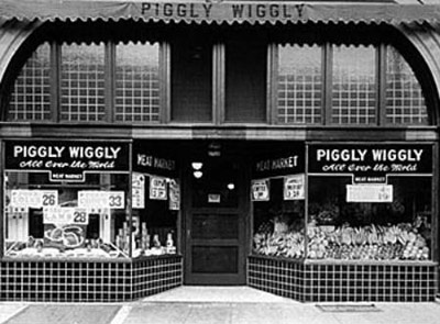
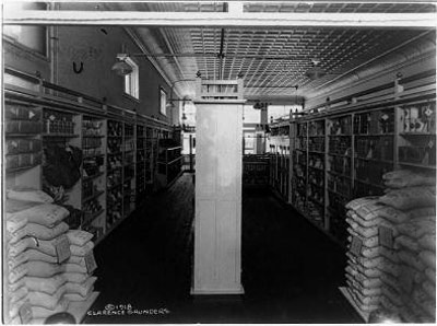
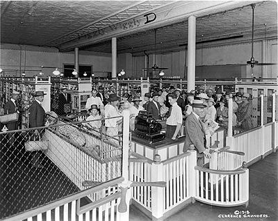
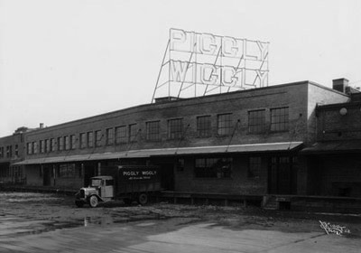
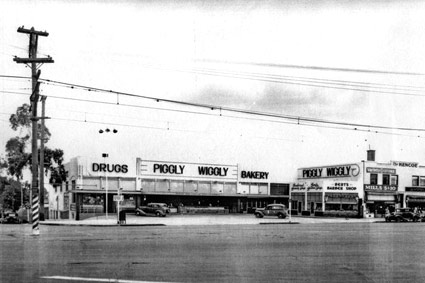
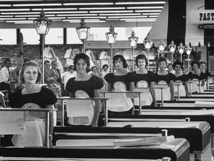
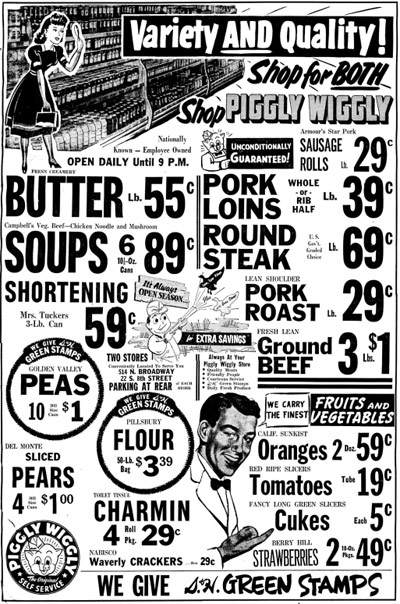
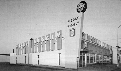
Old Piggly

‘America’s first true self-service grocery store’

Vintage Piggly Wiggly photos. Snag a tee here.

And here’s a bit about where supermarkets come from.

Photos found via Afiler, The Spokesman-Review, Vangobot, Citizendia, Multiply, Keyposters and Emulsion Compulsion

Old Hillsdale

‘Located on the famous ‘El Camino Real,’ just 20 miles from San Francisco. This beautiful shopping center offers the newest and most modern shops and stores. Color photo by Igor Stchogol.’

The Macy’s at just opened Hillsdale Mall, San Mateo, CA. Postcard from 1954.

Found via Utahkid

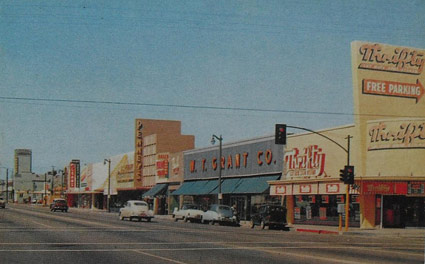
Old Penney, Thrifty, Grants

1950s postcard, Bellflower, CA. From the book, Boring Postcards USA.

Found via Christian Montone

Old Penney, new logo

JCPenney last ‘officially’ updated their logotype in 1971 – changing from a custom script (seen above) to Helvetica, set clean and neat (below).


1971

And last night – in a series of Academy Awards spots – jcp unveiled its new moniker (at bottom). Red box (retained from originally, their ‘it’s all inside’ campaign), lowercase helvetica, still clean and neat.

‘The winning design was provided by Luke Langhus, a third-year graphic design student at the University of Cincinnati.’

I do like when a redesign keeps the flavor of the original – here’s the official press release. Although this update does beg a few questions:

Doesn’t this look a lot like what GAP abandoned last year? And is the connection to Target’s brand a bit too obvious? And is ‘crowd sourcing’ how they went about this?

‘Participants included the Company’s associates, several design agencies and two art schools – University of Cincinnati and Rhode Island School of Design – that collectively submitted over 200 designs for consideration.’

I hope on the labor front, logo development participants were not as crowdsourced as is becoming commonplace. And it is a risky move to go this route – some could say jcp is running with what GAP chose to reject.

Though in the end, good merch behind the logo will determine what happens next. ‘What’s inside’ is still more important than not.


2011

1964 Penneys architectural drawing found via Vintage Seattle, click image to view larger, more/jump

Goudy’s Trajan

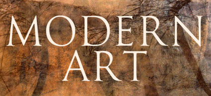
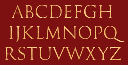
‘Not to be confused with Adobe’s Trajan typeface (which is very similar), this face is based on the drawings by Frederic W. Goudy of his rendition of the capital letters inscribed on the Trajan column in Rome.’

Expressive, classical.

Nick Castle’s digital version of Goudy’s Trajan, a reworking of one of Goudy’s lost fonts. Free trial version available, download here.


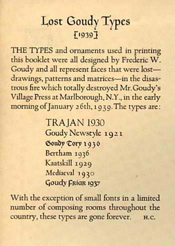
Lost Goudy Types, set by Howard Goggeshall, 1941


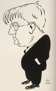
F.W.G. by Cyril Lowe

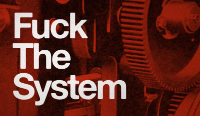
‘Fuck The System’

Just my mindset this morning.

Set in Alte Hass Grotesk, a free font based on the ‘cold type’ version of Helvetica. Download here.

‘Make Jobs,’ still free

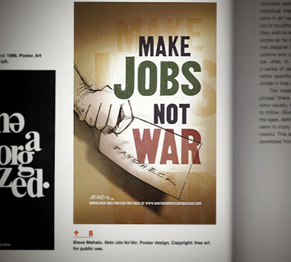
Former student takes design class. Former student notices my work in his textbook. Sends me an email. Photo, above.

Mike Dunkl spotted my 2003 ‘Make Jobs Not War’ poster in his copy of Design Basics: 8th Edition – with some academic text explaining how my visual works (below). Aside from the pencil illustration, I lifted the gothic type directly from a 1912 American Type Founders specimen book. (The green color means ‘money,’ btw) (And there are two ls in ‘mehallo’)

In 2003, jobs were drying up and we were about to go to war on some really flimsy evidence. I felt I had to say something, so I did. My poster – among others – became available for free download at Another Poster For Peace.

At the time, anti-war statements were not the popular thing. Though for me, it was the right thing to do. When the war started, I was following a young Iraqi’s ‘live from Baghdad’ blog up until he stopped posting. Never knew what happened to him – another innocent lost to history.

I still stand behind my poster. Evidence of why we ended up in Iraq in the first place has turned out to be far more flimsy than imagined  . . .  and today, we’re still at war. And the jobs have simply gone away.


Creative Commons License

the work at the mehallo blog. beta. is licensed under a creative commons attribution - noncommercial - no derivative works 3.0 united states license.  if reposting, credit must be given to steve mehallo - and if possible, please provide a link back to the mehallo blog. beta.

i include images for the purpose of critique, review, promotion and inspiration - and always make my best effort give credit/link back to the original source.  if i’ve screwed up, please fire me a note.

page layout based on the wordpress 'darkwater theme' by antbag, adapted and redesigned by mehallo.  valuable php assistance from bill mead.