Alexey Brodovitch, good layout

‘There is no recipe for good layout, but what must be maintained is a feeling of change and contrast.’ –Alexey Brodovitch (1898-1971)
Photo by Man Ray, layout by Brodovitch for Harper’s Bazaar, 1934.

‘There is no recipe for good layout, but what must be maintained is a feeling of change and contrast.’ –Alexey Brodovitch (1898-1971)
Photo by Man Ray, layout by Brodovitch for Harper’s Bazaar, 1934.
‘Her work was published for the most part in Harper’s Bazaar, between 1950-1965.’
The photography of Lillian Bassman. Beautiful geometric constructs shot in black and white.
Music by Budd/Wright, In the Midst of Life.
‘For every pair of glasses you purchase, Warby Parker will donate a pair to someone in need’
Vintage styling, Netflix-like purchasing system, charitable donation.
All frames 95 bucks. Details here. Buy here.
Found via Shandi Pierzina

Canadian Club advertisement, 1928.
The work of commercial illustrator and fashion design pioneer Ernst Dryden (1887-1938).
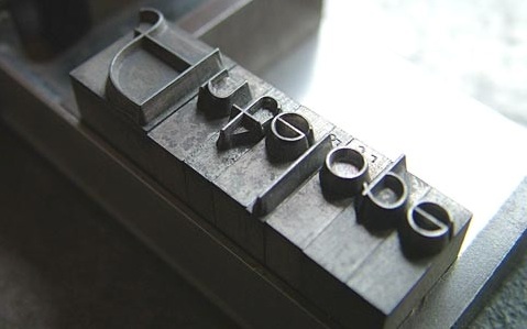
‘Bernhard Fashion. This typeface was designed by Lucian Bernhard and introduced by American Typefounders in 1929.’
Found via Emily McGuiness
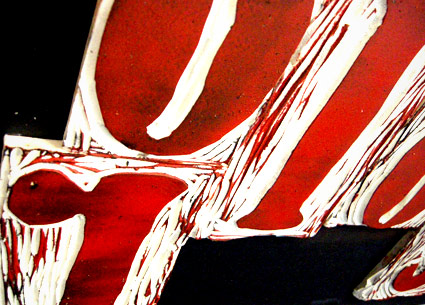
‘I was working on maintaining the quality of Bernhard’s handdone type while taking a new and different approach to it’
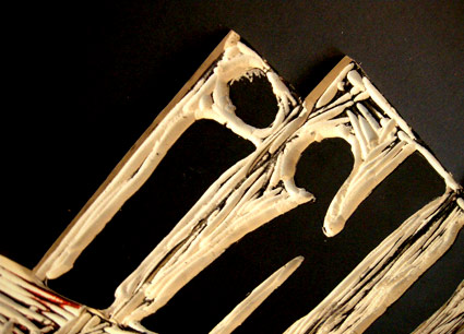
Student Lesley Gaesser’s large scale final project from my experimental type course at The Art Institute of California Sacramento.
Lesley did an 11 week study on the work of designer Lucian Bernhard (1883-1972) – which culminated in a final linocut-inspired project.
Bernard’s Antiqua type was traced onto Speedball carving blocks, cut by hand, inked and printed on large sheets of watercolor paper.
My next experimental course begins April 8.

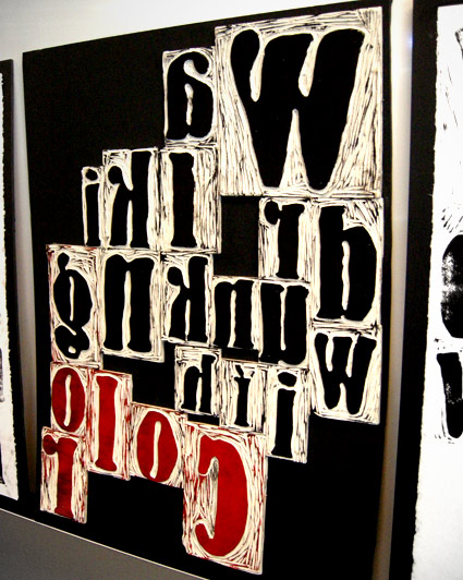
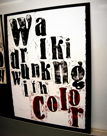
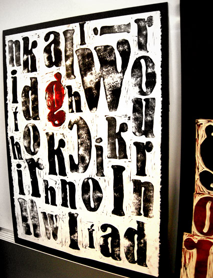
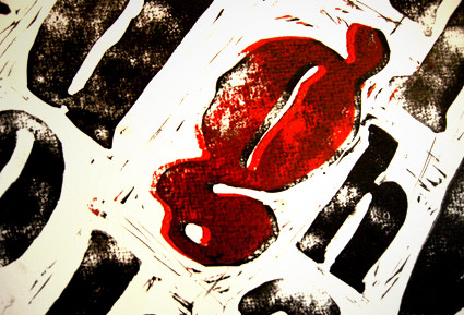
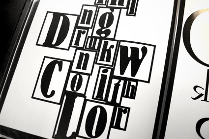
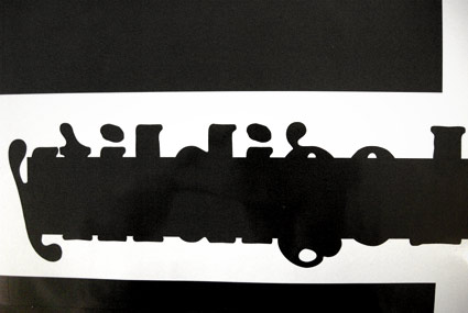
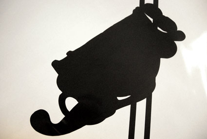
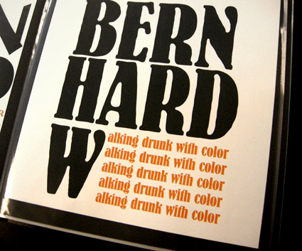
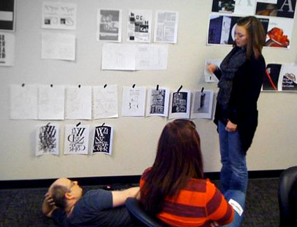
If student hangs roughs low on the wall, one can only critique if lying on the floor; Photo by Daniel Mendez
Rare Jan Tschichold book design, featuring his use of an early prototype of the Alta Calfornia font.
Cloth cover for Das lustige Buch (The Funny Book), Verlag der Bücherkreis GmbH, Berlin, 1931.
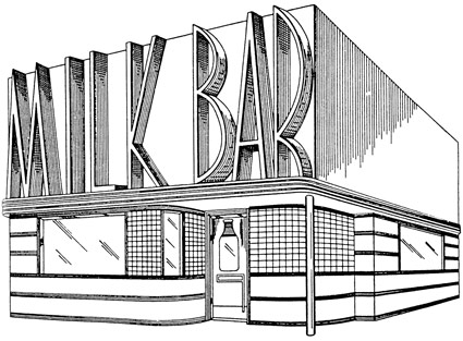
Store front design by Harry L. Wyman, 1939. US Patent Office drawing.
Found via Great Inventions, Good Intentions
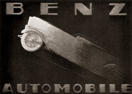
Advertisement for Benz Automobiles by Adalbert Roth, 1928.
Found via Advertising Art in the Art Deco Style
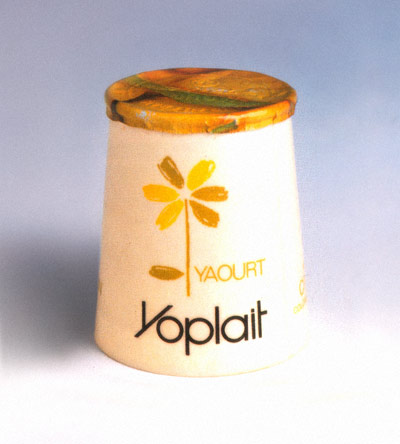
‘Their logo is a six-petaled flower designed by Phlippe Morlighem, each petal representing one of the six main cooperatives founders’
I remember when Yoplait yogurt worked its way into the US. Late 1970s.
In the dairy section of the store there were all these everyday milk cartons, cottage cheese and yogurt packages. And standing out amongst them was Yoplait. Looking very French.
Naturally, it was the one I had to try.
Photo found via Packaging Source Book