Food in Jars
I love canning stuff. And it’s getting to be the time of year to cram some stuff into bottles.
Pictured, logo design by Roger Estes for Marisa McClellan’s Food in Jars blog.


I love canning stuff. And it’s getting to be the time of year to cram some stuff into bottles.
Pictured, logo design by Roger Estes for Marisa McClellan’s Food in Jars blog.
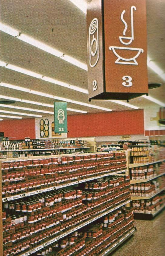
‘And so was born the ‘shop-at-a-glance’ concept’
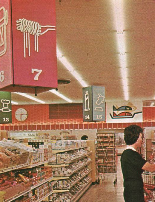
An ill-fated design experiment from 1965: Ralphs remodeled with departmentalized, color-coded graphic icons. Article here.
I use a lot of color coding in my own work – but with the assumption that the end user will need other organizational tools to find their way around. ‘Shop-at-a-glance’ never quite caught on; tho I’d love to see what data Ralphs collected as part of their process.
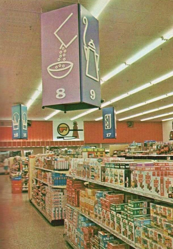
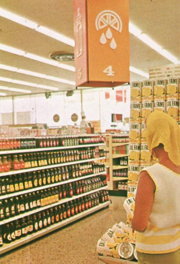
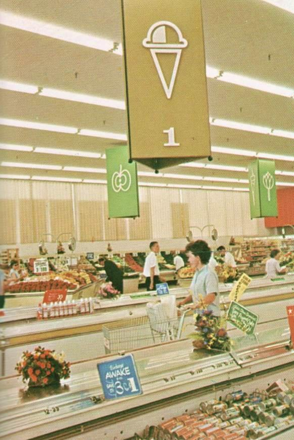
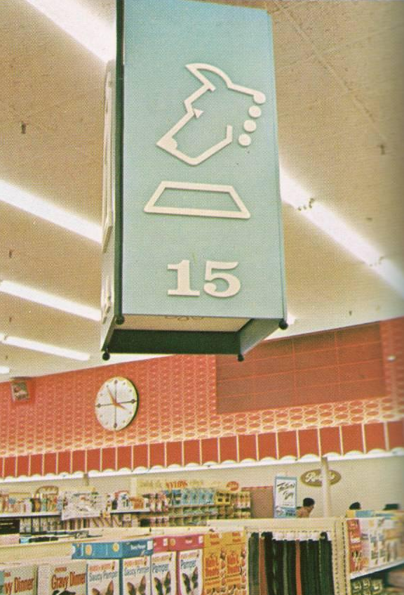
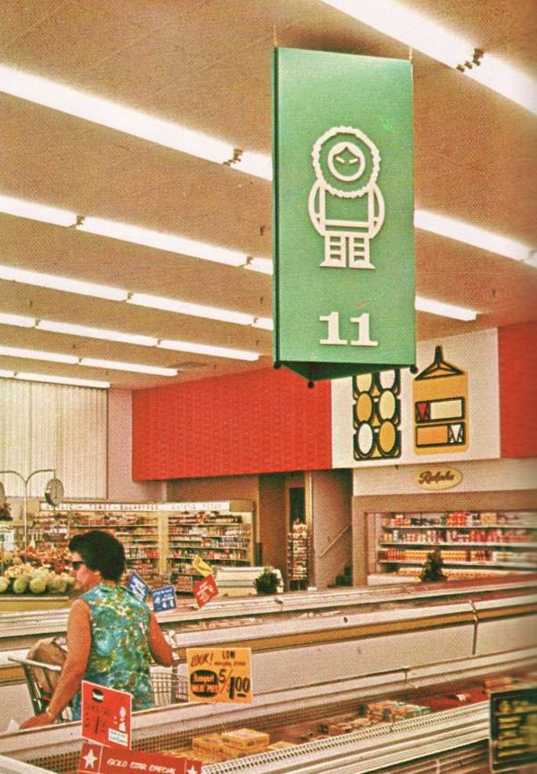
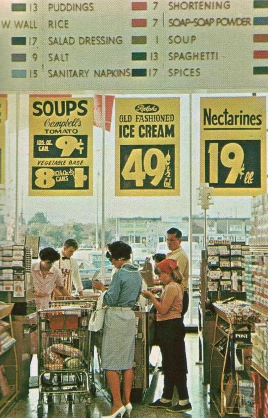
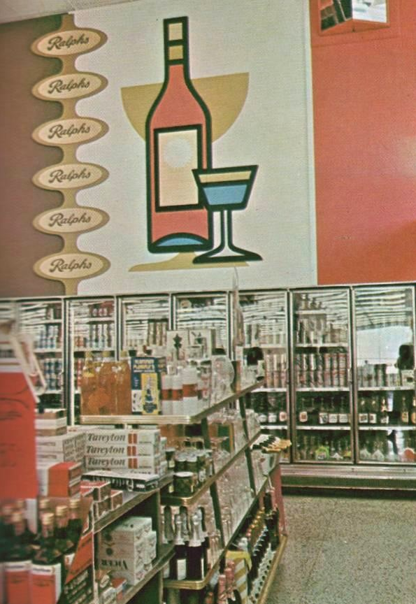
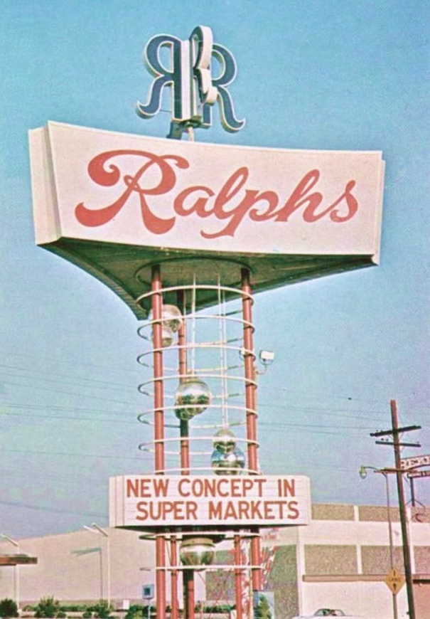
Found via Pleasant Family Shopping
‘Having many food and chemical sensitivities has been a largely trial-and-error process for what can be tolerated and what can’t, and has resulted in many creative kitchen science experiments’
Web designer/cartoonist (and former student of mine) Annie Hero has developed some major health problems. Recently, she’s taken to blogging about her approach to reclaiming her life from years of processed food intolerance.
Annie’s WTF are you eating? can be found here.
‘The company injects fatty beef trimmings with ammonia to remove E. coli and salmonella’
Ammonia in the beef. Sawdust in the cookies. Orange juice on life support.
Today’s US food processing industry is similar to a big Hollywood production of an apocalyptic society, arrived early. Fast Food Nation and FOOD Inc. were appetizers.
Read CRACKED’s The 6 Most Horrifying Lies here.
CRACKED? Yes, the humor ‘mazagine’ I read when I was a kid turned snarky humor website is now an investigative news site. Another sign of the apocalypse.
Photo by Carol Guzy/Washington Post
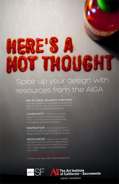
‘Spice up your design’
Hanging on the walls at Ai Sacramento: AIGA poster, designed and photographed by student Devon Cloutier.
At one point, there was a text change and in lieu of starting over, Devon fixed it – orally, swallowing a lot of the saucy rooster.
Designers do suffer for their art.
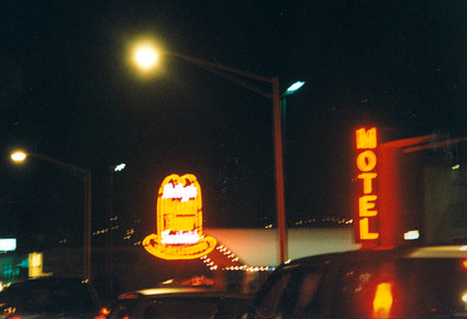
South San Francisco Arby’s, photographed 1991
I have a soft spot for Arby’s.
The food isn’t great. But when I was a kid, there wasn’t an Arby’s nearby – so heading to the South City location, which showcased a super cool flashing chuckwagon-themed neon sign, was always a special trip.
It was years before I even tasted what REAL sliced roast beef was – who knew it wouldn’t have a salty, lunchmeat-like boiled flavor?
Back then, Arby’s house BBQ sauce was sold in take home bottles; which today I’ve replaced with a knockoff recipe. The trick to a good sauce is a long, slow simmer and the right non-HFCS ketchup. Trader Joe’s Organic makes a great base. [Read more →]
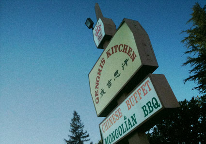
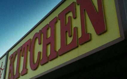
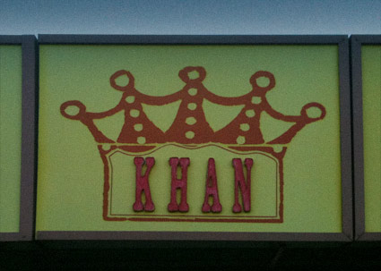
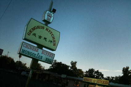
Up until a few months ago, I was living down the road from this place. I love the name, the food: not so good. Which may explain its recent closure.
Mongolian BBQ has nothing to do with Mongolia, but is a cuisine unto itself. Not anywhere near highbrow, not exactly a real BBQ. It’s a Taiwanese invention, a greasy, interactive meaty experience; the best I ever had was somewhere in Denver. The sport is all about getting as much slammed into the bowl as possible (flattening out the meat) so the food is plentiful and the trips to the grill are few.
Places with extra ingredients (such as shrimp, lamb, tofu) and seasonings (Italian herbs, Cajun spices and Rooster Sauce) are special. Ginghis (Khan) Kitchen, unfortunately, had neither. But – cool name, cool sign.
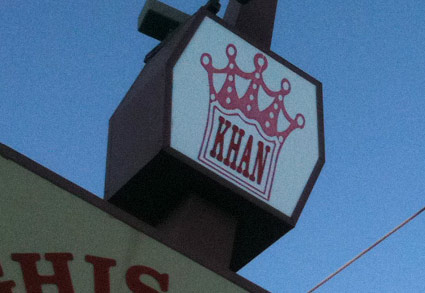

Photos by mehallo
Art Nouveau meets Russian Constructivism. Motion design by Matt Duplessie.
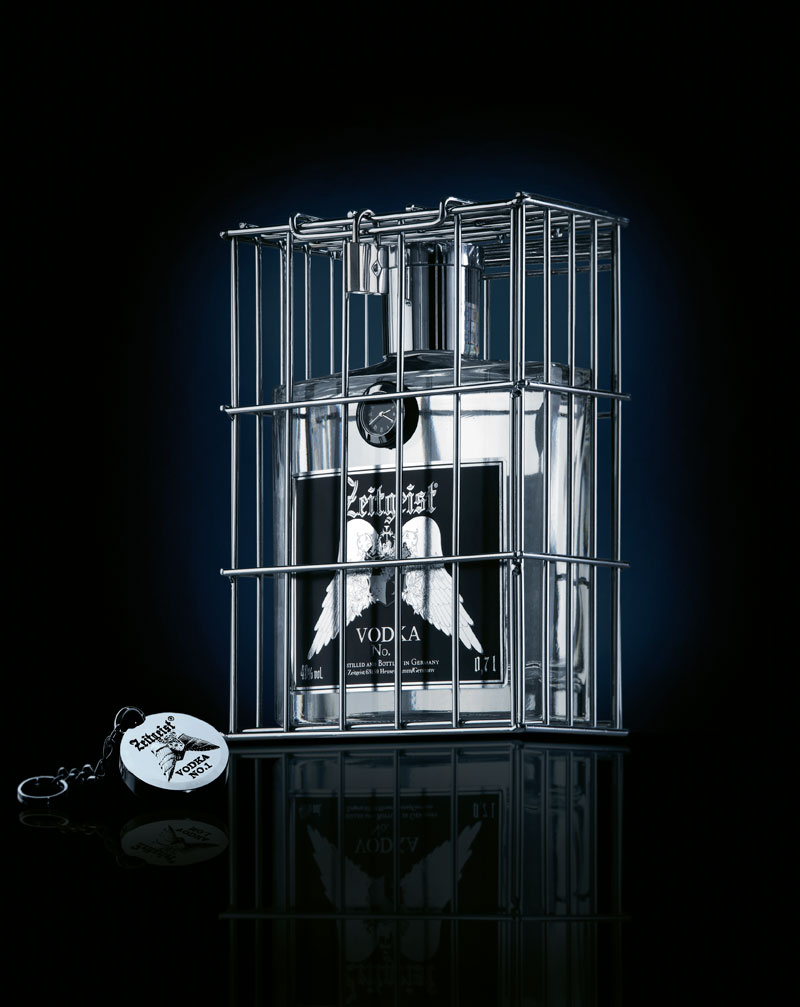
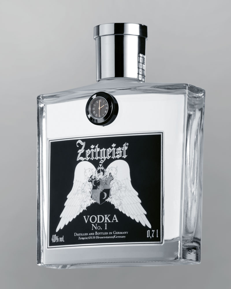
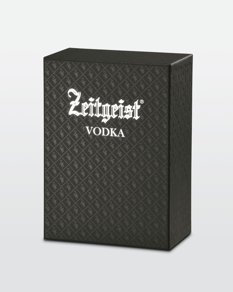
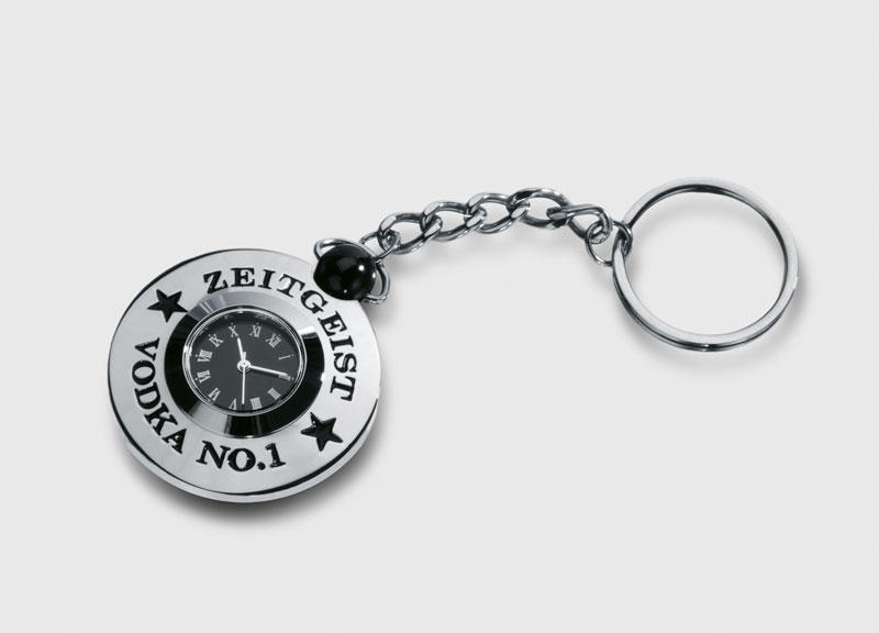
‘The vodka is ‘onstage’ in a chromium-plated cage to match its cool, argentiferous look which is reflected all around it. A silver lock secures the cage.’
Package design for Zeitgeist Vodka, made in Germany. Website here.
Found via Design made in Germany