Ysobel fonts

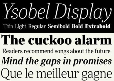
Nimrod is (secretly) one of my favorite type families. I used it on my father’s memorial booklet (he loved reading the daily newspaper). And Ysobel is a more modern interpretation in the same genre.

Newspaper (and publication design-friendly) Ysobel is now available as a superset thru Monotype. It was a collaborative design project with Robin Nicholas at the helm; Delve Withrington and Alice Savoie all making it work.

More details here.

Here’s an interview with Alice Savoie at i love typography.

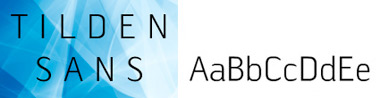
And drop by Delve Fonts, where one can – for a limited time – snag a copy of Delve Withrington’s free type teaser, Blasphemy. And do check out the nifty Tilden Sans. I know Delve has some cool stuff up his sleeve (I’ve seen some of it), get on his newsletter mailing list for updates.

Emigre’s new Baskerville Sans + No. 70

Taking the personality of Baskerville, mixing it with the thinking of Gill Sans (Sans version) and Futura (Modern version)  . . .  Zuzana Licko has finished work on the latest companion fonts for her popular Mrs Eaves typefaces.

Mr Eaves (above) is a sans serif take on the types of John Baskerville (1706-75). It can be snagged here.

And  . . .  also available is Emigre No. 70, a retrospect of Emigre Magazine. Emigre – which ran from 1984-2005 – was ‘the next big thing;’ which was a term they used a lot to describe design trends.

Emigre was a highly-influential, experimental and controversial design magazine that pushed the envelope to where the envelope didn’t look like the envelope anymore. I can safely say its influence can still be seen everywhere today. I miss going to Tower Books (owned by Tower Records) or Printers Inc. to snag the latest issue.

Details about Emigre 70 here.

Karamel Sans

‘Czech graphic design student Marta Maštálková has designed a typeface by pouring liquid caramel onto glass.’

Details (and recipe) here.

Today is my wife’s b-day

And here’s a music video.

Happy birthday Jeanne! (Yes, I named fonts after my wife)

‘IKEA Heights’


IKEA Heights from DaveAOK on Vimeo

‘A Melodrama Secretly Shot Inside the Burbank IKEA.’ More episodes here.

Downtown Cookin is back

Bet you didn’t even know they were gone.

Soul, hip hop, R&B. From Sweden. The band was started in 2004 and after some reshuffling (including the bass player suddenly moving to Israel to study Arabic) they’re back. New music is being mastered as I write this.

Font designer Göran Söderström is a band member, writer and producer. Check them out here. That’s Göran’s newest fonts all over their MySpace page.

Also, Göran’s turned me on to UK-based Speech Debelle. Get your type on!

Stefan Hattenbach: Fine Swedish type


ADAC 40th Anniversary Season mailer (2006-7)

Stefan Hattenbach is a font designer from Sweden who I first met thru Rod Cavazos at Psy/Ops. His types always take me to another place. The forms are rooted in history, but his interpretations are all his own. And his typographic ornaments are exquisite.


Anziano ornaments

I used his Anziano fonts for ADAC’s 40th Anniversary Season – teamed with a beta version of Stefan’s Beef fonts.

Beef will (finally) be released next year thru Veer. And I should note, Stefan is a vegetarian. Beef is pure irony. [Read more →]

Type history: Budapest

The upscale typography blog has a few beautiful Hungarian type images posted, via Budapesti Történeti Múzeum (Budapest History Museum). Details here.

ADAC is back, with Danz and Carpenter


Varanasi, India
Photography by Jayson Carpenter; website, blog

Sacramento ADAC returns with a new location and a Tuesday night talk.

Illustrator David Danz and photographer Jayson Carpenter will be talking shop November 10th, 2009, 6:30 p.m. at the American Institute of Architects Central Valley [AIACV] Building in Sacramento [map]. Details here.


Illustration by David Danz; website, blog

Sacramento Pecha Kucha triple header

‘Nil basterdo carborundum’

I did Pecha Kucha back in January and it was a blast. And since, Sacramento’s Pecha Kucha group has grown by leaps and a few bounds.

Happening this week is a three-night Pecha Kucha Grand Slam – brought to you by Ottolini & Associates, Architects. Co-sponsored by Capital Creative Collective and Urban Hive. Over a DOZEN really cool speakers! Designers, artists, photographers, architects. With music by the always incredible Alex Trujillo.

[1] Thursday, November 5th, 2009
The Level Up Lounge Outdoor Plaza, 8:20-10 p.m.

[2] Friday, November 6th, 2009
The Urban Hive 8:20-10 p.m.

[3] Saturday, November 7th, 2009
MARRS Building 8:20-10 p.m.

For more about Pecha Kucha in Sacramento (and worldwide) go here. (And I’m not one of the speakers this time. But I will do it again eventually)

Barbara Kruger: Born/Dying

Continuing in NYC is Barbara Kruger’s typography-based exhibition about media bombardment, Between Being Born and Dying. Show runs thru November 21. More info here and here.

Found via Michael Martinho


Creative Commons License

the work at the mehallo blog. beta. is licensed under a creative commons attribution - noncommercial - no derivative works 3.0 united states license.  if reposting, credit must be given to steve mehallo - and if possible, please provide a link back to the mehallo blog. beta.

i include images for the purpose of critique, review, promotion and inspiration - and always make my best effort give credit/link back to the original source.  if i’ve screwed up, please fire me a note.

page layout based on the wordpress 'darkwater theme' by antbag, adapted and redesigned by mehallo.  valuable php assistance from bill mead.