Emigre’s new Baskerville Sans + No. 70
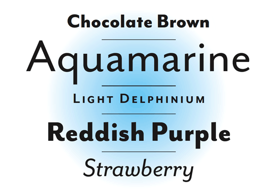
Taking the personality of Baskerville, mixing it with the thinking of Gill Sans (Sans version) and Futura (Modern version) . . . Zuzana Licko has finished work on the latest companion fonts for her popular Mrs Eaves typefaces.
Mr Eaves (above) is a sans serif take on the types of John Baskerville (1706-75). It can be snagged here.
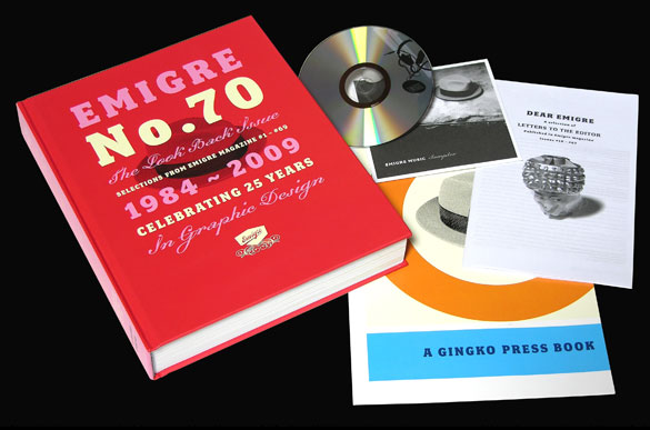
And . . . also available is Emigre No. 70, a retrospect of Emigre Magazine. Emigre – which ran from 1984-2005 – was ‘the next big thing;’ which was a term they used a lot to describe design trends.
Emigre was a highly-influential, experimental and controversial design magazine that pushed the envelope to where the envelope didn’t look like the envelope anymore. I can safely say its influence can still be seen everywhere today. I miss going to Tower Books (owned by Tower Records) or Printers Inc. to snag the latest issue.
Details about Emigre 70 here.