Ken Adam and Ralph McQuarrie do Trek


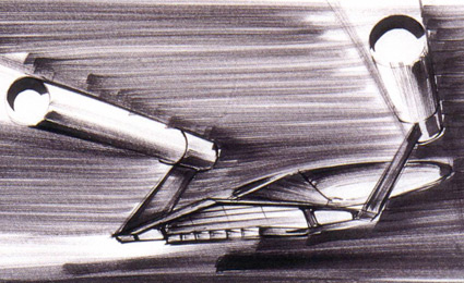
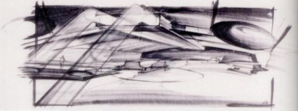
The Enterprise by Ken Adam

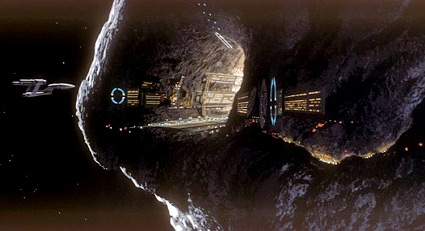
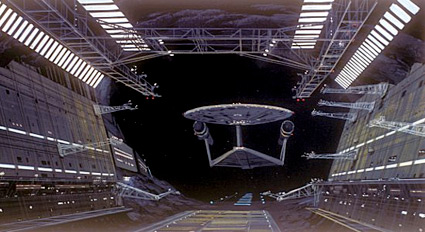
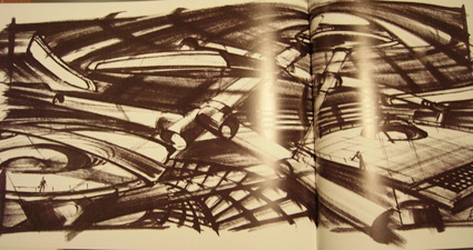
Somewhere in the limbo that was the 1970s was a never-completed UK-produced film Star Trek: Planet of the Titans.

They made it as far as the conceptual illustrations. Ken Adam was hired as production designer and Star Wars visionary Ralph McQuarrie set about redesigning the Enterprise.

Article here. More McQuarrie art here.


Enterprise interior


Enterprise shuttlebay

Ken Adam: Bond production designer

Sir Ken Adam was the production designer for the Bond films.

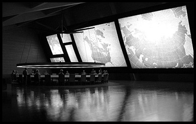
He also developed the forced perspective look of Dr. Strangelove or: How I Learned to Stop Worrying and Love the Bomb (his War Room made a retro/1960s/1980s appearance in Watchmen). Many of the recent Bond films still reference his work.

Interview here. Book here.


The War Room from Dr. Strangelove or: How I Learned to Stop Worrying and Love the Bomb, 1963


Less and More: Braun in London

‘Transparent plastics and wooden veneers were mixed and colour schemes were limited to tones of pure whites and greys, the only splash of colour being allocated to switches and dials’

Designer Dieter Rams’ work for Braun inspired Jonathan Ive at Apple. And just opened at the London’s Design Museum is a Rams retrospective. Details here.

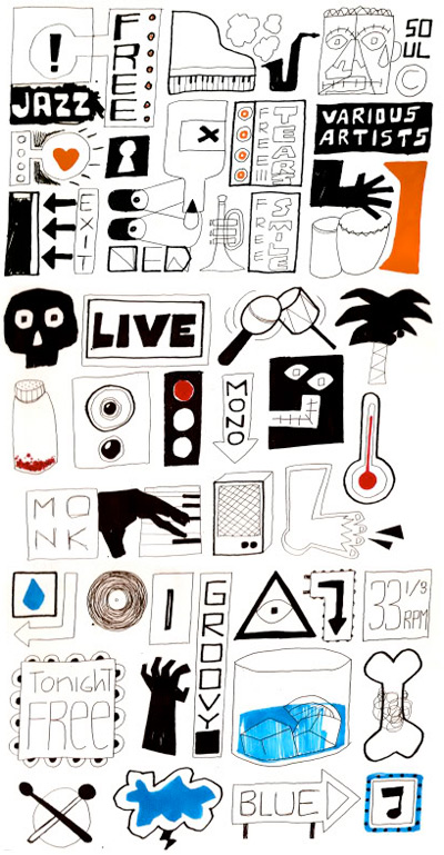
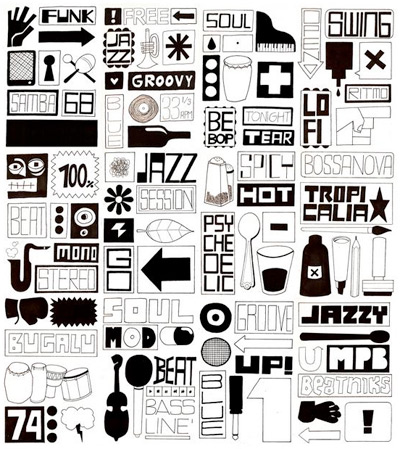
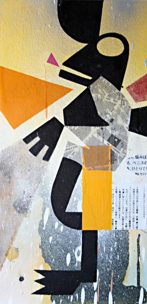
Edu in Spain: Friday night show

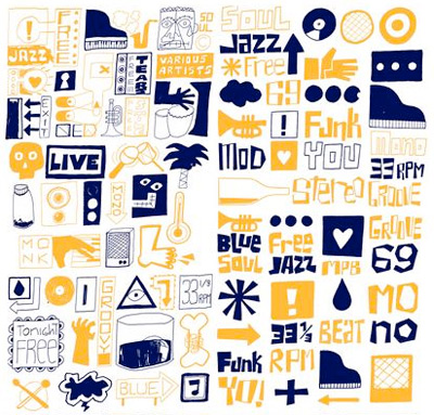
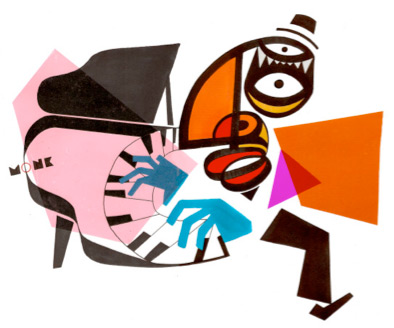
The jazz-inspried work of Edu Camacho. MySpace here. His work reminds me of several artists, including Fortunato Depero and Ben Shahn.

Edu is part of a group show Friday night (tomorrow): which includes paintings, illustration, projected photography and short film. November 20, 2009 in at maumau underground in Barcelona. Details here (translated).

007: Illustrated

Peter Lorenz’s Illustrated 007: The Art of James Bond blog looks at all forms of artist interpretations of the British secret agent. Including these great pulp renderings.

Click on the images for the related posts.


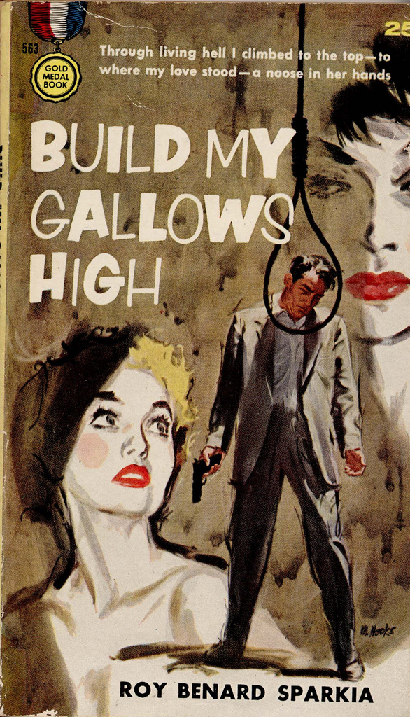
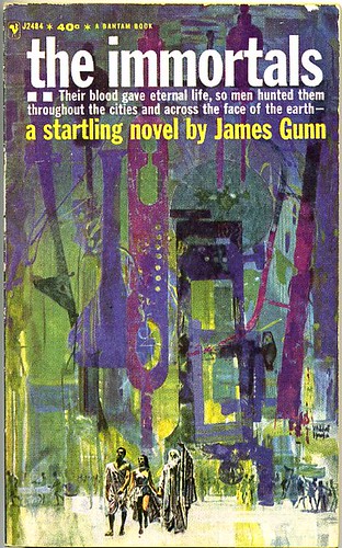
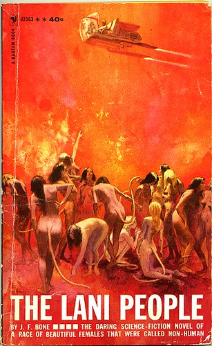
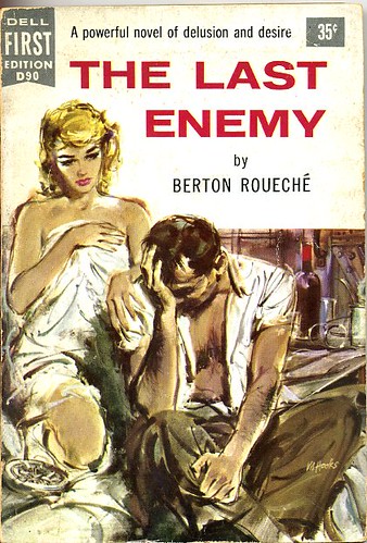
Mitchell Hooks: Pulp

Mitchell Hooks was one of the pioneers of the ‘literal’ illustration style employed on pulp paperback covers.

Overview here. Flickr collection here.

And
UK Vintage has a whole photostream of paperback covers in the same genre here. Even more here. And gads, here.


Found via Drawn!

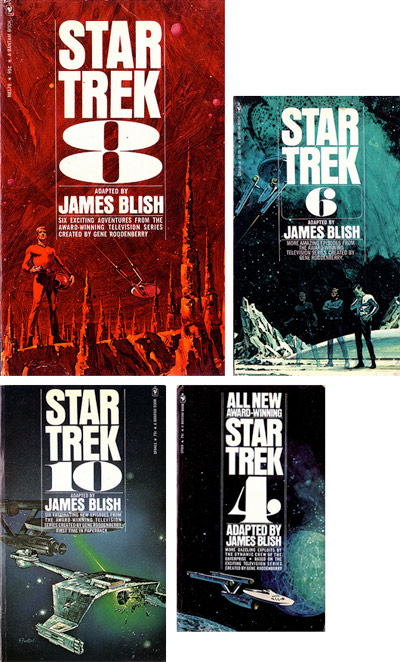
Early Star Trek novel design

Author James Blish turned the original episodes of Star Trek into short stories, which have been printed and reprinted by Bantam Books.

The original cover paintings (above) were top notch. Lou Feck’s incredible brush strokes and fanciful landscapes took Star Trek beyond the confines of a television SFX budget (he did #s 4, 7 and 8). Eddie Jones made a blasted Klingon engine look really cool on #10 (Jones did the later numbers in the series, under the pen name S. Fantoni).

And the type: Helvetica Condensed and some ultra bold numbers (you know, like one of my fonts).

Cool design for explorers on the edge of space. Here’s Modern Fred’s Flickr/photoset of the bunch. And while you’re out exploring, check out Fred’s other space age modern snaps.

Star Trek production design of the 1960s


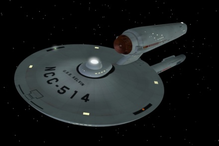
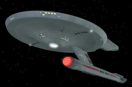
The U.S.S. Kelvin, 2009

J.J. Abrams made a few changes to Star Trek.

Plotwise it had something to do with a black hole or alternate reality time travel singularity cinnamon gumball something or other. Below is what Abrams’ U.S.S. Kelvin would have looked like if it fit the style created by Star Trek’s original designer, Matt Jefferies.


Renderings by Kenneth Thomson Jr.

Star Trek’s 1960s production design is a reflection of its era. Cold War, The Man in the Gray Flannel Suit – or Mad Men – in outer space.

Jefferies’ original Enterprise model sported antennas on the engines, a radar dish up front with deliberate nods to the military. I think that triangle thing under the forward hull may be for an anchor. Maybe.


Battleship Wisconsin

The ships from the original series also sported traditional ‘painted’ surfaces – battleship gray hull – plus, identification tags, banners and typography. Port and starboard navigation lights. Just like the Navy. [Read more →]

Too many type issues, so little time


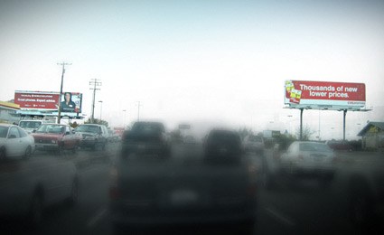
Competing Helvetica billboards, a visual from my morning commute

I’m not much of a purist. Well, that’s a lie. When it comes to type I am. Well, not always. I argue with myself a lot about it. It either works or it doesn’t. My litmus test: ‘Does it communicate?’ And if the goal for the local business is not to be read, then often, it works.

An article in this Sunday’s New York Times is all about this. Once one starts to see type, it’s all over. Read here.

Thanks to Susan and Jonathan for forwarding

Star Trek-n-me


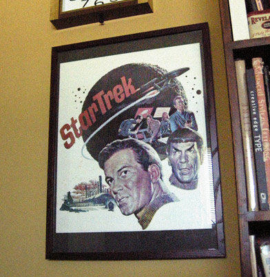
Star Trek poster 1966, art by James Bama

Okay, I’ll admit it. I was a trekkie from way back. Sort of lost interest along the way, but I did enjoy the new movie. Which releases in all sorts of formats this Tuesday.

The message of Star Trek is a good one, when it works. A future utopia where humans have gotten past all their petty hangups. President Obama thinks this way. It’s good thinking.

velour: fabric of the future!
Of course, the early design of the show fascinated me. The look changed after its second pilot episode – which featured cast and crew in these really nifty velour shirts (that Kirk could rip at will). I have the original publicity poster framed in my office (above). The art is by the incredible James Bama, great write up at the Drex Files.

The poster really captures the original look, which was a mix of mid-century modern, googie and space age Disney.
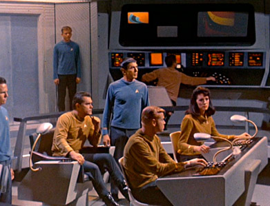

In the future, everyone gets a gooseneck video monitor!

It would have been fun if the new movie had the original velour shirts (above) on the bridge of the Kelvin. The U.S.S. Kelvin, at least, had Star Trek’s signature ‘ping’ noise and the lighting was a little bit like the scene from above. Those were a nice touches. [Read more →]

Project Echo: NASA’s big balls

Gargantuan satellites from the early 1960s. Details.

Plus: Wiki.


Creative Commons License

the work at the mehallo blog. beta. is licensed under a creative commons attribution - noncommercial - no derivative works 3.0 united states license.  if reposting, credit must be given to steve mehallo - and if possible, please provide a link back to the mehallo blog. beta.

i include images for the purpose of critique, review, promotion and inspiration - and always make my best effort give credit/link back to the original source.  if i’ve screwed up, please fire me a note.

page layout based on the wordpress 'darkwater theme' by antbag, adapted and redesigned by mehallo.  valuable php assistance from bill mead.