New (Square) Coke
‘It’s slick, futuristic and vastly different from Coca Cola’s packaging which would be the reason they wouldn’t pick this up’
so green!
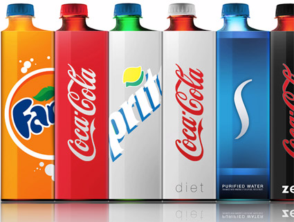
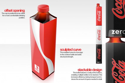
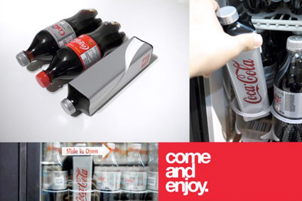
A brilliant bottle concept by an Industrial Design student – Andrew Seunghyun Kim – for helping reduce Coca-Cola’s environmental footprint. Would love to see this implemented. Coke: are you listening?
Details here. More details at Andrew Seunghyn Kim’s blog.
Just don’t tell Raymond Loewy about this.
Found via Designers Couch
The Apple Calendar

‘Keeps the doctor away’
The Apple Calendar, which holds a month’s worth of the fruit, was designed by Serviceplan for the offices of health insurance provider AOK.
Details here.
The Traffic Calendar
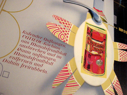
I don’t buy a calendar anymore.
Because, like clockwork, a super cool one will arrive in the mail; typically a bit after the New Year has arrived.
For the past 15 years, Thomas Krug has been mailing me an incredible calendar. It often arrives in a large box and it always dazzles. Elaborate printing techniques, special inks, die cuts – a mesmerizing trip of photography and design.
Thomas is the owner of the Traffic design agency in Winnenden, Germany. And his firm’s self-designed calendar is one helluva promotional item. [Read more →]
Koch Tart Cards

‘a ‘Tart Card’ to support the St Bride Library, London’
Koch Blackletter
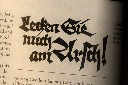
Mexican Blackletter
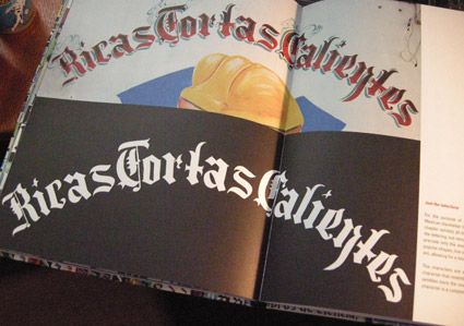
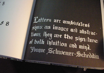
‘The letterform’s characteristics rely on ornaments and contrast, which are both playful and mysterious at the same time. The same as the market engulfs the shopper with its array of stimuli’ -CP
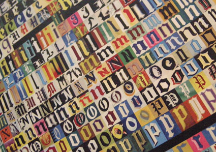
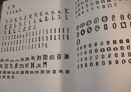
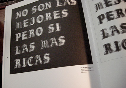
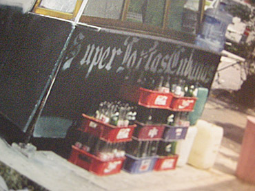
Cristina Paoli’s slim coffee table book Mexican Blackletter takes a look at the importation of blackletter types into the Americas (via Spain) and subsequent vernacular adaptations in Mexico.
My favorite part is the breakout of multiple adapted forms, how they compare with each other (below) and how these forms have evolved into something distinctly Mexican.
Snag the book here. It’s a delightful read.
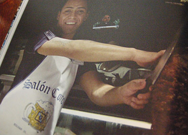
The Road Less Traveled
‘The Road Less Traveled takes its inspiration from American folk tunes from the likes of Pete Seeger and Bob Dylan . . . I have been really into the typographic work of Ed Ruscha and inspired by the typography that appears on old fruit crate labels. Both have a very ‘American’ feel to me just like the song’ -Matt Owens
Matt Owens’ The Road Less Traveled. More details here.
Found via Oded Ezer
Harley Beast
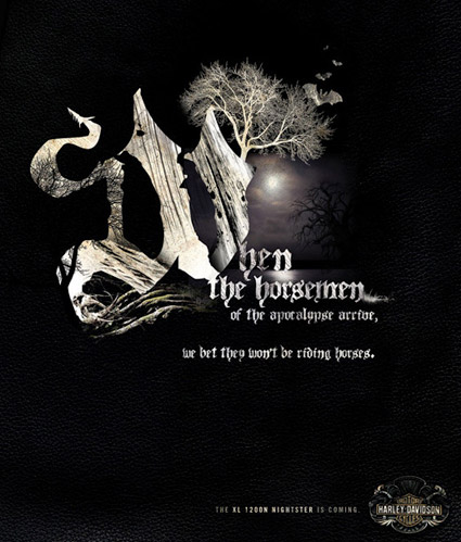
The Harley Davidson 2007 Beast campaign. Creative director: Joe Hospodarec, art director/illustrator: Joel Arbez, Agency: WAX.
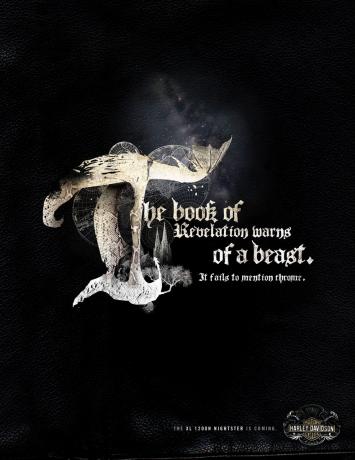
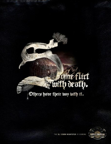
Found via Ads of the World
Rosetta Stone
From 1991: Video for Rosetta Stone’s Leave Me For Dead. From the album Adrenaline.
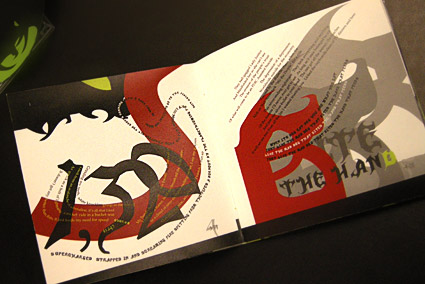
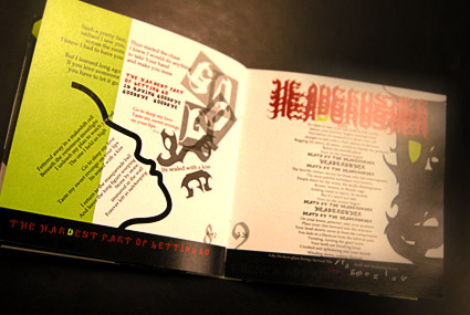
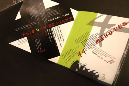
Megadeth, reinterpreted
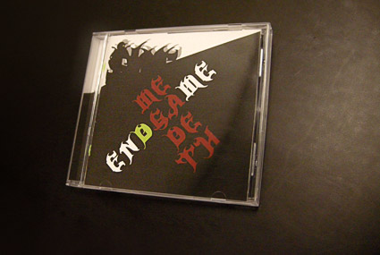
In my intermediate typography course at the California Art Institute Sacramento, students tackle CD packaging design – with a slight twist. Inspired by Project Runway, I like to put limitations on the work to force the student to engage the project where inventiveness will lead to unusual results.
If I could get them to do everything in 24 hours, with Tim Gunn checking in, I’d try that too.
project limits
In this case, students have to work with a band (or recording artist) that they do not know anything about or (preferably) simply do not like. The more they delve into a genre foreign to them, the more interesting the results have been.
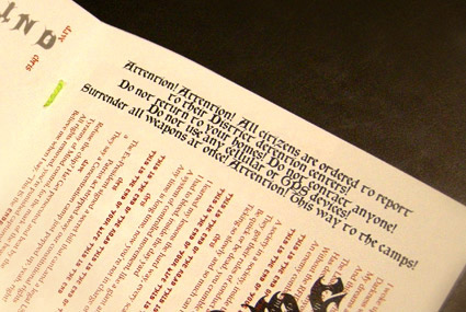
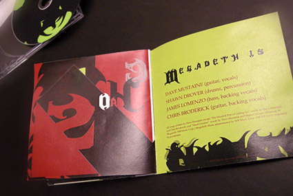
Pictured is student Isla Waite’s interpretation of the Megadeth album Endgame. Her decision to reimagine the lyrics into typographic layouts (inspired by the lyrics’ subject matter) led to a unique interpretation of the traditional stylings of Heavy Metal.
