Maripol, 2010

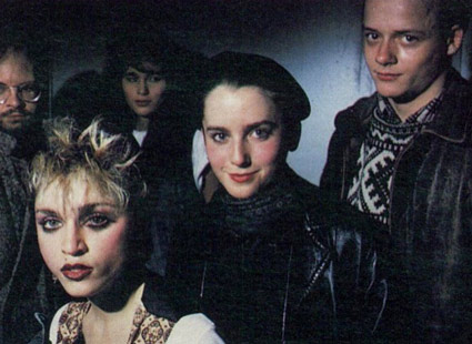
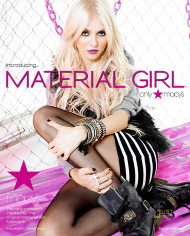
Maripol is best known as the stylist of Madonna, circa 1984. She’s worked as an art director, producer, photographer, fashion designer and artist.

This year, she brought back the 80s with Marc Jacobs and her newest book can be snagged here.

Here’s an interview from a few years back. And drop by her (oddly designed) official site here.


Maripol for Marc Jacobs, above; some of Maripol’s Polaroids, below


Madonna: Into The Groove

1984 again: Madonna’s Material Girl line

Madonna and daughter Lourdes launched their Material Girl line just a couple weeks ago. With Gossip Girl Taylor Momsen fronting the collection the way she fronts The Pretty Reckless.

Considering the provocative personalities, it seems like a good fit. More of a ‘pass the torch’ moment than that Britney kiss those many years ago.

Website here.


Madonna: Like a Prayer


The Pretty Reckless: Goin Down

Ric Ocasek, stalker

Video for The Cars’ You Might Think. From 1984.

Early award-winning animation by ‘computer graphics’ pioneer Charlex. Video details here.

Vena Cava

‘A surreal commercial for Viva Vena. A collaboration between LT and Co and the broadcast design studio Gretel. Music by Copilot.’

Found via Ashley Simko

Gap reality

From Australia: Gap by Tom Bryan.

Minding the Gap: One more

A Gap logo suggestion from Great Britain by designer Guy Mayger.

Found via Steve Matteson

Gap inspires new symbol for recycling

   
Before and after

I was thinking.

The recycle symbol we’ve been using all these years could use an update. Something simpler, more modern, earth-friendly and all that.

And what better way to update than looking to the most legible of the legibles, Helvetica. With all the Gap hoohaw this past week, I’d noticed that the G actually has an arrow in it. Not a perfect arrow, but redrawing Helvetica – that would take too much time. No one’s gonna notice an arrow that’s a bit off, right?

G is for garbage, of course. Turning it backwards means sending things back. For recycling. And the gradiated avocado green box, it just says green better than anything else can say green.

Because people really like avocados.

Hansen’s Natural: Bottom of the pile


Before and after

This hit last year, redesign of soda cans for Hansen’s Natural Sodas by Deutsch Design Works.

The look just seems very  . . .  techno to me.


Garbage: I’m Really Into Techno, B-side from Shut Your Mouth 3

Photos found via BevReview

MSNBC campaign: More for the pile

The Daily Show With Jon Stewart Mon – Thurs 11p / 10c
MSNBC Left Behind
www.thedailyshow.com
Daily Show Full Episodes Political Humor Rally to Restore Sanity

 
‘Fox News: Your source for hyper-partisan bullshit.
CNN: If you’re watching this your flight’s been canceled
MSNBC: Lean forward???’

I’m just wondering – as far as these desperate acts of branding are going – how much of the Kool Aid are they drinking at NBC?

Next thing you know, NBC’s gonna cancel all its good shows and put Jay Leno on in prime time.

Again.

Found via Laura Serra

New Gap logo: One more for the pile

   
Before and after

Another company’s gone and done it.

Desperate times call for  . . .  logo changes. If a company’s not doing well, they have to do something. Forget the pressure of product marketing, pricing, supply and demand – all too tough to deal with. Instead: Let’s change the logo.

K-Mart has done it a few times.

Not quite getting to the root of things. But changing a logo to solve a major problem is like saying, I have cancer, so – I’m going to go get my hair done.

When exactly did this become the rule of the day? Is a logo change what it takes to shore up a failing brand? Gap seems to think so and if that’s how they’re managing things right now, they probably should fail. [Read more →]

Pressure, 2009

Paramore’s Pressure. Performed live in Chicago, 2009.


Creative Commons License

the work at the mehallo blog. beta. is licensed under a creative commons attribution - noncommercial - no derivative works 3.0 united states license.  if reposting, credit must be given to steve mehallo - and if possible, please provide a link back to the mehallo blog. beta.

i include images for the purpose of critique, review, promotion and inspiration - and always make my best effort give credit/link back to the original source.  if i’ve screwed up, please fire me a note.

page layout based on the wordpress 'darkwater theme' by antbag, adapted and redesigned by mehallo.  valuable php assistance from bill mead.