entries Tagged as [typography]
The Traffic Calendar
I don’t buy a calendar anymore.
Because, like clockwork, a super cool one will arrive in the mail; typically a bit after the New Year has arrived.
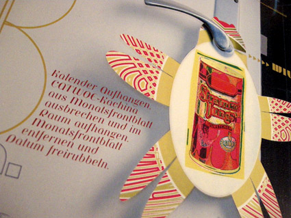
For the past 15 years, Thomas Krug has been mailing me an incredible calendar. It often arrives in a large box and it always dazzles. Elaborate printing techniques, special inks, die cuts – a mesmerizing trip of photography and design.
Thomas is the owner of the Traffic design agency in Winnenden, Germany. And his firm’s self-designed calendar is one helluva promotional item. [Read more →]
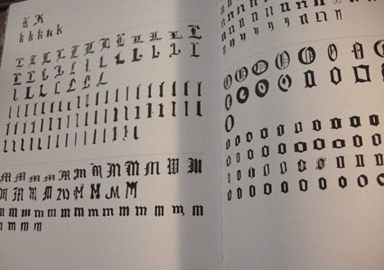
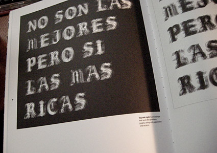
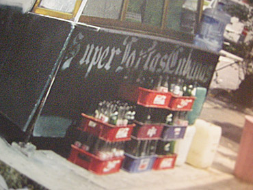
Mexican Blackletter
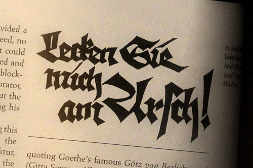
‘The letterform’s characteristics rely on ornaments and contrast, which are both playful and mysterious at the same time. The same as the market engulfs the shopper with its array of stimuli’ -CP
Cristina Paoli’s slim coffee table book Mexican Blackletter takes a look at the importation of blackletter types into the Americas (via Spain) and subsequent vernacular adaptations in Mexico.
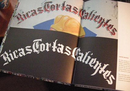
My favorite part is the breakout of multiple adapted forms, how they compare with each other (below) and how these forms have evolved into something distinctly Mexican.
Snag the book here. It’s a delightful read.
The Road Less Traveled
‘The Road Less Traveled takes its inspiration from American folk tunes from the likes of Pete Seeger and Bob Dylan . . . I have been really into the typographic work of Ed Ruscha and inspired by the typography that appears on old fruit crate labels. Both have a very ‘American’ feel to me just like the song’ -Matt Owens
Matt Owens’ The Road Less Traveled. More details here.
Found via Oded Ezer
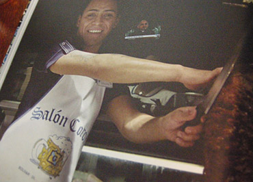
Harley Beast
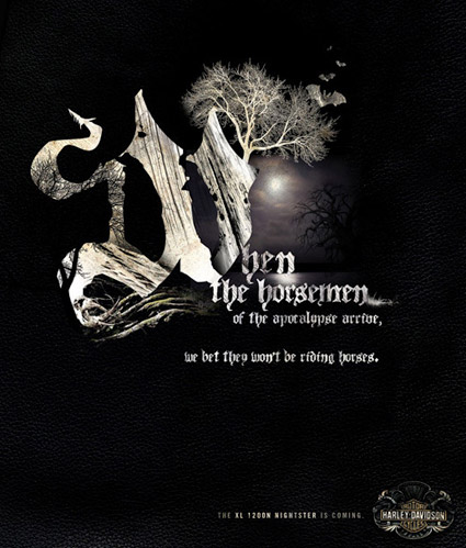
The Harley Davidson 2007 Beast campaign. Creative director: Joe Hospodarec, art director/illustrator: Joel Arbez, Agency: WAX.
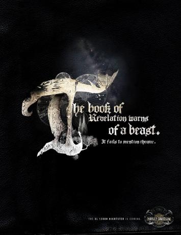
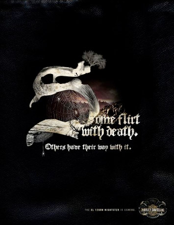
Found via Ads of the World
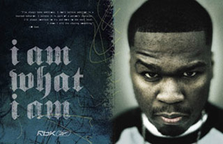
Megadeth, reinterpreted
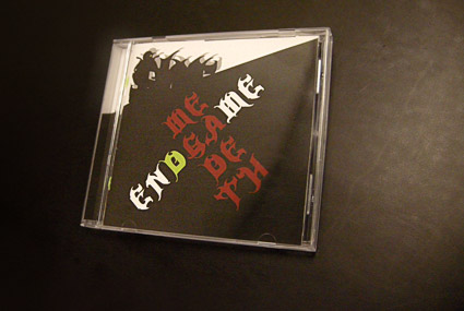
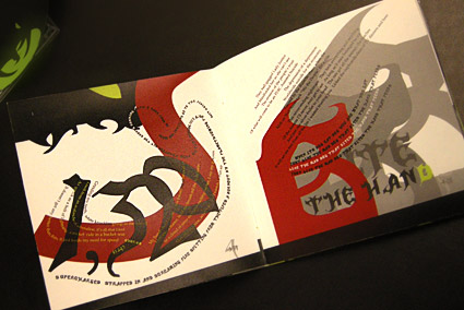
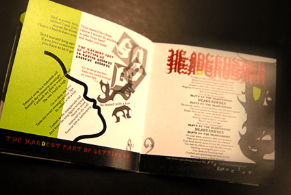
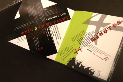
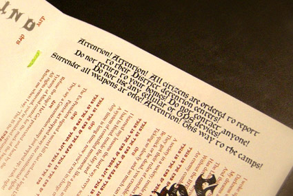
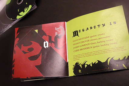
In my intermediate typography course at the California Art Institute Sacramento, students tackle CD packaging design – with a slight twist. Inspired by Project Runway, I like to put limitations on the work to force the student to engage the project where inventiveness will lead to unusual results.
If I could get them to do everything in 24 hours, with Tim Gunn checking in, I’d try that too.
project limits
In this case, students have to work with a band (or recording artist) that they do not know anything about or (preferably) simply do not like. The more they delve into a genre foreign to them, the more interesting the results have been.
Pictured is student Isla Waite’s interpretation of the Megadeth album Endgame. Her decision to reimagine the lyrics into typographic layouts (inspired by the lyrics’ subject matter) led to a unique interpretation of the traditional stylings of Heavy Metal.
Blackletter in Mainz
I Love Typography takes a look at the holdings of the library of the Gutenberg Museum in Mainz. More than just Bibles.
Article here.
White space and E

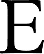
The concept of ‘negative space’ (or ‘white space’) as an important part of type design is very difficult to teach. The student either sees it right away, it clicks over time or sometimes the concept is just weird enough to cause them to back away very slowly.
It’s a up is down, left is right sort of thing. Pen strokes are important, but so are the parts that aren’t made by the pen.
Just the right amount of negative space defines the character and readability. Claude Garamond (c. 1480-1561) was a master at this; it’s one of the reasons his types are still incredibly popular today.
Here’s some cap E comparisons to chew on.
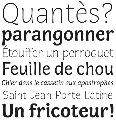
Plus, here’s a great breakdown of today’s Garamond interpretations (images below).
And, an interview with the master himself.
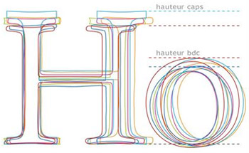
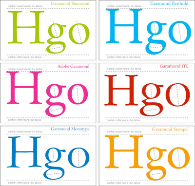
Cap Es found via Nina Stoessinger; Garamond comparisons by Barney Carroll
Jenson’s Italic
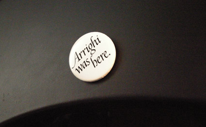
‘Arrighi was here’ button by George Abrams
Any current drawing of the type work of Nicholas Jenson (1420-80) that includes an Italic is doing a little fudging. Since (like Trajan and lowercase), Italic wasn’t quite around yet when Jenson was making type.
Typically the work of Ludovico Arrighi (1475–1527) is adapted as the companion font to Jenson – as the Italic.
Monotype did this with its Jenson-influenced Centaur – and Adobe Jenson sports an Arrighi-influenced italic. [Read more →]

handpicked posts

a piano falls in old manhattan
tetro and typography
it’s typography: film, song and dance
ghosts of gustov klimt
the great times new roman controversy
picking fonts
kapitaal
defining terms: design is not decoration
garcia's 'pure design'
'enhance that image!'
magic highway remixed
the cynic
rad anthem
Brought to you by man dom-


buy my fonts
go shopping
mehalloreads

Divinely Elegant: The World of Ernst Dryden
Jozsef Pecsi: Photo and Advertising
Color: A Natural History of the Palette
Collage: Assembling Contemporary Art
Modern Dog: 20 Years of Poster Art
Gaberbocchus Press: An Experiment in Publishing, 1948-1979
Advertising Art in the Art Deco Style
Googie Redux: Ultramodern Roadside Architecture
Hot Sour Salty Sweet: A Culinary Journey Through Southeast Asia
now playing


the work at the mehallo blog. beta. is licensed under a creative commons attribution - noncommercial - no derivative works 3.0 united states license. if reposting, credit must be given to steve mehallo - and if possible, please provide a link back to the mehallo blog. beta.
i include images for the purpose of critique, review, promotion and inspiration - and always make my best effort give credit/link back to the original source. if i’ve screwed up, please fire me a note.
page layout based on the wordpress 'darkwater theme' by antbag, adapted and redesigned by mehallo. valuable php assistance from bill mead.


