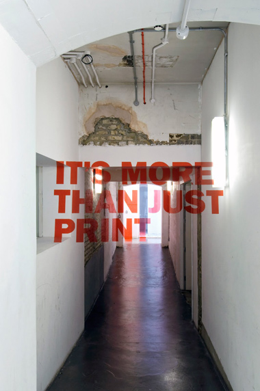
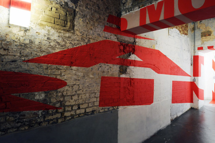
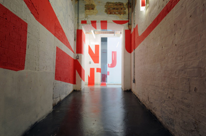
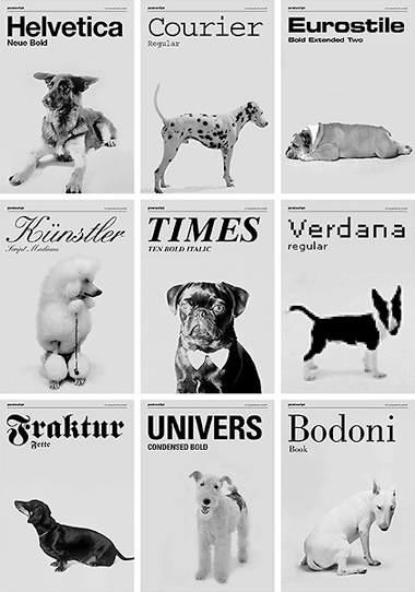
entries Tagged as [typography]
Television is a drug
Poem by Todd Alcott, kinetic type by Beth Fulton.
Slumdog typography, Bollywood dance
Finally saw Slumdog Millionaire. Really enjoyed the (Oscar winning) Jai Ho dance number (and titles) at the end of the film.
And
Here’s the Pussycat Dolls’ version (below).
Hello Brooklyn
‘Starring: Akzidenz Grotesk & Brooklyn’
Animation by Greg Solenström of Jay-Z’s Hello Brooklyn.
Found via Tipocracia

‘I’m Comic Sans, asshole’

Great post over at McSweeney’s – written by Comic Sans. Enjoy it here.
I actually like Comic Sans. It’s not great, but I love its unintentional subversive nature. It just gets used a whole lot for really stupid stuff. By people who don’t know what they hell they’re doing. But I’d absolutely love one of my fonts to be as notorious.
OEM licensing for Chandler 42 anyone?
Also found by former student, Ai Buenafe
Zapfino: Really fast
‘Real time: 1 hour 28 minutes, footage was recorded nonstop in one sitting. I was going as fast as I could so there are some imperfections here and there.’
Student Tony Wang’s final project from my experimental typography course at The Art Institute of California Sacramento. Tony spent the past eleven weeks doing a multifaceted study of the work of Hermann Zapf.
It culminated in the above video – vector-based drawings/tracings of Zapfino caps.
Each drawing was hand rendered (no live trace) in Adobe Illustrator. (For my beginning courses, students have to draft letterforms by hand with pencil/compass. Tony’s beautifully realized final is the next logical step in the process.)

handpicked posts

a piano falls in old manhattan
tetro and typography
it’s typography: film, song and dance
ghosts of gustov klimt
the great times new roman controversy
picking fonts
kapitaal
defining terms: design is not decoration
garcia's 'pure design'
'enhance that image!'
magic highway remixed
the cynic
rad anthem
Brought to you by man dom-


buy my fonts
go shopping
mehalloreads

Divinely Elegant: The World of Ernst Dryden
Jozsef Pecsi: Photo and Advertising
Color: A Natural History of the Palette
Collage: Assembling Contemporary Art
Modern Dog: 20 Years of Poster Art
Gaberbocchus Press: An Experiment in Publishing, 1948-1979
Advertising Art in the Art Deco Style
Googie Redux: Ultramodern Roadside Architecture
Hot Sour Salty Sweet: A Culinary Journey Through Southeast Asia
now playing


the work at the mehallo blog. beta. is licensed under a creative commons attribution - noncommercial - no derivative works 3.0 united states license. if reposting, credit must be given to steve mehallo - and if possible, please provide a link back to the mehallo blog. beta.
i include images for the purpose of critique, review, promotion and inspiration - and always make my best effort give credit/link back to the original source. if i’ve screwed up, please fire me a note.
page layout based on the wordpress 'darkwater theme' by antbag, adapted and redesigned by mehallo. valuable php assistance from bill mead.


