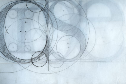
What to expect in my beginning typography course(s) . . .

Roman lettering study by James Yassie from steve mehallo’s beginning typography course, Fall 2005
I’ve gotten a lot of questions about the type courses I teach. They’re usually specific to ARTNM 303 Graphic Design: Typography (scroll down after the jump, it’s not posted in the right place) which is held Friday nights at American River College.
(I also teach type at The Art Institute of California Sacramento)
The main question typically is: Why in God’s name are you teaching a Friday night type course!!?
And the simple answer is classroom availability.
The only other choice was Thursdays at 6 a.m.
So I’ve decided to post a peek into my philosophy here. The latest questions come from Homaside:
Q.
In you typography class. Is it more about designing with type or designing type. Do you go over design grids? What program are you working with to design type? Fontographer or is there other programs you like to use?
A.
That’s a loaded question. Here’s a loaded answer:
designing with type
sort of, at least the final project is.
designing type
the class shows the basics for how one would need to be thinking to design type. That alone is more powerful than learning software (at least when you use the software, you should know what you’re doing)
grids
No. But I do go over powerful form and composition basics that lead to grids – and how designers can manipulate these elements in order to control where viewers will look and react. And I show some great examples one doesn’t normally see elsewhere.

If you want to know grids, check out: The Designer and the Grid from RotoVision. One of the best books I’ve seen on the subject, not as dry as the other, traditional ones. (sorry jmb, hurlburt)
software I use
Outside of class, for drawing fonts I use Fontlab, because Fontographer’s update is still based on 1980s screen rendering; I can’t see details on screen as well as Fontlab, and there’s some better tools specifically tied into how letters are constructed; and Adobe Illustrator can be a good starting point before bringing into Fontlab. Note: The Fontlab folks also have a basic type drawing program called TypeTool, which I’ve heard has a great student discount.
In short, I teach the class based on how I was taught and how (in some cases) I wish I were taught. A lot of what I cover I had to learn on my own. And I believe strongly that the basics of typography cannot be taught on a computer – the alphabet we use now evolved over the past 2000 years from pen-drawn forms. And frankly, what we’re doing on the computer today simply mimics what came from a broad-edge pen. There’s no substitute for going back to the pen.
So that’s how I teach the class. And students’ work after they take the class is typically amazing to see!
Here’s a preview of my new font package, which will be released soon (it’s in beta right now). And I couldn’t have drawn it if I hadn’t taught this course:


[…] anyone who’s taken an intro to typography course with me – there is a fair amount of stippling involved as part of some really complex […]