entries Tagged as [typography]

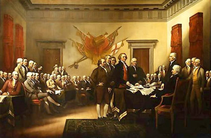
‘Shitty piece  . . .  It is very bad history’

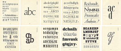
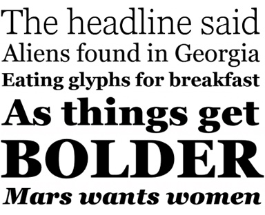
‘It was Benjamin Franklin’s favorite typeface, and the first printings of the Declaration of Independence and the U.S. Constitution were set in Caslon.’

I am a history junkie.

And I loved the scene in HBO’s John Adams miniseries when Adams disputed the accuracy of the above painting (video, below). And how Ben Franklin’s approach to French diplomacy was more  . . .  ardent, than formal.

(I also loved how the miniseries used titled camera angles – like the United States was founded by villains from the old Batman tee vee series)

William Caslon’s fonts were the typefaces of the American Revolution.

Here’s some great reads on early American documents – as handy PDFs.

And here’s a link to John Adams on DVD.

Caslon ‘g’

Student and Caslon g from my Spring typography course [artnm 303] at American River College, Sacramento.

Class starts up again this Friday August 28, 2010. Waiting list is full. Can’t teach everyone.

It’s gonna be an unavoidable ‘that teacher’s an asshole’ session.

Self portrait by Samantha Costanilla

F is for fail

This one is always a favorite.

‘Ooo, ooo, oooo’

‘Lyric video for Ceelo’s big, big single FU.’

Love this video, but  . . .  Dang!

Typos.

Found via Bwargh Von Modnar

‘hy’ ligature

New type concept: The ‘hy’ typographic ligature. Developed by former student Holly Rabayda-Wickland.

New Arabic

Some modern examples of Arabic. More here.

Found via designnewz

Pepsi and the Font Me mug

My type mug goes well with the real Pepsi that’s back in stores this month.

Get the mug here.

Recueil d’Alphabets à Dessiner

Pages from Recueil d’Alphabets à Dessiner by René Henry Munsch (1951).

More here.

Found via Biggest Apple

ABCDEFGHIJKLMNOP

‘A video of two people drawing the alphabet.’

Drop cap(puccino)

‘Hand sprinkled cinnamon’

Snapshot by student Rikki Morehouse. She went thru several cups of coffee til she got them serifs right.

(Hedline written by former student Devon Cloutier)

Georgia, expanded


A few fonts from the new Georgia Pro type family

Matthew Carter’s Georgia is among my favorite fonts. And recently, Georgia turned into something a bit  . . .  more.

I love that Georgia exists, or the interwebs would be Times forever (well, until WOFF kicks in) – and without Georgia, the argument that sans fonts online are more legible (which I think is hooey) sort of wins.

And if you’re reading my blog directly online (without using RSS), you’re reading Georgia. It does what I like it to do. Reads well. [Read more →]


Creative Commons License

the work at the mehallo blog. beta. is licensed under a creative commons attribution - noncommercial - no derivative works 3.0 united states license.  if reposting, credit must be given to steve mehallo - and if possible, please provide a link back to the mehallo blog. beta.

i include images for the purpose of critique, review, promotion and inspiration - and always make my best effort give credit/link back to the original source.  if i’ve screwed up, please fire me a note.

page layout based on the wordpress 'darkwater theme' by antbag, adapted and redesigned by mehallo.  valuable php assistance from bill mead.