Georgia, expanded
A few fonts from the new Georgia Pro type family
Matthew Carter’s Georgia is among my favorite fonts. And recently, Georgia turned into something a bit . . . more.
I love that Georgia exists, or the interwebs would be Times forever (well, until WOFF kicks in) – and without Georgia, the argument that sans fonts online are more legible (which I think is hooey) sort of wins.
And if you’re reading my blog directly online (without using RSS), you’re reading Georgia. It does what I like it to do. Reads well.
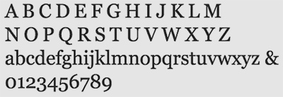
The original Georgia, 1993
new georgia
Behind the scenes, the boys at Ascender (including the great Steve Matteson) got the license to expand the Georgia type family into some really cool weights – and working with Carter & Cone, The Font Bureau and Microsoft – did just that.
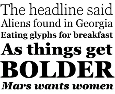
Georgia Pro: 20 new fonts, beyond the basic set that one sees on the web. The details really come out as things get bolder and heavier.
Check em out here. Condensed versions here.
And
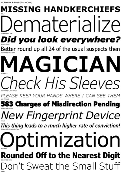
To balance things a bit – Verdana (below) has also gone . . . more.


I find this fascinating. Both of these original fonts are beautiful and designed for the screen and licensed for web use. With all this buzz about web fonts and getting good typography on the web, it makes me curious as to whether these fonts will be licensed for web use. Since that is there intended purpose, I certainly hope so. These foundries have given some good fonts some great attention and wonderful options. Since they were originally designed for web, it would be great if we can continue using these new weights in the same way.
You know, in knowing some of the parties involved in this – including the supercool web guy behind Font Bureau’s new webfonts program (he also ate some of my pizza at TypeCon) – I will safely say these – and a bunch of others – will be web friendly very soon. :)