Metal Spiekermann!

Isla Waite’s extremely heavy, laser cut student final from my most recent experimental typography course. Her research subject was Erik Spiekermann.
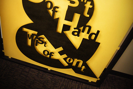
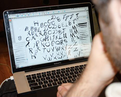
No digitally-made drop shadows here.
Type Munching Dinos by Tiffany Valdez.
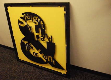
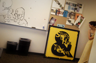
Isla Waite’s extremely heavy, laser cut student final from my most recent experimental typography course. Her research subject was Erik Spiekermann.
No digitally-made drop shadows here.
Type Munching Dinos by Tiffany Valdez.
Part one
‘Fry travels across Europe to find out how Gutenberg kept his development work secret, about the role of avaricious investors and unscrupulous competitors and why Gutenberg’s approach started a cultural revolution.’
Stephen Fry loves design. That’s one of the reasons he’s really cool. [Read more →]
So I’m pretty much out the door right now – driving down to TypeCon.
And this Thursday morning I’ll be speaking as an ‘icebreaker’ in the Type & Design Education Forum. I’ll be going over a bunch of things I’ve learned while teaching; things that I’ve discovered work very well in a creative classroom. [Read more →]
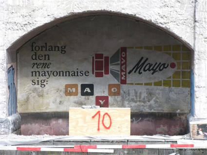
‘I could not be happier about this, or any more proud to live in a city that recognise the importance of preserving this kind of work.’
Vintage signs unearthed and preserved in Copenhagen. Details here.
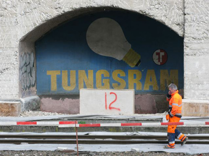
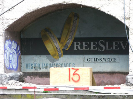
Found via Martin Klasch
‘The film’s title is an allusion to Tatlin’s Tower. This animated short by Theodore Ushev is like a whirlwind tour of Russian constructivist art and is filled with visual references to artists of the era, including Vertov, Stenberg, Rodchenko, Lissitsky and Popova.’
Brilliantly done! From 2006.

‘We’ll explore the hot button topic of web fonts; antique type and lettering of the textile trade; the typography of Disneyland; making smart fonts even smarter; the influence of Charles Eames; liquid typography; west coast ‘Cholo’ style graffiti; and so much more.’
typecon 2010: babel
Big typography conference next week in Los Angeles. Wood Type preview in Carson today. Designer talks, workshops, dealer room, font makers, stuff.
and me
I’ll be giving my first ever TypeCon talk as part of their Type & Design Education Forum. My title is Tell Lies in the Classroom and Get Away With It. It will be as weird as what I normally do in a classroom.
Promise. [Read more →]
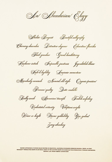
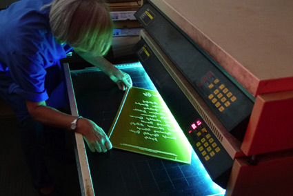
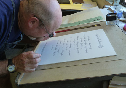
‘The broadside is printed on Mohawk Superfine Eggshell, White, 100t. Everyone attending TypeCon 2010 will receive a copy, courtesy of type quizmaster Allan Haley.’
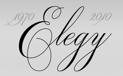
A broadside tribute to ITC’s new Elegy font – printed in letterpress at Patrick Reagh Printers in Sebastopol, CA. The poster was typeset by the wonderful Ilene Striver – who’s managed to talk me into giving a presentation as part of TypeCon’s Education Forum – next Thursday. More about TypeCon in my next post.
More info about the broadsheet here.

Original ITC logotype handlettered by Ed Benguiat, 1970

Elegy typeface designed by Jim Wasco, 2010
“Where can I get a font of the script used for the ITC logo?’ For almost four decades, this has been one of the most frequently asked questions of ITC. The answer has always been the same: ‘You can’t. The ITC script logo is handlettering and it is not available as a font.”
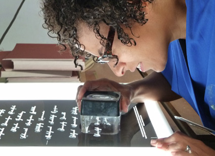
Now it is. Introducing: ITC Elegy. Two years in production, Jim Wasco took apart Ed Benguiat’s original Spencerian-style script and put it back together with updated spacing and a bunch of stylistic changes.
Detailed article here.

Comparison: Elegy and the original


Found via Delve Withrington
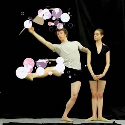
‘The resulting font is based on the physical movements of two Oregon ballet dancers . . . The dancers were fitted with infrared LED lights, which captured their steps in real time as they danced all 26 letters of the alphabet.’
Typography combined with ballet. Details (and final font) here.

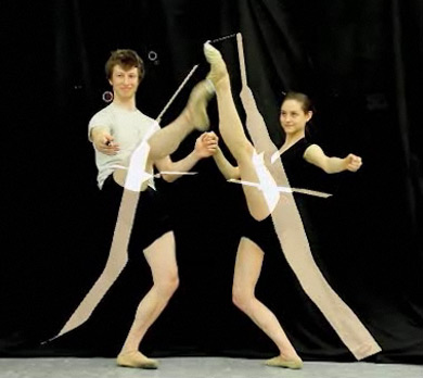
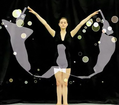
Found via Lyndsie Ross


the work at the mehallo blog. beta. is licensed under a creative commons attribution - noncommercial - no derivative works 3.0 united states license. if reposting, credit must be given to steve mehallo - and if possible, please provide a link back to the mehallo blog. beta.
i include images for the purpose of critique, review, promotion and inspiration - and always make my best effort give credit/link back to the original source. if i’ve screwed up, please fire me a note.
page layout based on the wordpress 'darkwater theme' by antbag, adapted and redesigned by mehallo. valuable php assistance from bill mead.