Mercedes typewriter
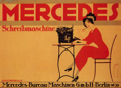
Mercedes Schreibmaschine poster by Ernst Dryden, 1911.
Mercedes Schreibmaschine poster by Ernst Dryden, 1911.
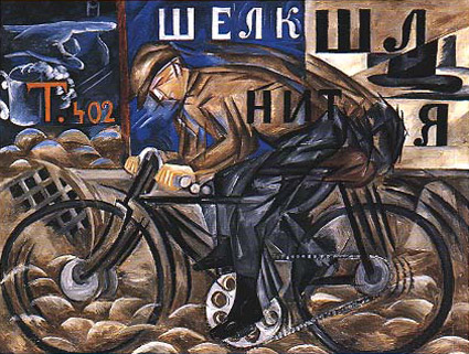
‘She did not hesitate to break up forms and rearrange their component parts. She introduced musical notation, letters and words, as they flash past in shop signs; she expressed movement by repeating the same form in several phases of its action and velocity by blurring contours.’ –Goncharova: Stage Designs and Paintings
The work of Natalya Goncharova (1881-1962).
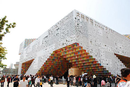
‘It’s an amalgamation of ‘sign’ (Korean written language) and ‘space’: signs become spaces, and spaces become signs’
The South Korean pavilion at the Shanghai World Expo 2010. Designed by Mass Studies. More info here.

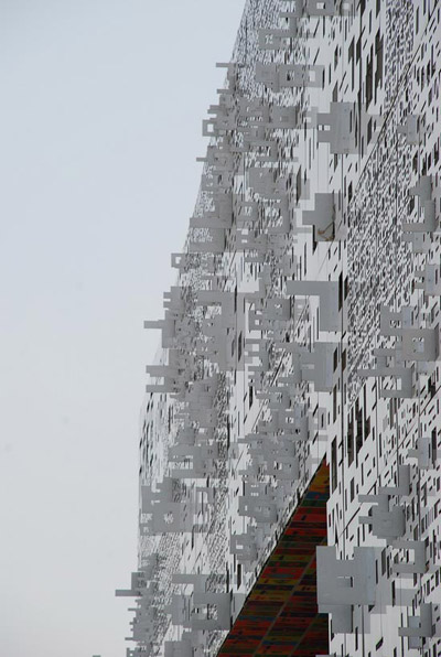
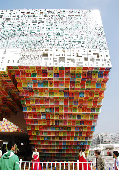
Found via Poketo
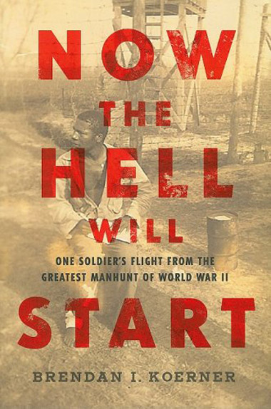
Svend Smital’s Super Grotesk used on the cover of Brendan I. Koerner’s Now The Hell Will Start: One Soldier’s Flight from the Greatest Manhunt of World War II.
Found via The Book Cover Archive
‘My father gave me some magazines from the 1920s and 1930s’
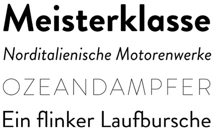
Hannes von Döhren’s Brandon Grotesque, influenced by early geometric types – available in six weights with true italics.
One of TDC’s 2011 award winners. Available thru HvD Fonts.
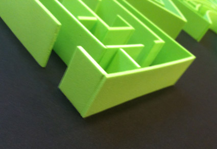
Dmitriy Antropov’s final project was a Gill Sans maze, hand crafted from foam.

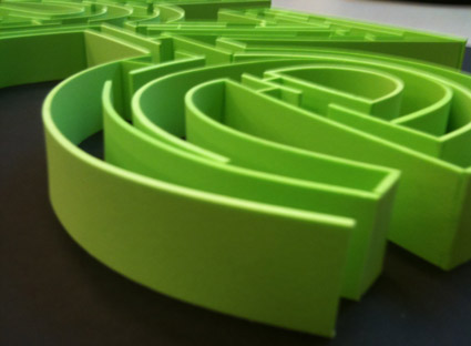

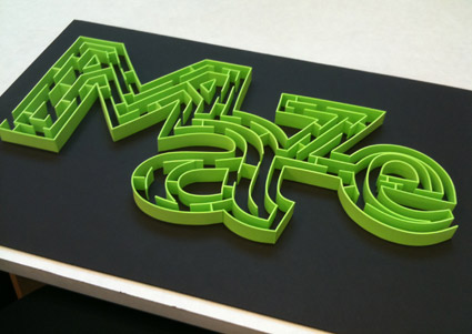
After we tried to actually do the maze (and failed), Dmitriy reached down and carefully removed a small partition – near the bottom of the a – and we were able to complete.


the work at the mehallo blog. beta. is licensed under a creative commons attribution - noncommercial - no derivative works 3.0 united states license. if reposting, credit must be given to steve mehallo - and if possible, please provide a link back to the mehallo blog. beta.
i include images for the purpose of critique, review, promotion and inspiration - and always make my best effort give credit/link back to the original source. if i’ve screwed up, please fire me a note.
page layout based on the wordpress 'darkwater theme' by antbag, adapted and redesigned by mehallo. valuable php assistance from bill mead.