entries Tagged as [typography]

In screen type: Bank Gothic
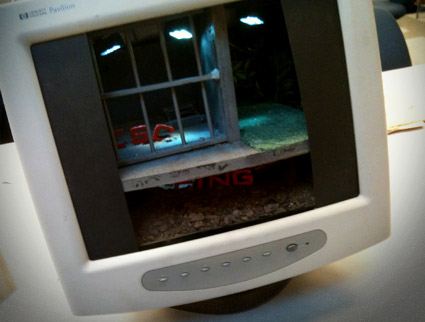
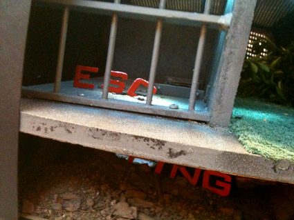
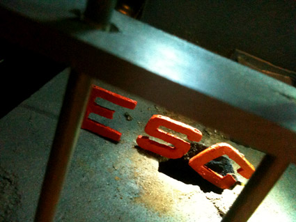
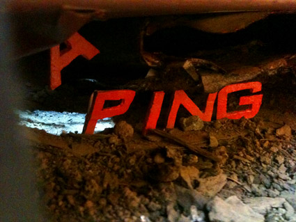
‘escaping the norm’

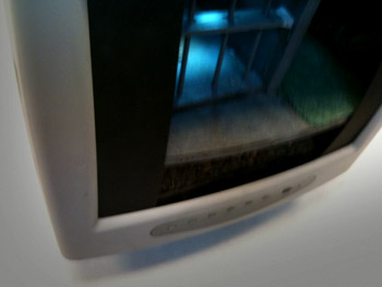
Just finished up my Friday night beginning type course – and final projects can take any form. Last night, Christopher Gianni-Embrey showed up for class with an old computer monitor.

Inspired by a recent viewing of The Shawshank Redemption, Christopher visualized the word ‘escaping’ using Morris Fuller Benton’s Bank Gothic.

Not on screen, but in screen.

The final piece was Christopher’s first ever attempt at model making. It was crafted from mostly found materials. As he put it, ‘driving around town, there’s a lot of stuff people throw away.’

In the process, he ended up with a bunch of dead computer monitors – just in case the first attempt didn’t pan out.

My next Friday night type course is scheduled for Fall 2011 at American River College. Course number: ARTNM 303.
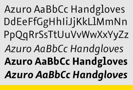
On screen type: Azuro

‘Azuro, the first typeface that’s perfect for reading on screens’

FontShop has released Georg Seifert’s Azuro. Humanist in origin, with large counters and oldstyle numerals; Azuro has been tested in all current on screen media, including Apple’s iOS.

Gizmodo review here. FontShop details here.

And Azuro is on sale – 90% off – thru May 31, 2011.

Also check out Seifert’s Graulau Sans, types he started working on while studying at Bauhaus University, Weimar.

Font Swapper

In addition to eating pizza, Nick Sherman designs cool interactive stuff.

Over at MyFonts, Nick’s incredible interface is not only for buying fonts, but a jumping off portal for font cataloging and research. At the bare minimum, I like to use my own RSS feed for previews.

Nick’s latest idea: Webtype’s Font Swapper (pictured above).

Type in any (CSS-coded) website, see what it looks like with types from the Webfonts library.

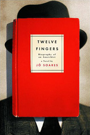
Twelve Fingers

Jo Soares’ Twelve Fingers: Biography of an Anarchist. Cover designed by Evan Gaffney (with Futura doing the type honors).

Found via The Book Cover Archive

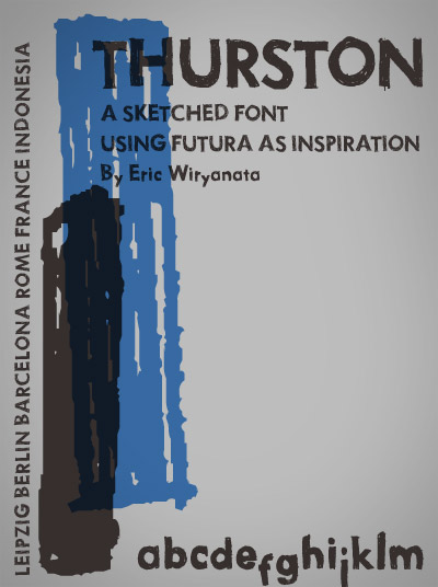
Handmade Futura

‘i named this masterpiece after Thurston Moore from Sonic Youth’

Funky, Futuraesque Thurston font, sketched by Eric Wiryanta.

Free download here.


Sonic Youth: Becuz

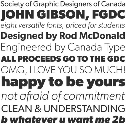
Gibson: For students

‘For less than the price of a design textbook, a student can now have a sturdy and contemporary humanist sans serif family that fits pretty much any design application, and will remain useful long after academic studies and well into a professional career in design.’

Gibson is a humanist sans serif honoring designer John Gibson, designed by Rod McDonald and digitized by Patrick Griffin and Kevin King.

And it’s available at student pricing: Eight complete fonts for $48 (that comes out to six bucks a font). With revenues benefiting The Society of Graphic Designers of Canada (GDC).

Details here. Snag it here.

Ideal Sans

New from Hoefler & Frere-Jones: Ideal Sans. The result of an experiment in asymmetry.

Details here.

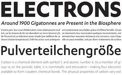
Karbon: Rethinking Futura

‘Karbon is an open, geometric sans serif with a contemporary spartan finish.’

Kris Sowersby’s beautiful Karbon fonts. Purchase thru Village.

Found via Mark Milic

Royal Barnbrook

The (most recent) work of Jonathan Barnbrook, above.

Found via Jean François Porchez

‘Qui est in, qui est out’

More Serge.

April in Paris

‘one more time’

BBC bird-filled animated version of Count Basie’s version of April in Paris (1957) – the song that just wouldn’t end.


Creative Commons License

the work at the mehallo blog. beta. is licensed under a creative commons attribution - noncommercial - no derivative works 3.0 united states license.  if reposting, credit must be given to steve mehallo - and if possible, please provide a link back to the mehallo blog. beta.

i include images for the purpose of critique, review, promotion and inspiration - and always make my best effort give credit/link back to the original source.  if i’ve screwed up, please fire me a note.

page layout based on the wordpress 'darkwater theme' by antbag, adapted and redesigned by mehallo.  valuable php assistance from bill mead.