entries Tagged as [typography]


Ein Hungerkünstler
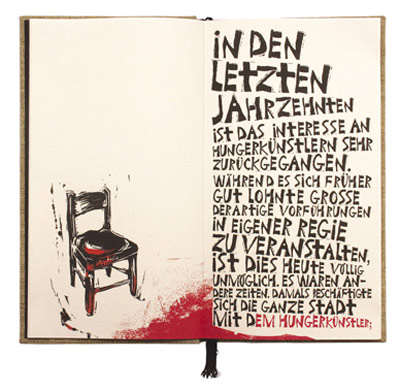
‘the letters and punctuation marks were carved into lino plates and digitized to portray the bipolar nature of the protagonist by using lettering with a harsh edge.’
Juergen Schlotter’s interpretation of Kafka’s Ein Hungerkünstler (A Starving Artist). Details here.
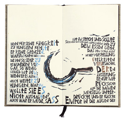
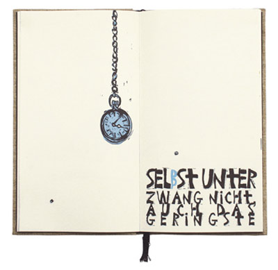
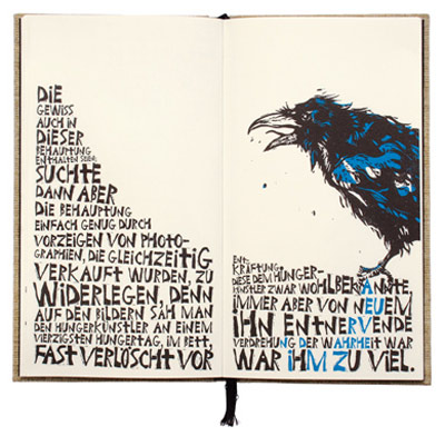
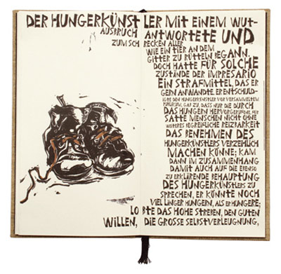
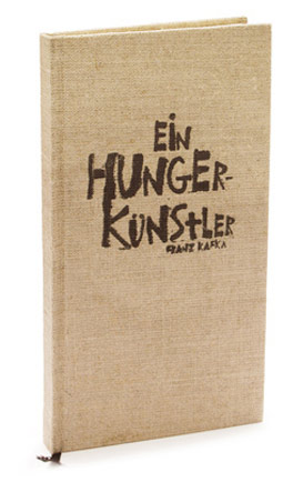
Found via Communication Arts
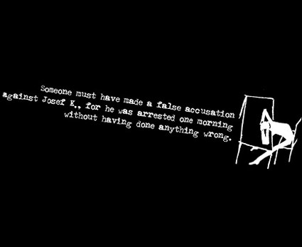
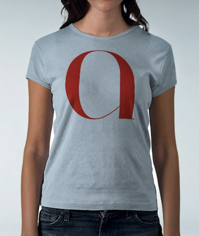
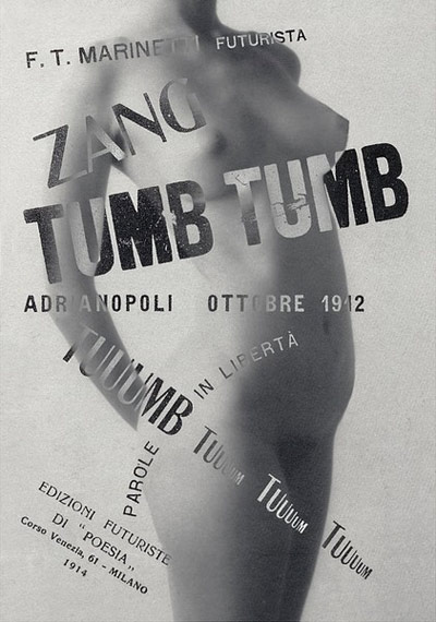
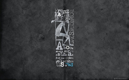
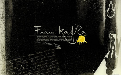
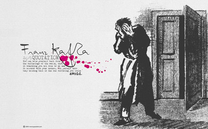
Kafka Chandler 42
Even more free wallpapers by Arno Kathollnig . . .
Franz Kafka Trilogy – featuring my own Chandler 42 fonts (with some pointing hands from Alta California).
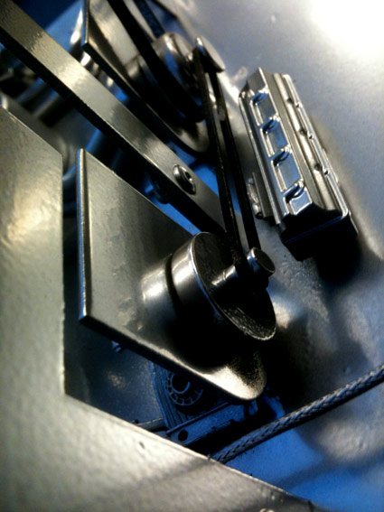
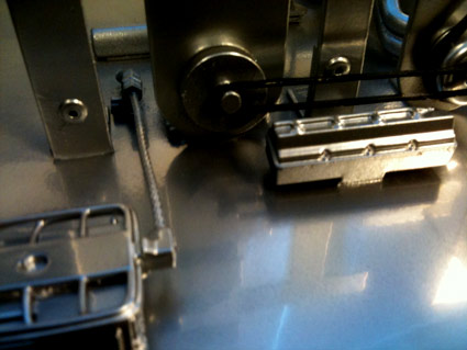
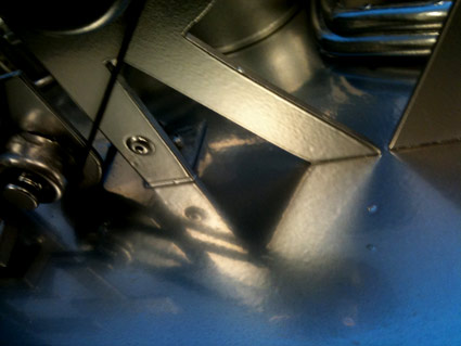
Futura Maschine 2011
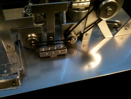
‘Paul Renner’s Futura interpreted in metal’
Handmade model with engine. Cesar Santos Perez’s final project from my most-recent experimental typography course at Ai Sacramento.


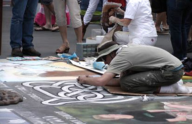
George Charles, I Madonnari
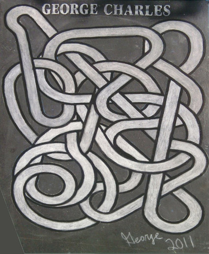
My cousin – former Disney Animation engineer George Charles Polchin – has taken up painting. Pictured, his most recent work from the Santa Barbara 2011 I Madonnari festival.
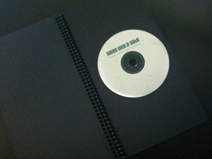
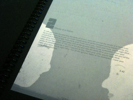
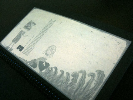
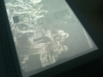
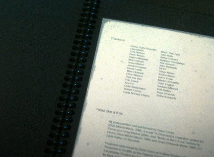
Head Like a Kite redux
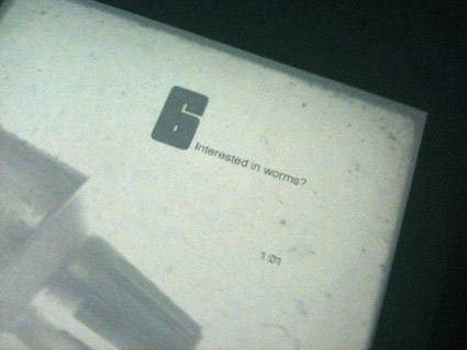
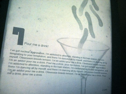
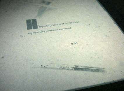
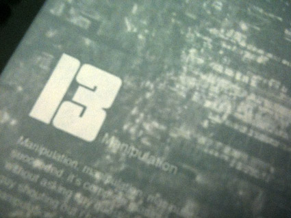
From my intermediate typography course: Student Allie Olcese’s experimental redesign of CD packaging for Head Like a Kite’s Random Portraits of the Home Movie.
Interpretative imagery veers from found photography, illustration, finger paints to hypodermic needles, gummy worms and tin foil – rendered in subdued, faded colors.
The final piece is housed in a wire-bound album, accented with carefully set 1970s-style shareware type.
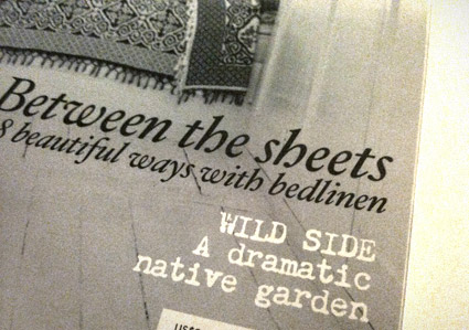
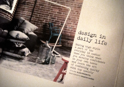
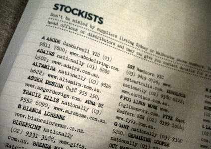
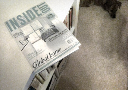
Chandler in Oz
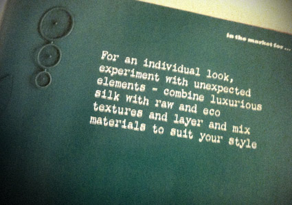
‘inspiring homes with heart’
Magazines are great sources for inspiration. Not as permanent as a logo – or brand – periodicals have a timer on them. After a few months, they’re gone.
A good newsstand is a treasure trove of the experimental, conservative, international, concise, good, bad, ugly. I drop by whatever I can find – even the Barney Noble chain if one is not nearby – just for a shot in the arm.
Earlier this year I spotted Chandler 42 being used in an Australian interiors pub. Alexendria-based Inside Out is using my typewriter type as a nice accent throughout their pages.
Here’s a few snaps (taken in my new home office – sleepy dog in background).

handpicked posts

a piano falls in old manhattan
tetro and typography
it’s typography: film, song and dance
ghosts of gustov klimt
the great times new roman controversy
picking fonts
kapitaal
defining terms: design is not decoration
garcia's 'pure design'
'enhance that image!'
magic highway remixed
the cynic
rad anthem
Brought to you by man dom-


buy my fonts
go shopping
mehalloreads

Divinely Elegant: The World of Ernst Dryden
Jozsef Pecsi: Photo and Advertising
Color: A Natural History of the Palette
Collage: Assembling Contemporary Art
Modern Dog: 20 Years of Poster Art
Gaberbocchus Press: An Experiment in Publishing, 1948-1979
Advertising Art in the Art Deco Style
Googie Redux: Ultramodern Roadside Architecture
Hot Sour Salty Sweet: A Culinary Journey Through Southeast Asia
now playing


the work at the mehallo blog. beta. is licensed under a creative commons attribution - noncommercial - no derivative works 3.0 united states license. if reposting, credit must be given to steve mehallo - and if possible, please provide a link back to the mehallo blog. beta.
i include images for the purpose of critique, review, promotion and inspiration - and always make my best effort give credit/link back to the original source. if i’ve screwed up, please fire me a note.
page layout based on the wordpress 'darkwater theme' by antbag, adapted and redesigned by mehallo. valuable php assistance from bill mead.


