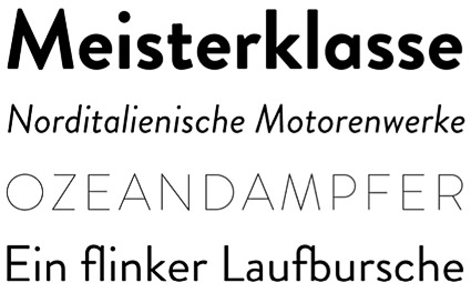
Brandon Grotesque

‘My father gave me some magazines from the 1920s and 1930s’

Hannes von Döhren’s Brandon Grotesque, influenced by early geometric types – available in six weights with true italics.

One of TDC’s 2011 award winners. Available thru HvD Fonts.

2 Responses to “Brandon Grotesque”

  1. Garmin Nuvi 1490t…

    […]here are some links to sites that we link to because we think they are worth visiting[…]…

  2. 1.) Recommendation…

    2.) […]here is a site that I like. If you have a few minutes then take a look too[…]…


Creative Commons License

the work at the mehallo blog. beta. is licensed under a creative commons attribution - noncommercial - no derivative works 3.0 united states license.  if reposting, credit must be given to steve mehallo - and if possible, please provide a link back to the mehallo blog. beta.

i include images for the purpose of critique, review, promotion and inspiration - and always make my best effort give credit/link back to the original source.  if i’ve screwed up, please fire me a note.

page layout based on the wordpress 'darkwater theme' by antbag, adapted and redesigned by mehallo.  valuable php assistance from bill mead.